This project was a whole marathon of pure joy in autumn colors and vibrant feelings. I created the visual identity for one of the most iconic trail run contests in Romania. The marathon is celebrating the 10th edition and together with it a new, fresh and modern visual identity.
The contest takes place in Cerna Mountains – an emblematic place with lush virgin forests, isolated villages and limestone mountains. Historically speaking the area is covered in legend and rich cultural heritage from the Roman period until last century’s monarchies. Baile Herculane used to be one of Europe’s top thermal baths resorts where the architectural beauty was built in harmony with the local legends. It is said that Hercules himself stopped here to enjoy the wonders of the thermal waters. The name of the contest is built upon this rich heritage and while creating the new visual identity I remained focused on keeping this link well connected.
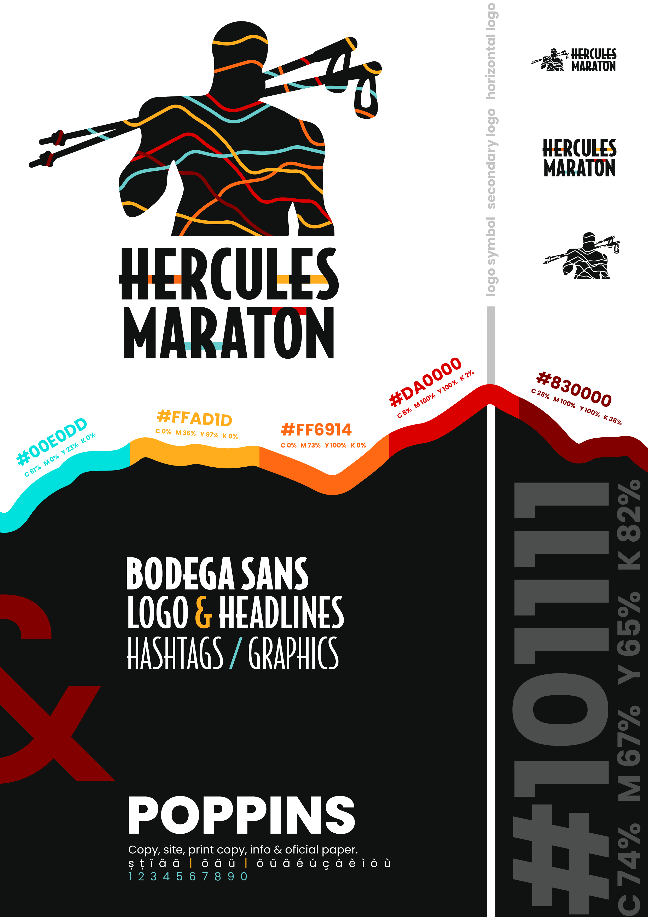
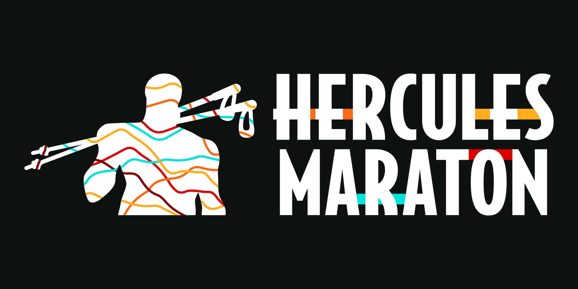
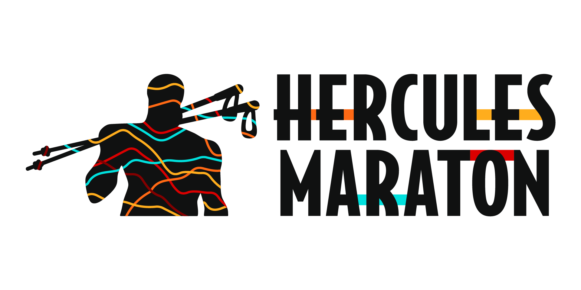
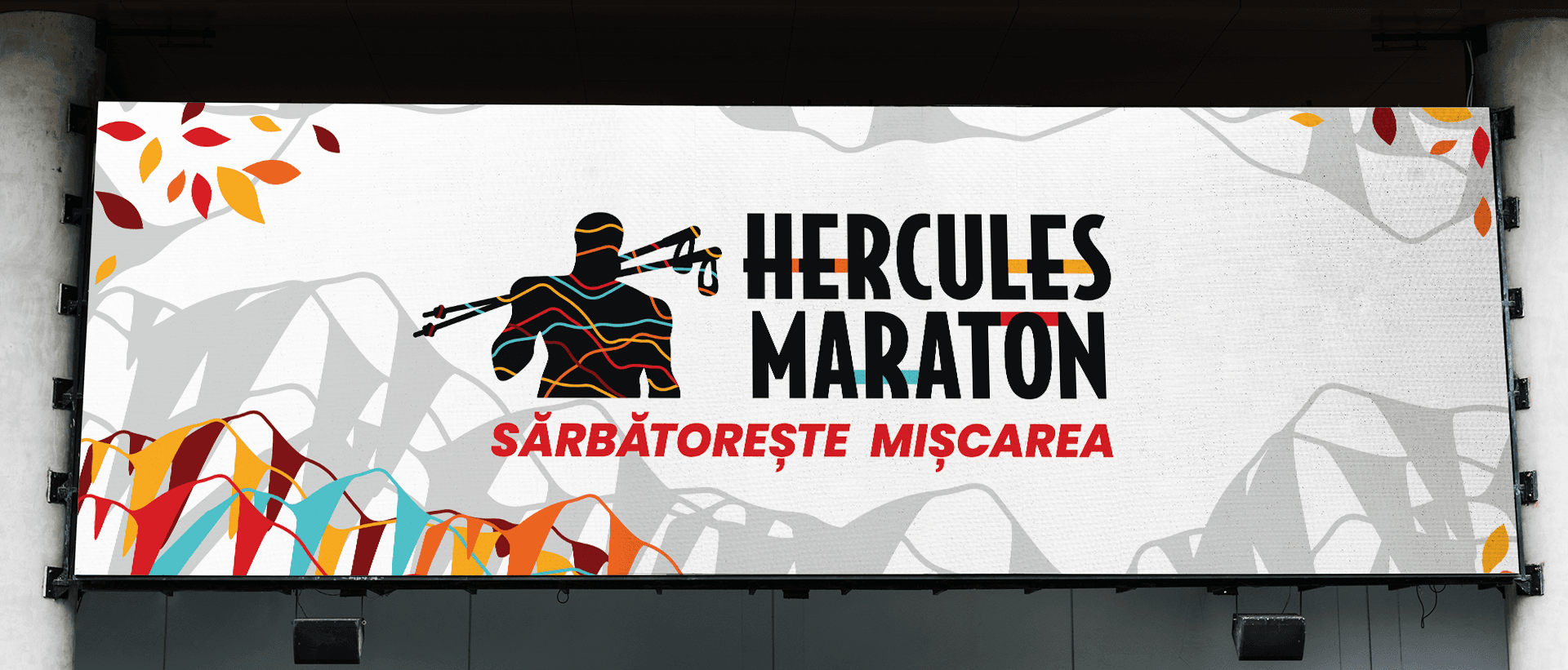
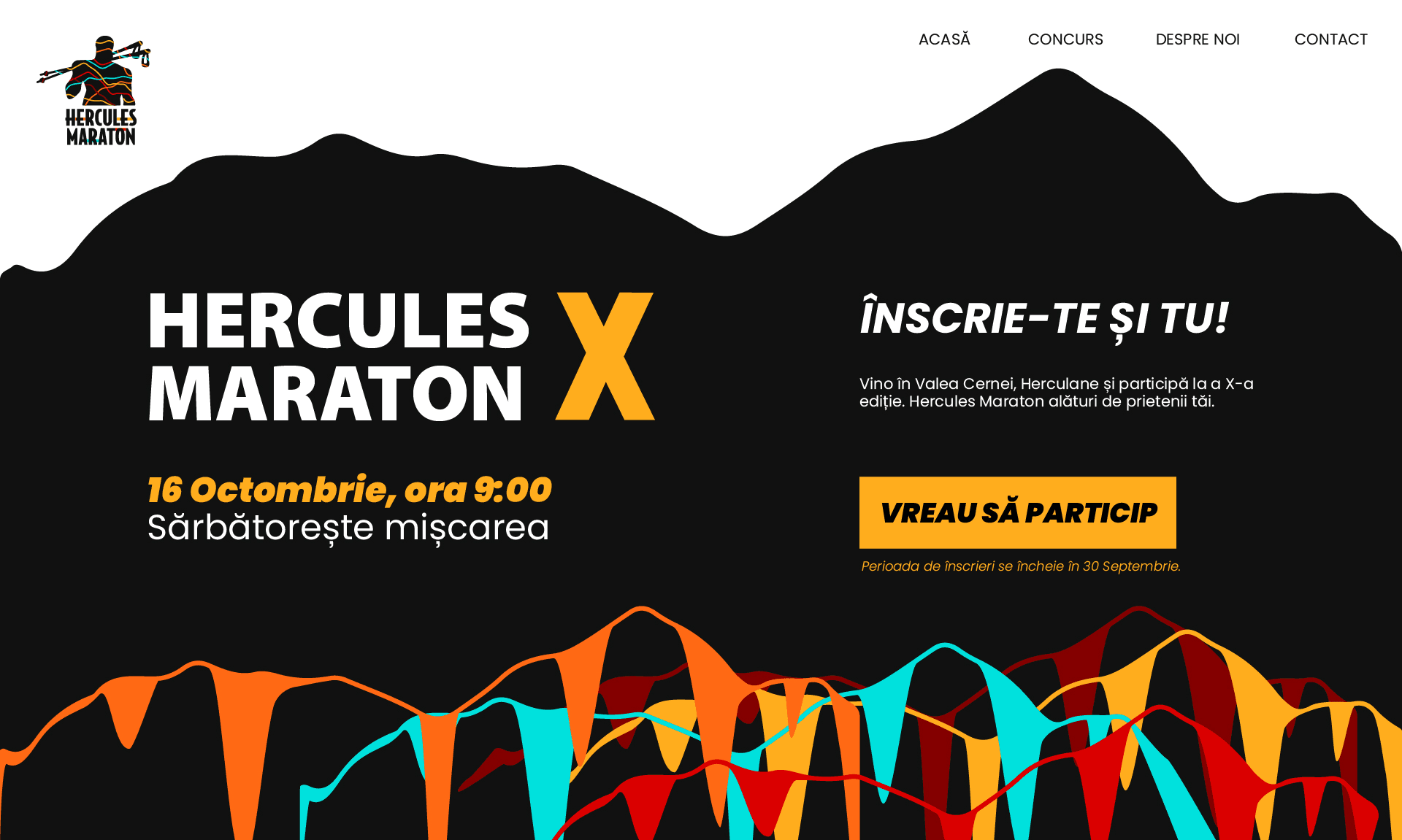
In the logo creation process I started from a three elements that would represent the backbone of this contest: HERCULES – as the main character and the soul of the project, AUTUMN – the event takes place every year in mid October, which happens to be the most spectacular season in the area and last but not least TRAIL RUN – which is the purpose of the whole project. And when Hercules himself grabs a pair of trail poles and a splash of autumn colors everyone knows it’s going to be a fun ride.
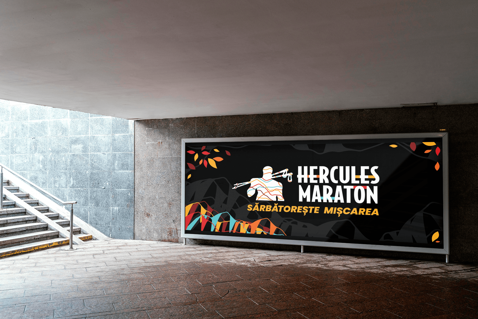
Color wise I based the design concept on a powerful contrast between black and yellow to give a burst of energy and vibrance. The red, dark red and orange notes are inspired from the local landscape in mid October and the cyan represents both the river stream that divides the mountains (Cerna River) as well as the perfectly clear skies of warm Autumn days.
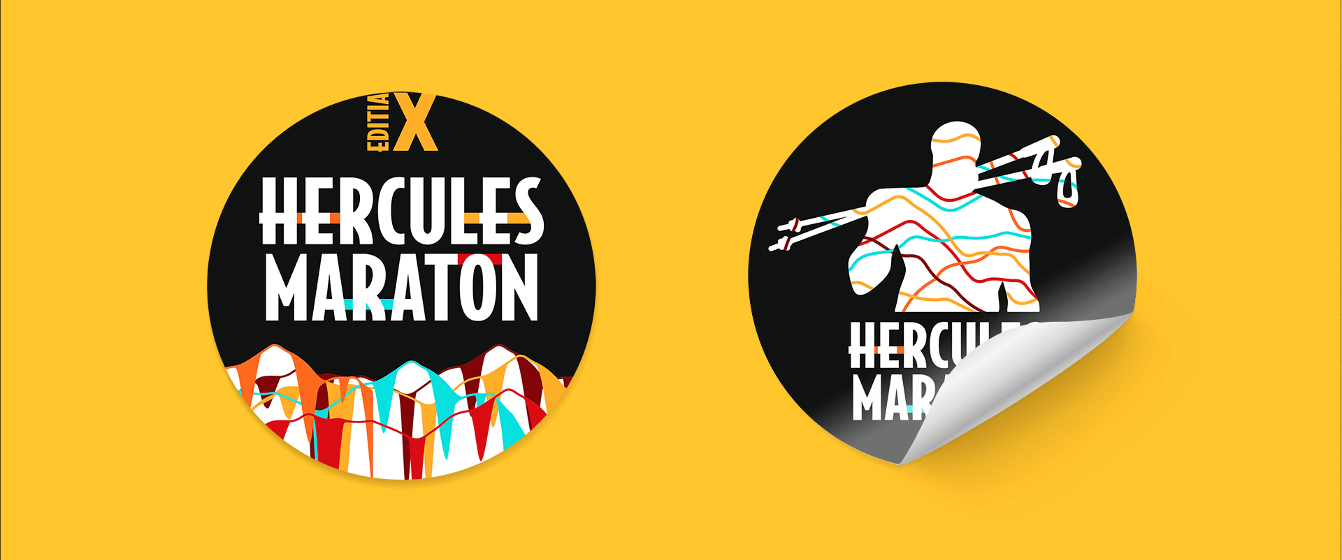
Each line that crosses Hercule’s upper body emphasizing the natural shapes is a projection of the actual trail altitude profile of the marathon. This adds up to the personality and identity of this contest. Hercules Marathon is personal. It is about friendship, the joy of sharing experiences and being together, the beauty of nature and the local identity. It all intertwines harmoniously to result in one of the most appreciated trail run contests in Romania.
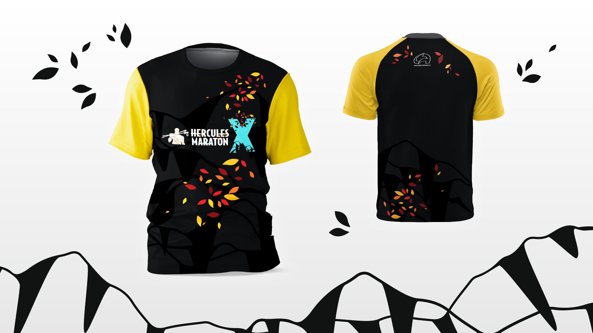
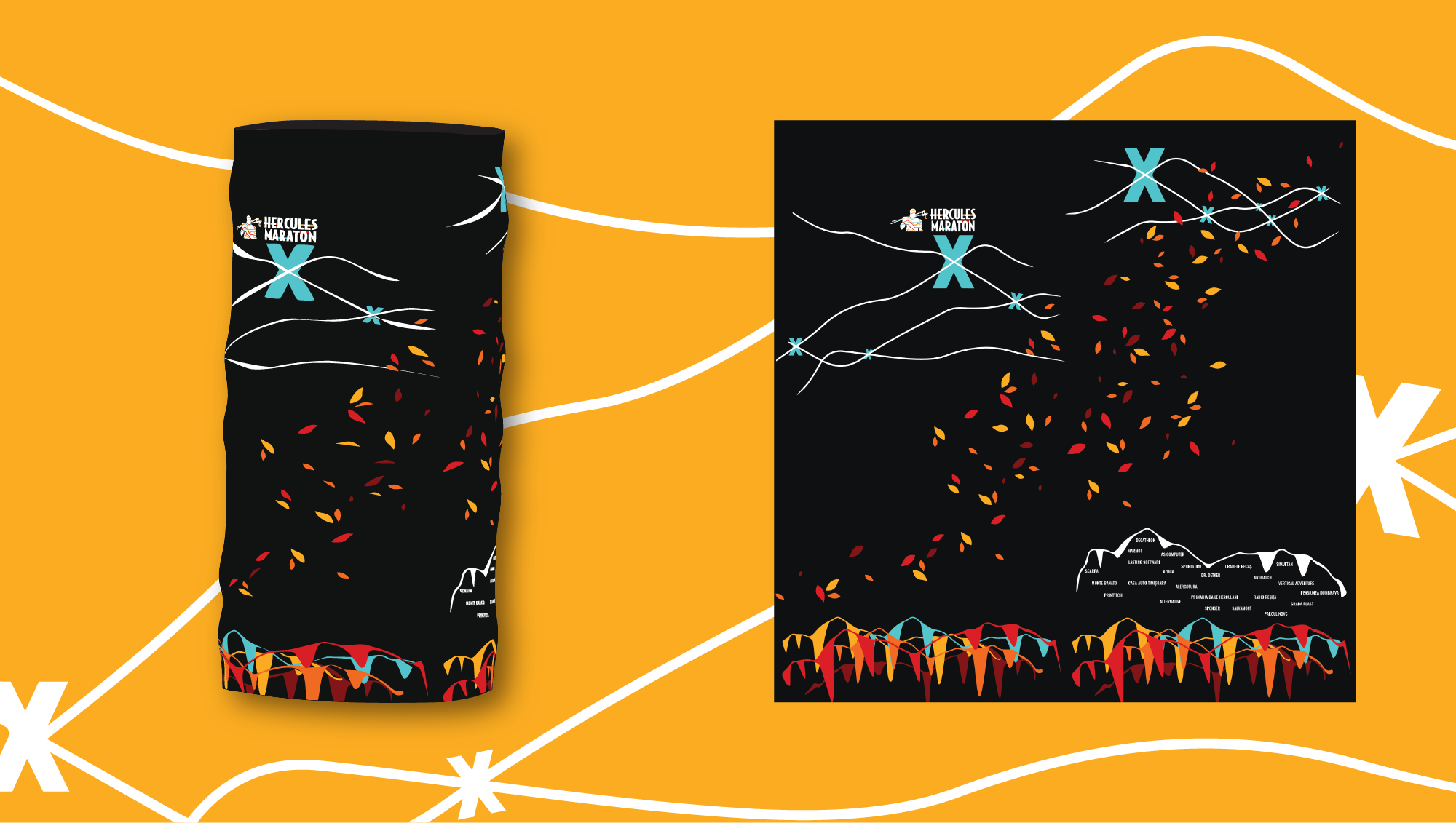
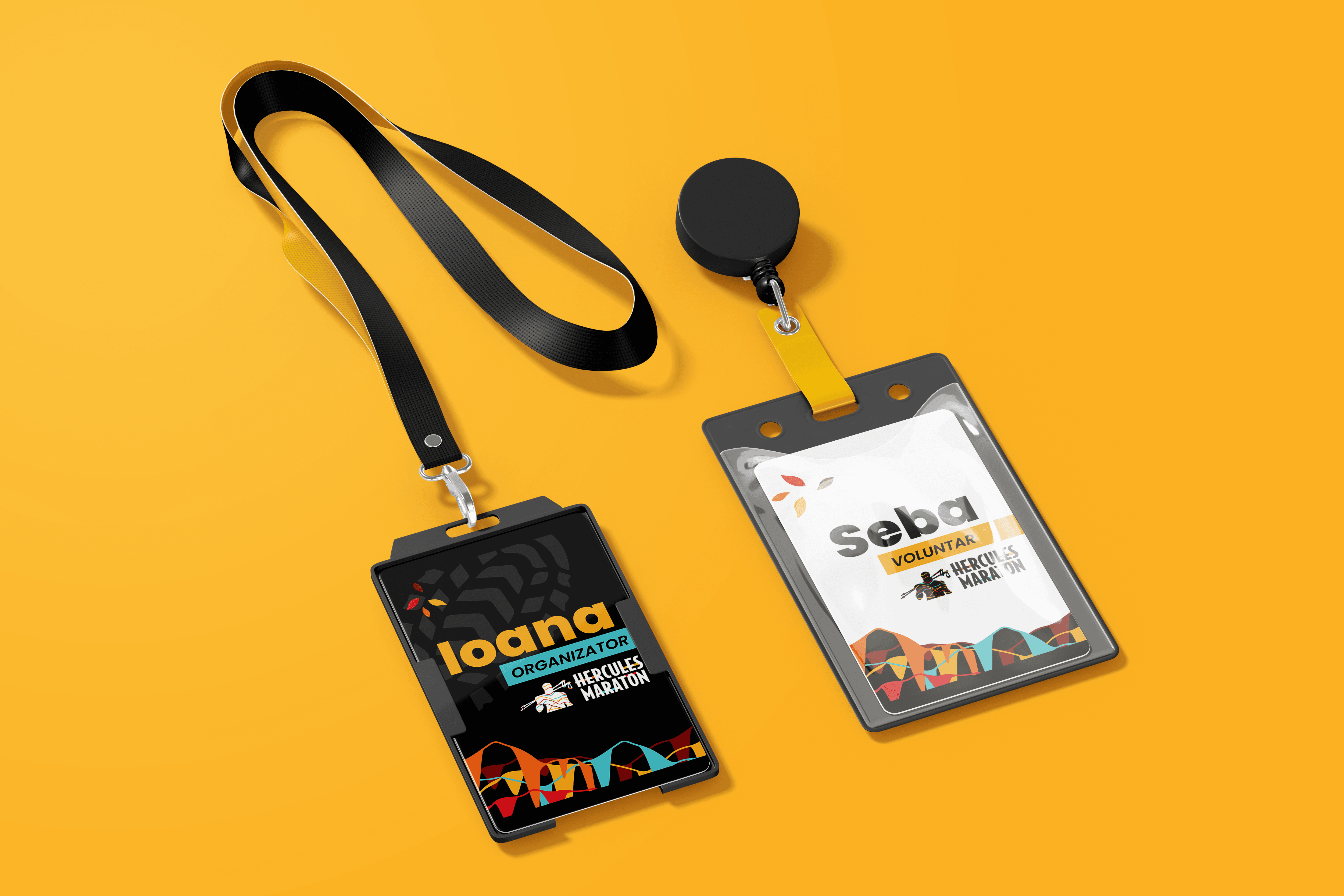
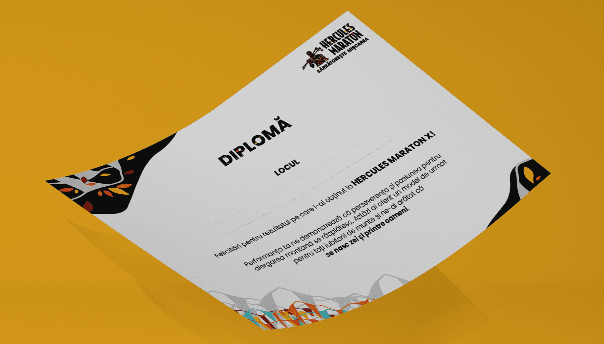
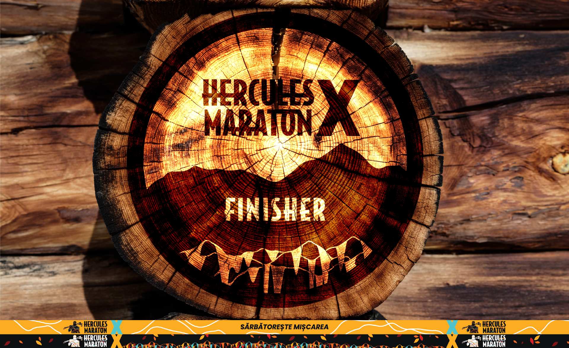
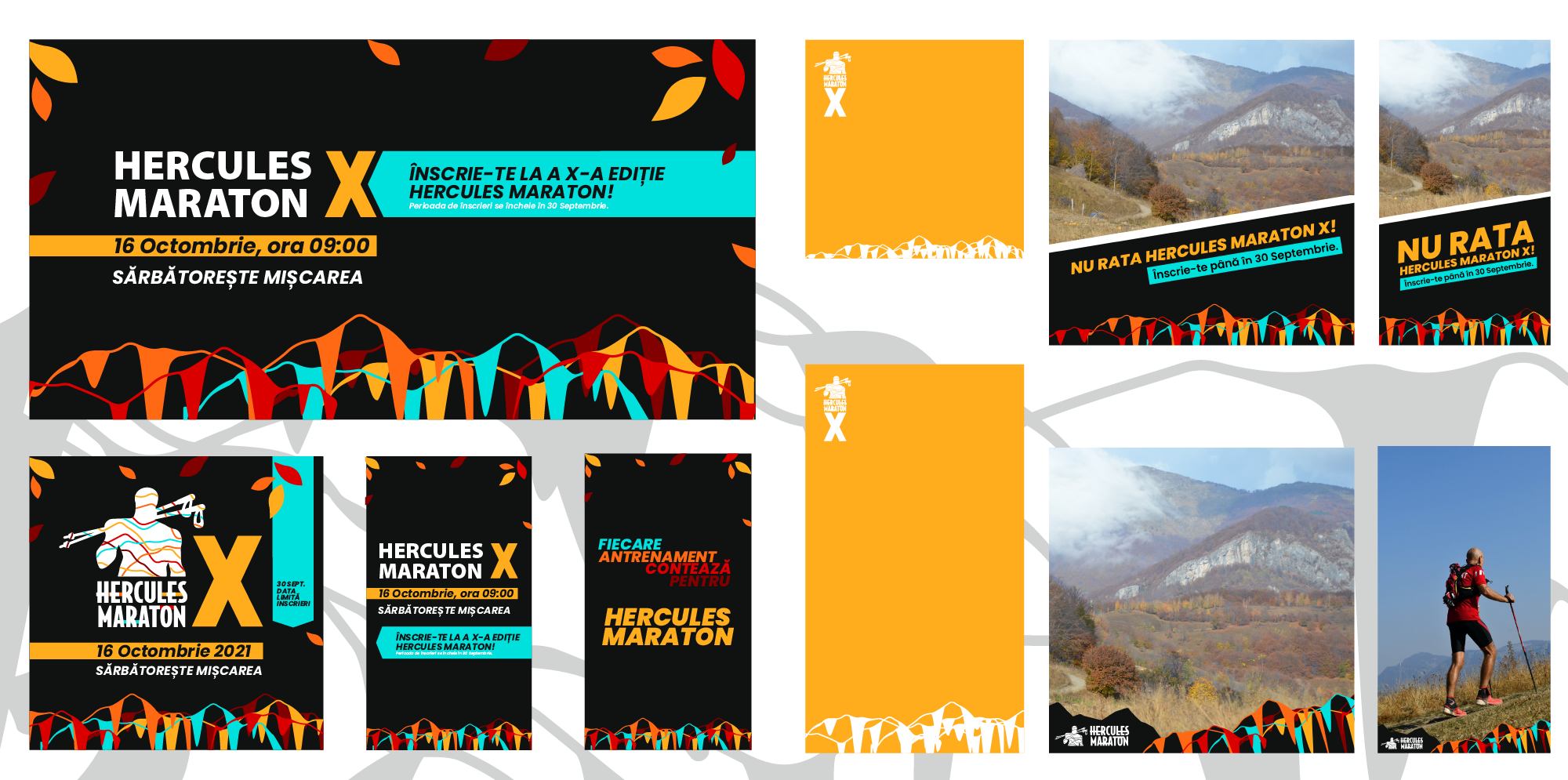
I feel privileged to have worked on this amazing project. Probably one of the most complex projects for the time being with a lot of assets to deliver. From building up the visual identity (logo, graphic elements, typeface and color pallette) to web design of the landing page, social media templates and many print materials (medals, trophies, ribbons, t-shirt, stickers, badges, diplomas and banners).

