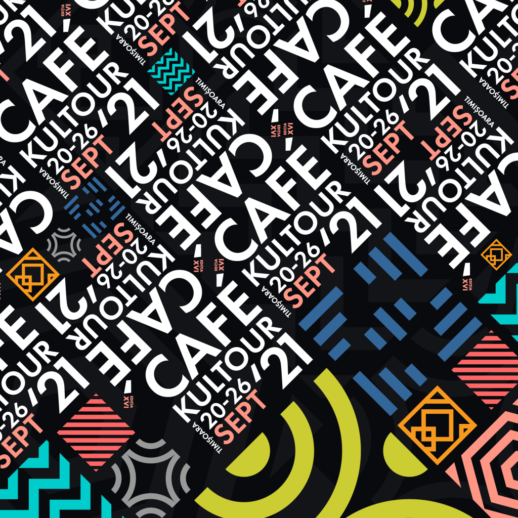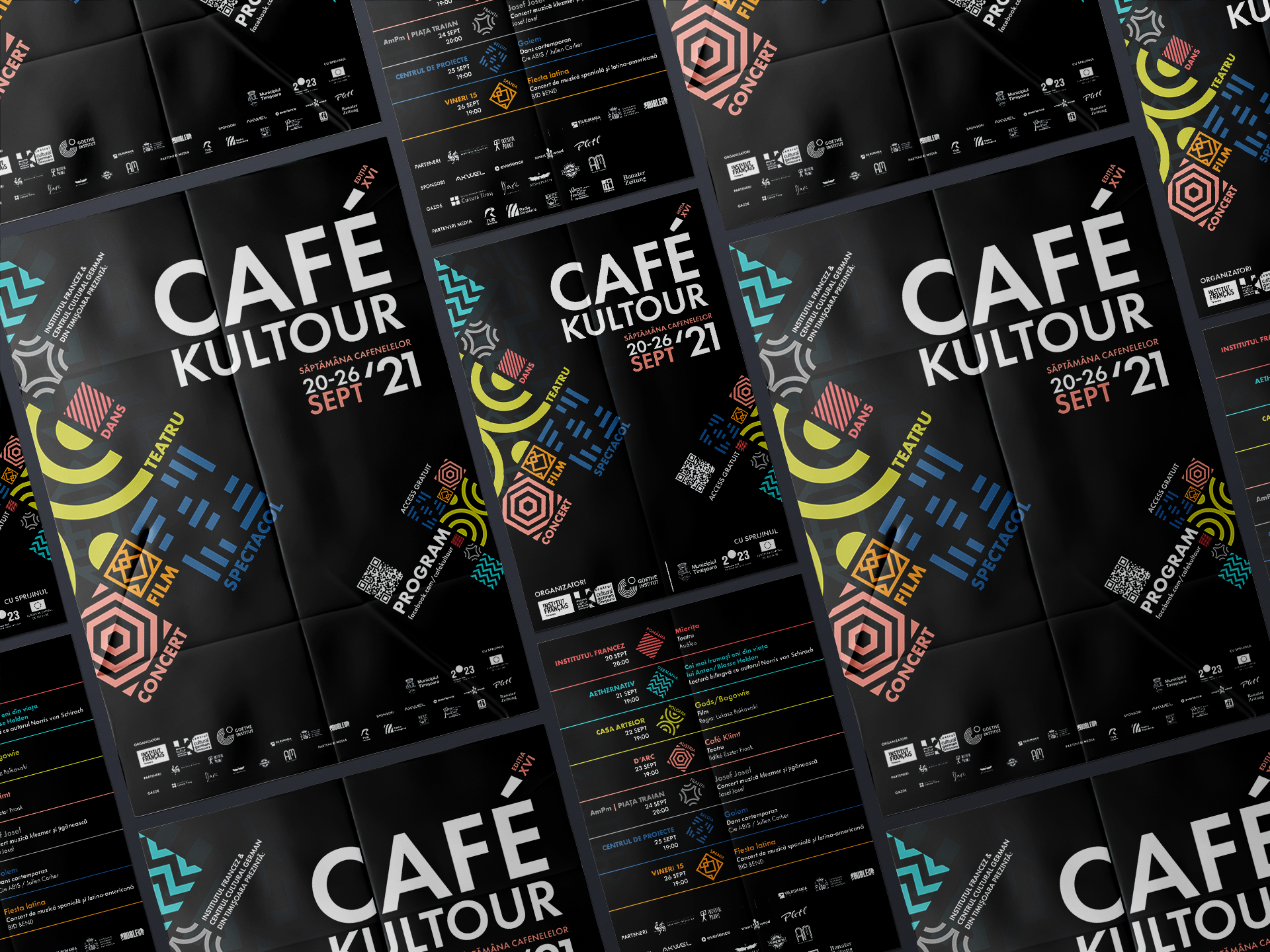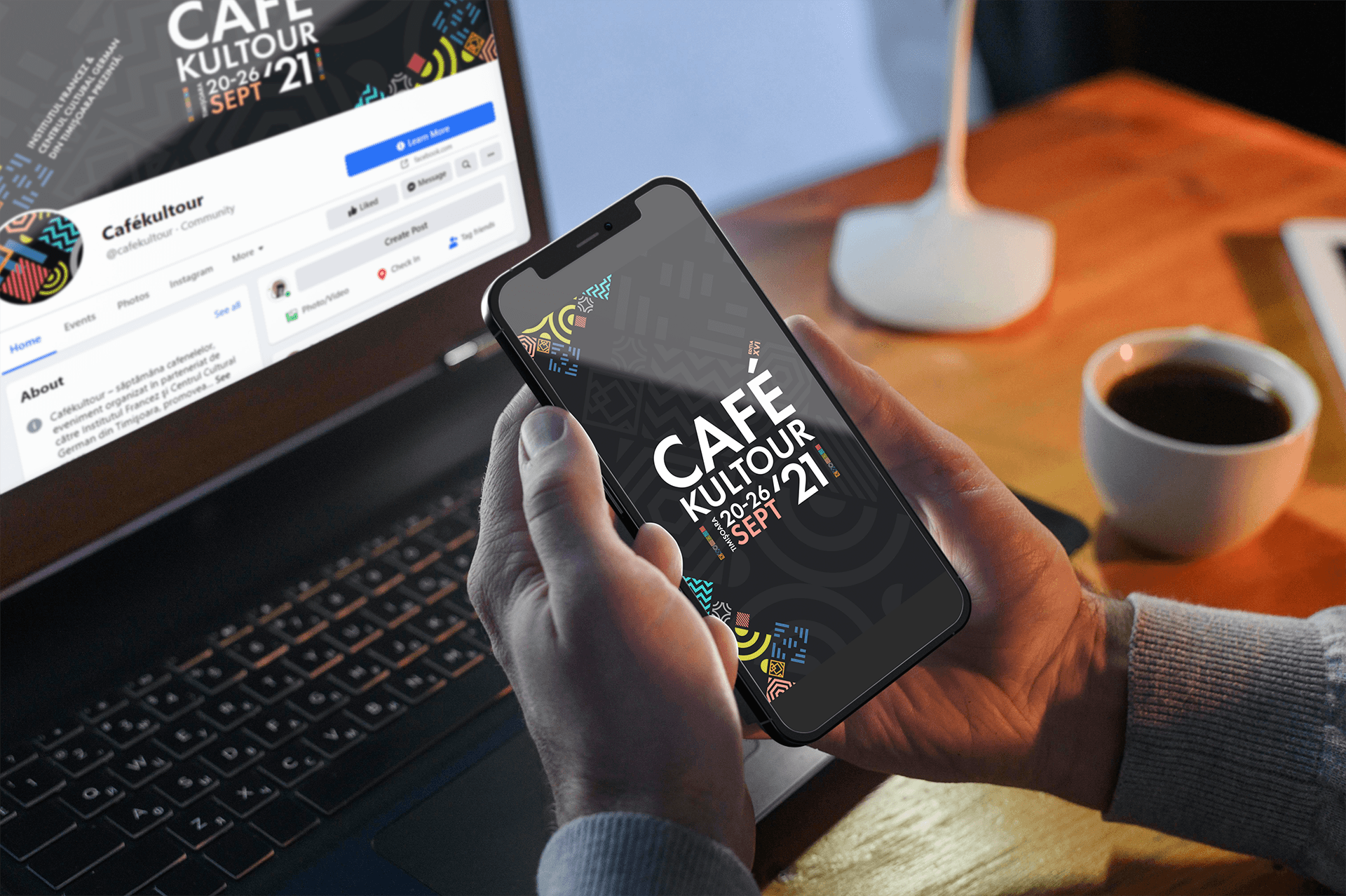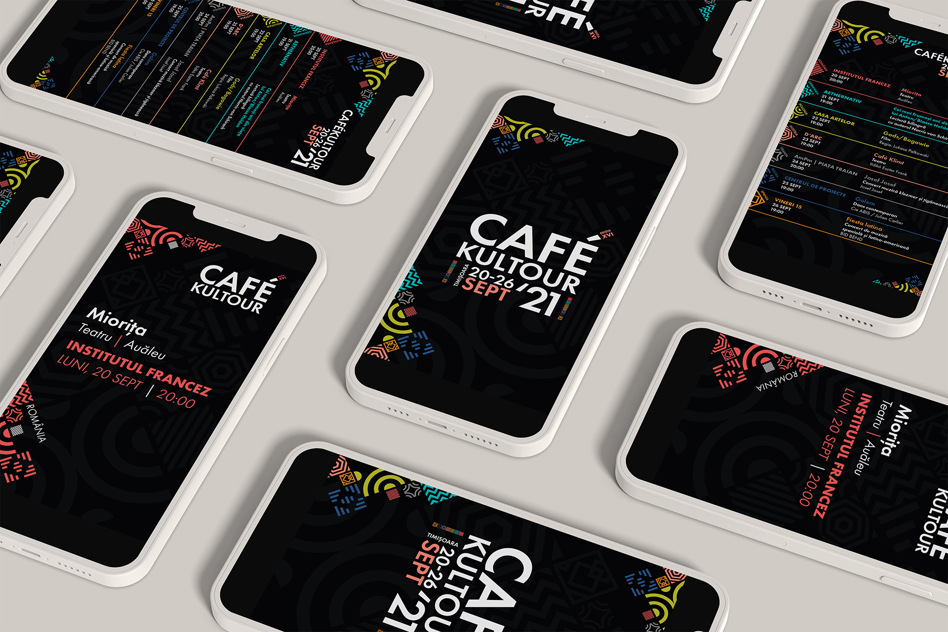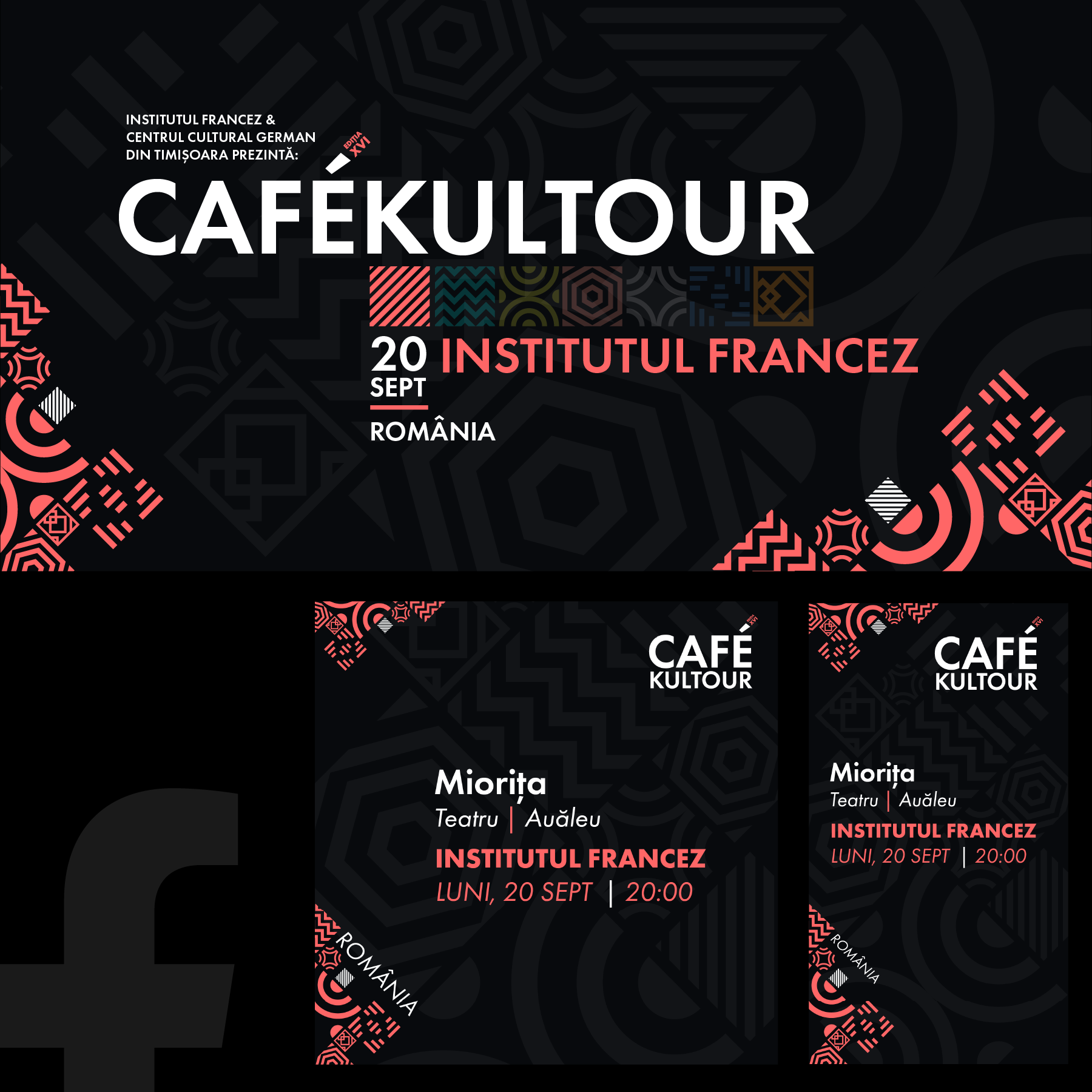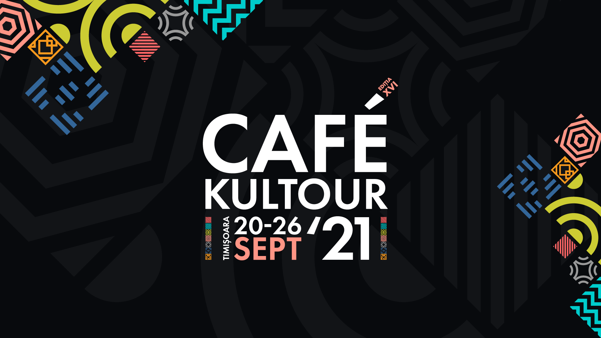
Dedicated to coffee and culture lovers – Cafékultour is a series of seven events spread over seven evenings in seven different locations. The event is organized by the French Institute and the German Institute in Romania to whom I am more than grateful for choosing me to create the visual identity for the 2021 edition.
I had the whole liberty to work on the color pallette, typography and art direction and this is where the fun began. I got inspired by modern coffee, tea and chocolate brands when decided on the pallette. Tiny bit of ecuatorial vibes in the urban jungle of a big city. This is how I imagined a cultural week in various bars in Timisoara, the city that hosted Cafékultour. I was delighted when I presented the concept to my clients and from the very beginning they had a ‘nespresso’ feeling.
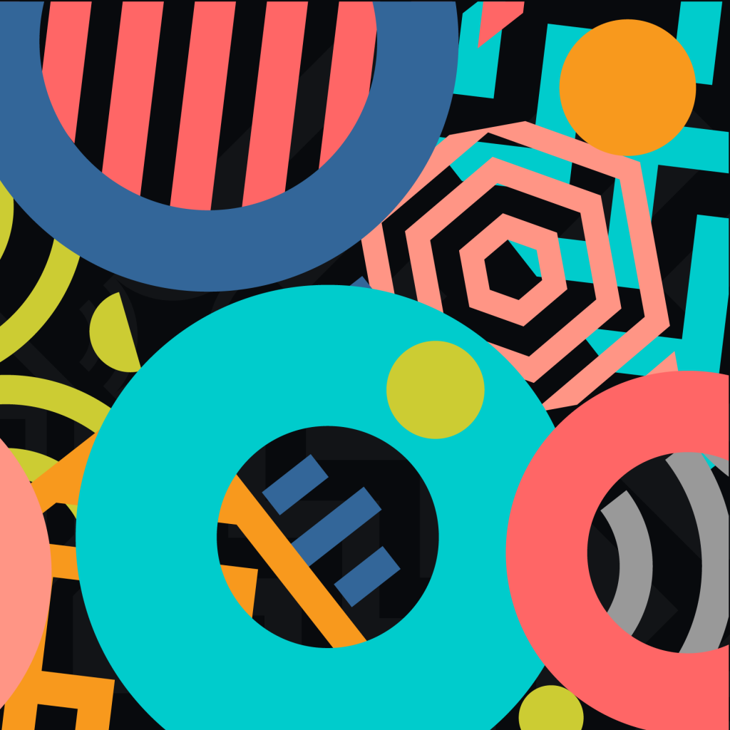
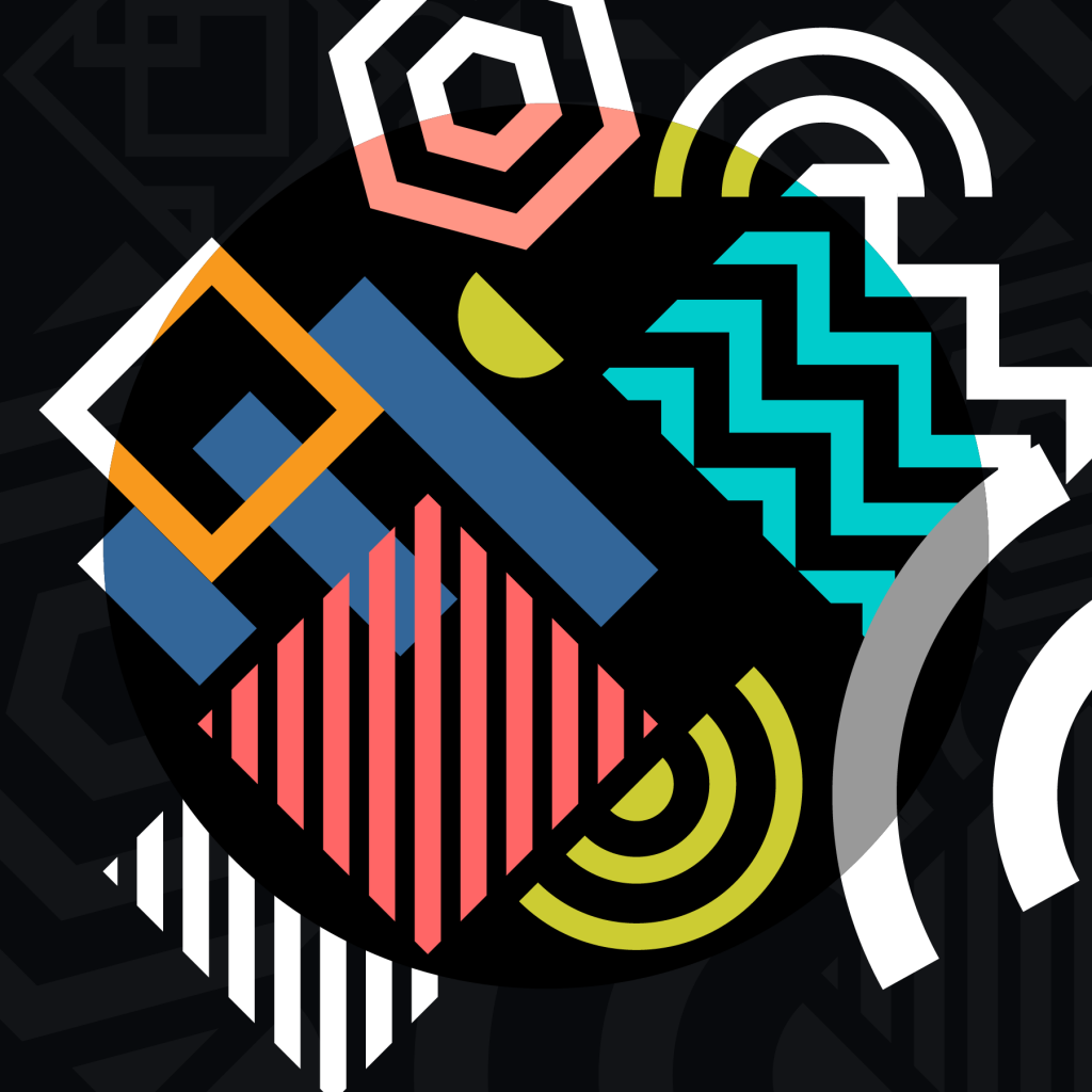
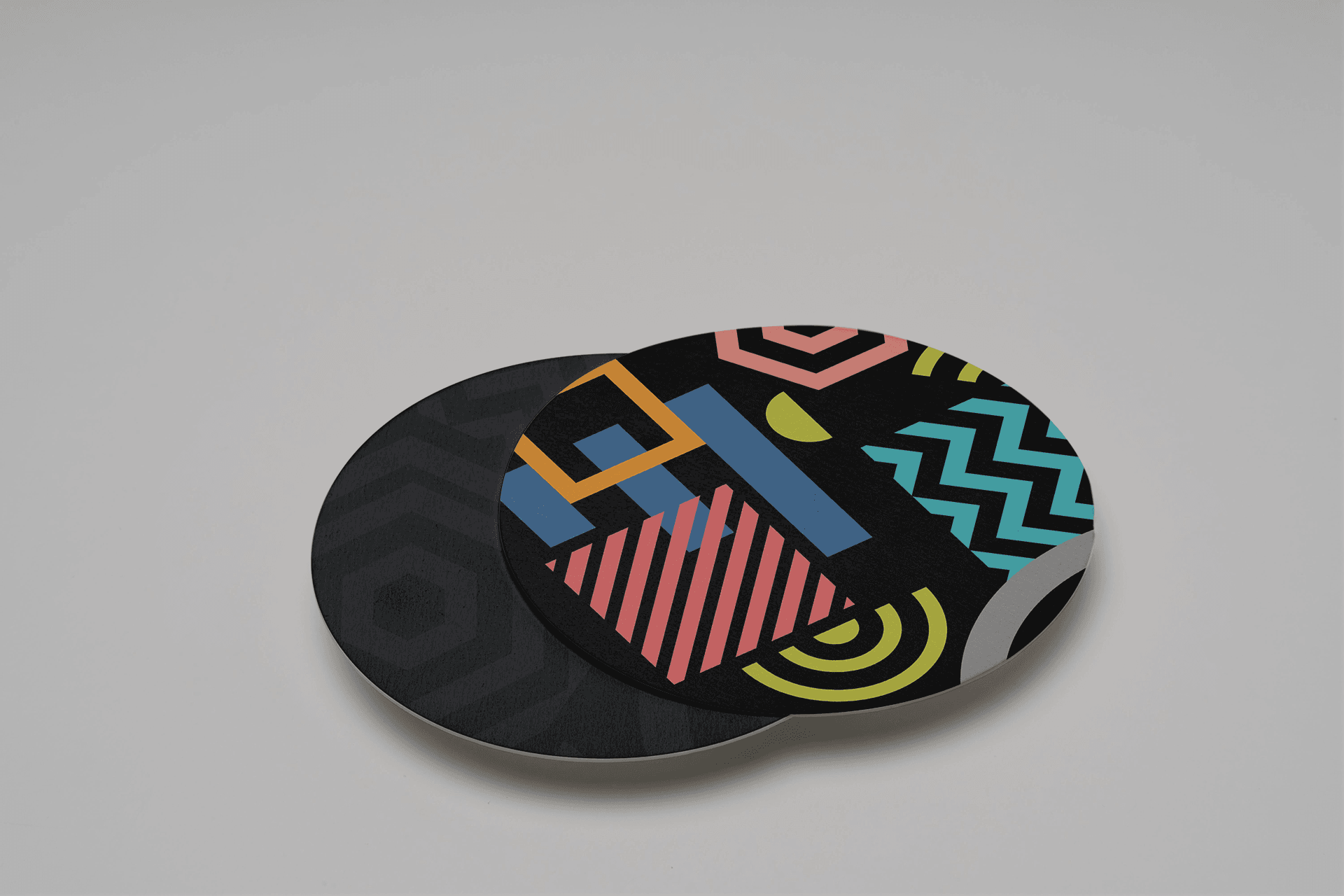
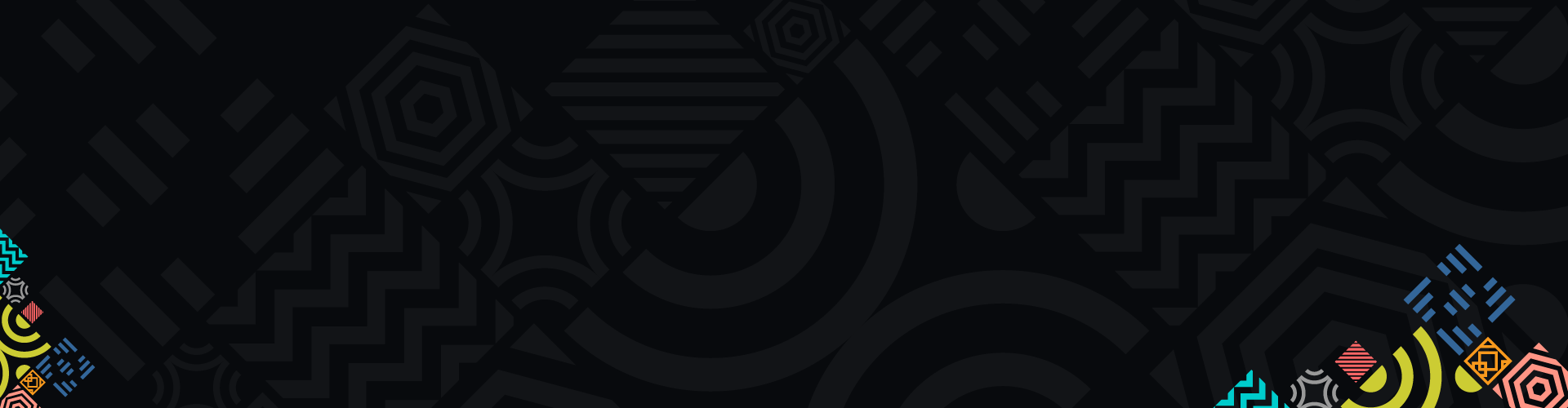
Our whole concept of culture started from simple shapes. Straight lines, rectangles, rounded shapes and wavy lines – from here, we had a great range of emotions, concerns, ideas and feelings. CULTURE. There’s a lot of it in Cafékultour: music, theatre, film and even dance. Every location and event is flagged with a specific color and symbol, easy to spot. Mix them together and you have a colorful week to enjoy.
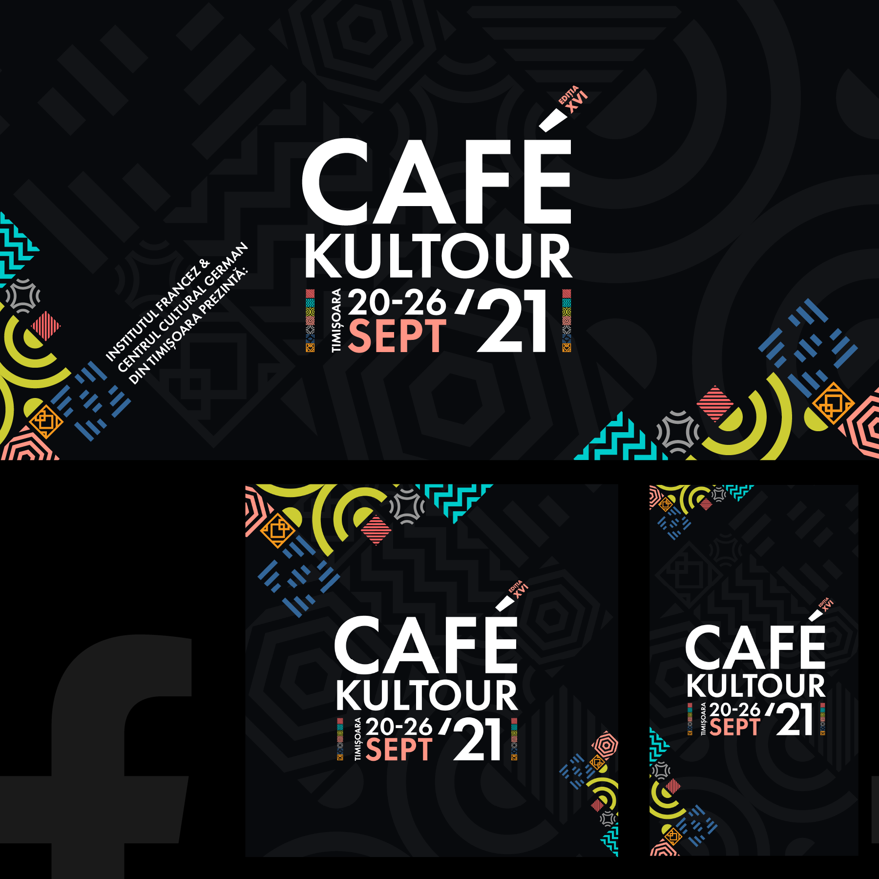
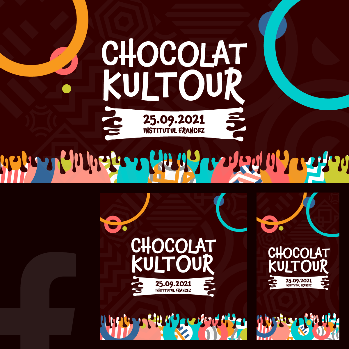
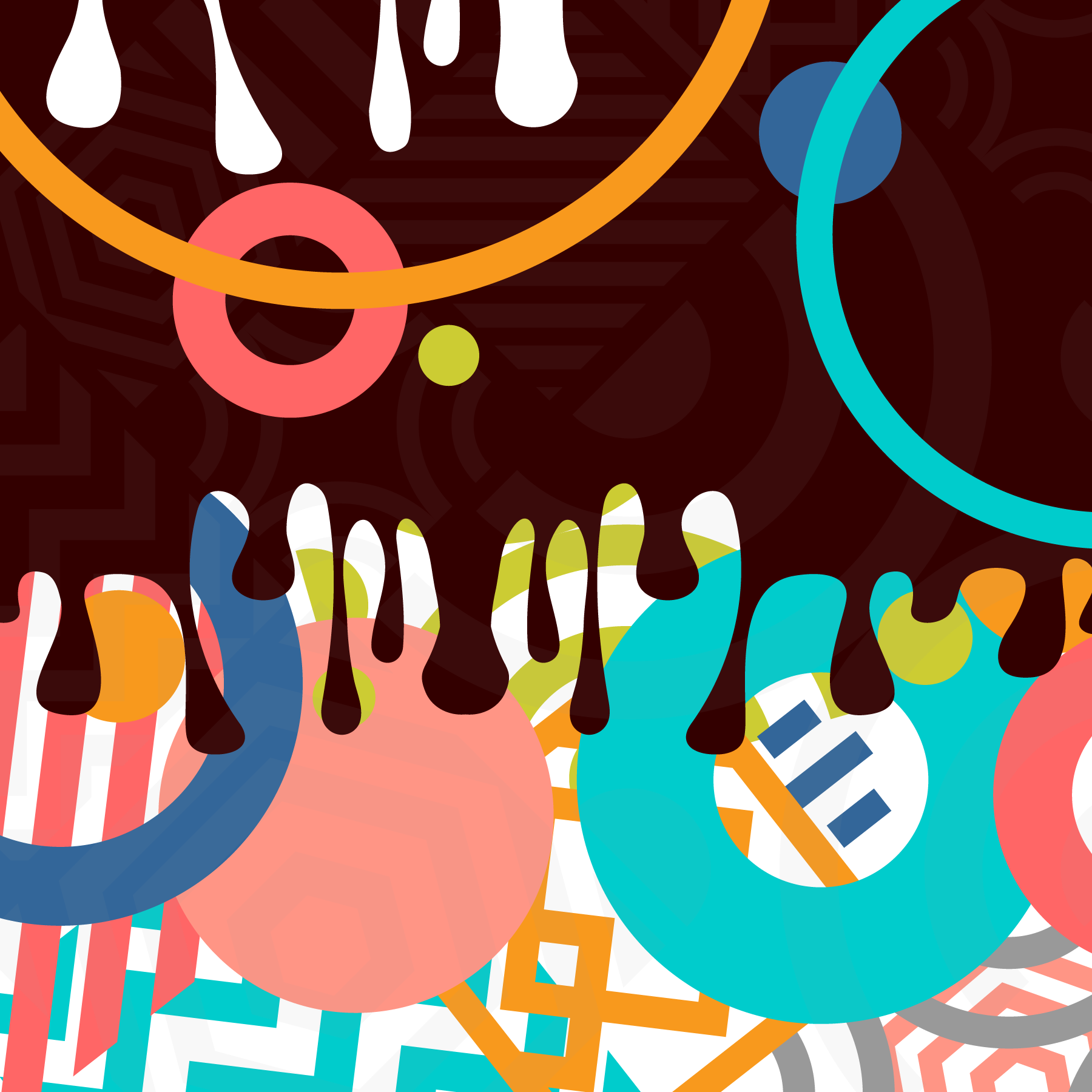
Print materials such as banners, flyers, web banners and social media kits – for the main event as well as for each of the seven separate events. As well I worked on one additional visual concept for Chocolatkultour – an event dedicated to children – until they grow big enough to enjoy a coffee. I added cocoa and milk sweetness to build the graphics for Chocolatkultour while keeping the main geometric shapes behind the playful bubbles. Edible design.
Typography wise I used Futura PT for Cafékultour and Chaloops for Chocolatkultour. I aimed to match a modern, clean easy to read typeface with the geometric design for Cafékultour and a ludic font for Chocolatkultour.
All in all, in love with this project.