logo

© Copyright Karina Isar
UX/UI: Roar Webpage Project
763
portfolio_page-template-default,single,single-portfolio_page,postid-763,bridge-core-2.6.6,qode-page-transition-enabled,ajax_fade,page_not_loaded,,qode_grid_1300,side_area_uncovered_from_content,qode-content-sidebar-responsive,qode-theme-ver-25.1,qode-theme-bridge,disabled_footer_top,disabled_footer_bottom,wpb-js-composer js-comp-ver-6.6.0,vc_responsive,elementor-default,elementor-kit-5
 

UX/UI: Roar Webpage Project

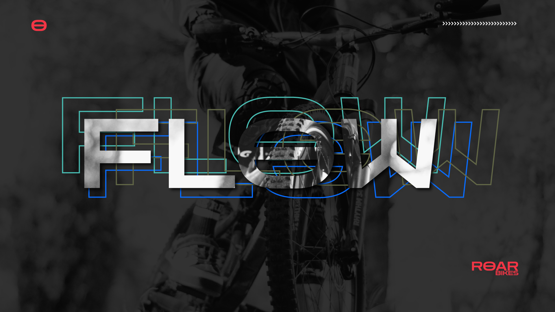
ROAR bikes is an experimental web design project I created based on the specs of a class project (UX Design by Daniel Walter Scott) and a little bit of extra TLC from my end.


While I followed the initial requirements (naming, three bike models) I added complexity (in terms of the pages and interactions) and some mountain-biking orientation just for fun. There’s no real-life ROAR BIKES company, as such I used three bike models and images from CUBE, a real bike producer. Why Cube? because I own a Cube, I love mountain biking and I could use my personal photo gallery. I aimed to create consistency throughout the project and having images from one producer helped a lot in this sense. Some of the amazing black & white images are coming from Unsplash (check out the link to find the amazing photographs).

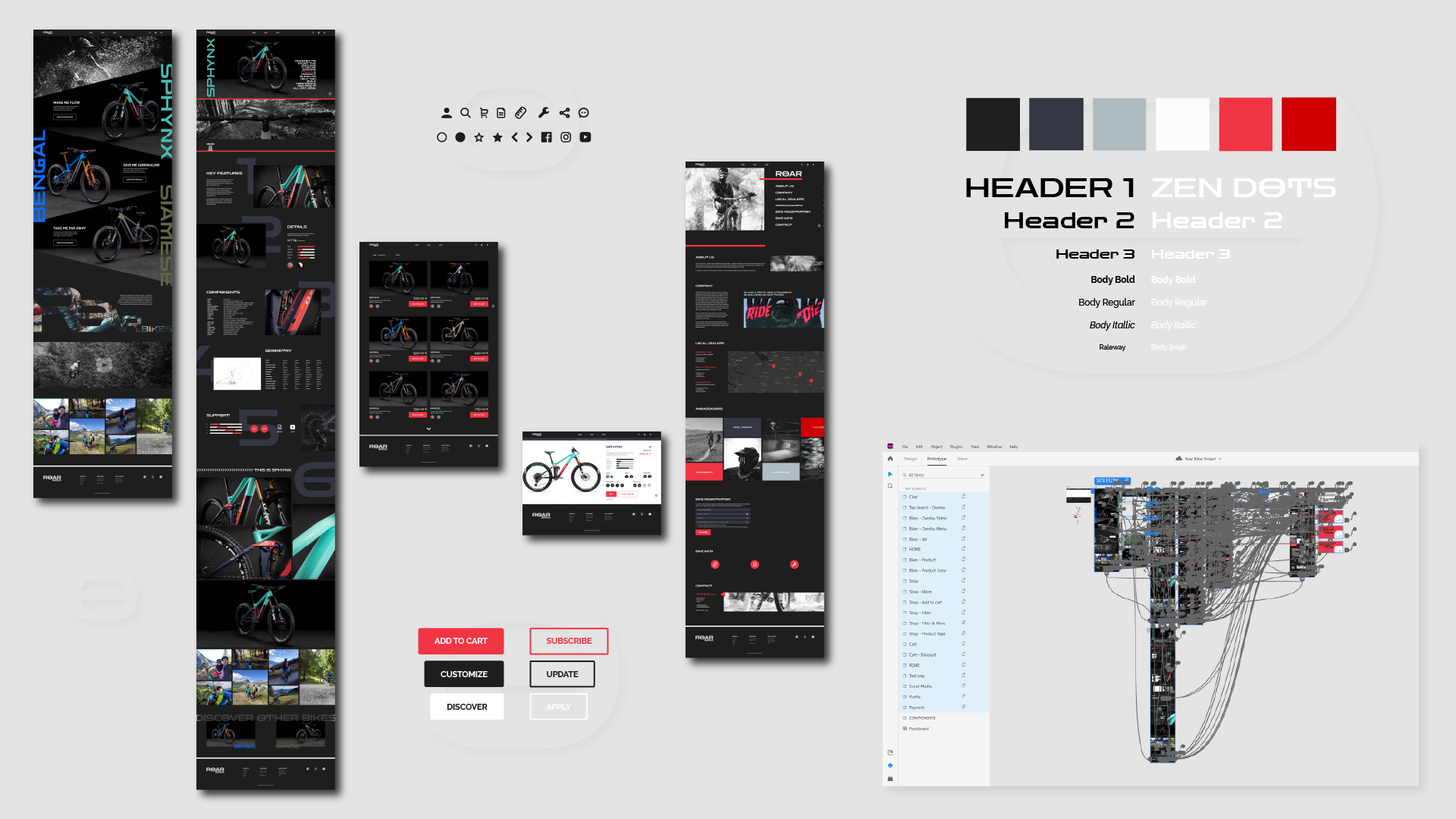
I designed the user interface of the website following a dark theme to reverberate a feeling of quality, modern and uniqueness. I complimented the dark theme with intense pink-ish red accent color to get the most out of the CTA buttons, clickable elements and highlights.


The overall geometric typography and page elements together with the bold typefaces emphasize the roughness, accuracy and challenge of mountain biking as sport.


The project includes a website designed to present the three bike models, to allow the user to feel the vibe of the bike producer (homepage/roar page), to discover the features of each model, to shop and to perform actions such as registering a bike, troubleshooting and contacting the company. As a site usage example, there is only one model presented on the product page / shop etc. – the Sphynx (the rest, goes just by imagination). As well, there are a few dummy pages (yes, in a dummy project – inception) that aim just to allow the user to discover the navigation idea behind. Some basic functionality for e-commerce such as adding in the cart (one product only), checking the cart, applying a discount and payment are also included. Horizontal and vertical scrolling, microinteractions and different kinds of overlays spice up the user experience.


Overall fun falling in love with Adobe XD.  

Click below to explore the interractive prototype for this website.

ADOBE XD PROTOTYPE
Category
Graphic Design