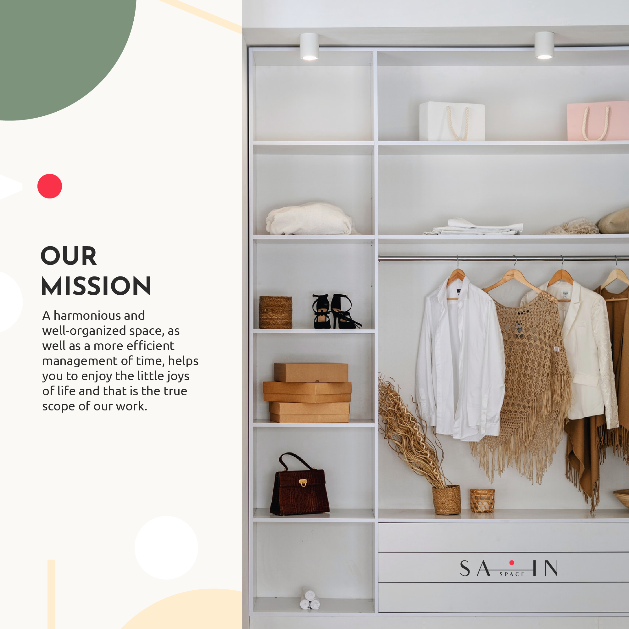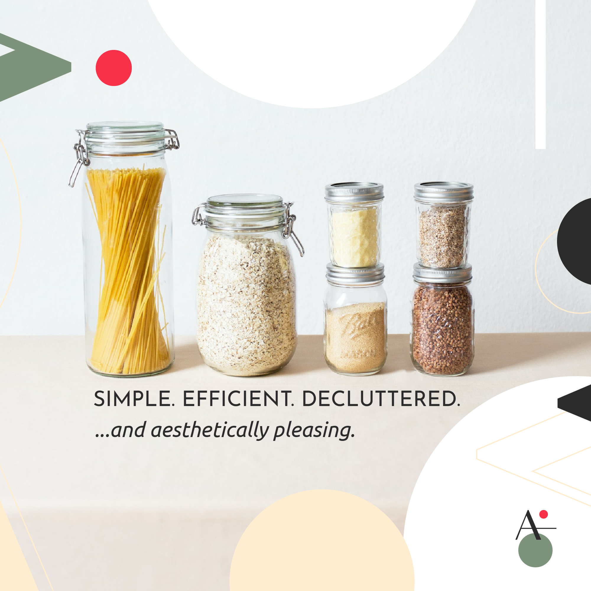
SIMPLE. EFFICIENT. MINIMALIST. At the very core of Sain.space is the desire to contribute to a better balanced life through professional organizing and decluttering services for homes and offices. A well organized space gives you more time to focus on the important things in life. That’s the final goal.
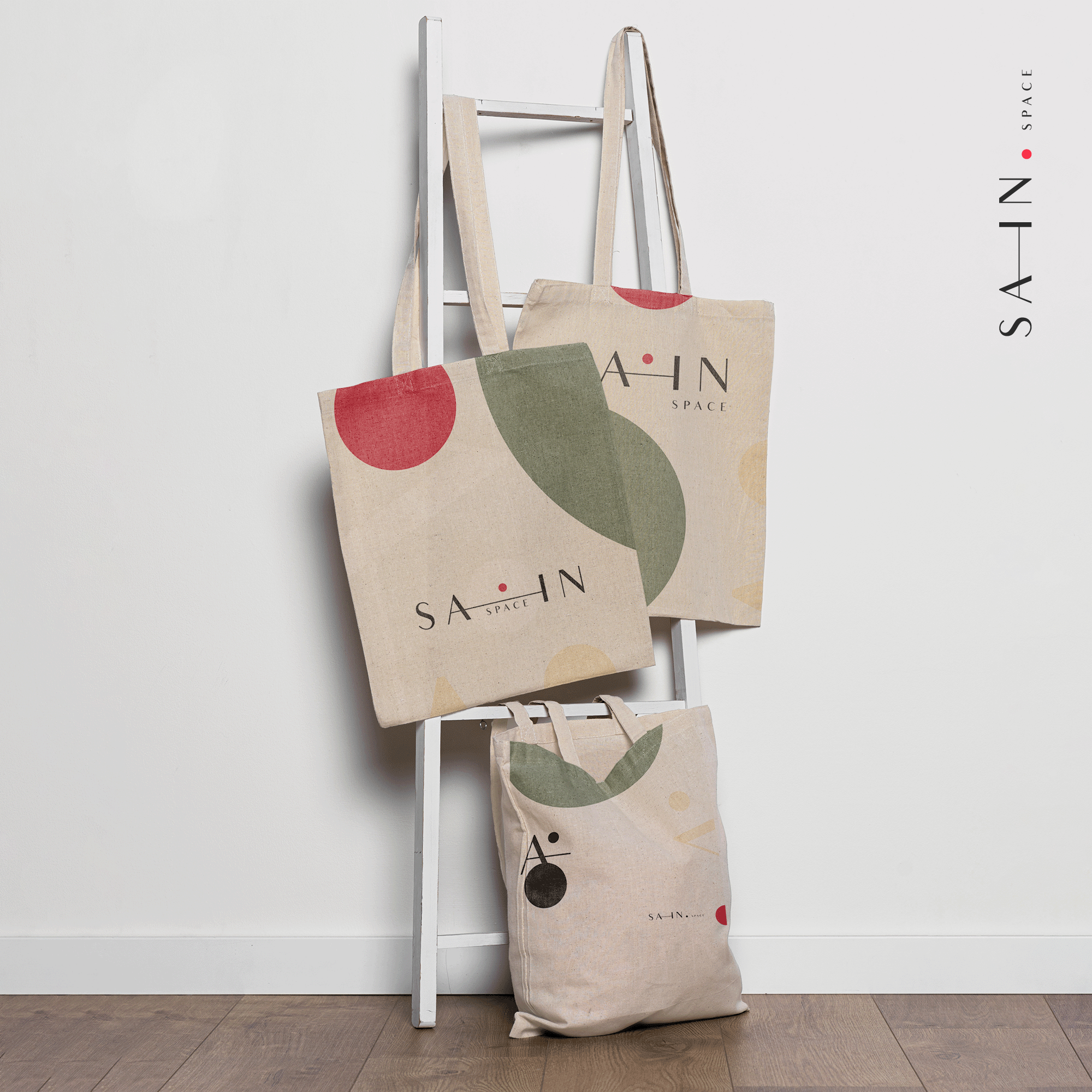
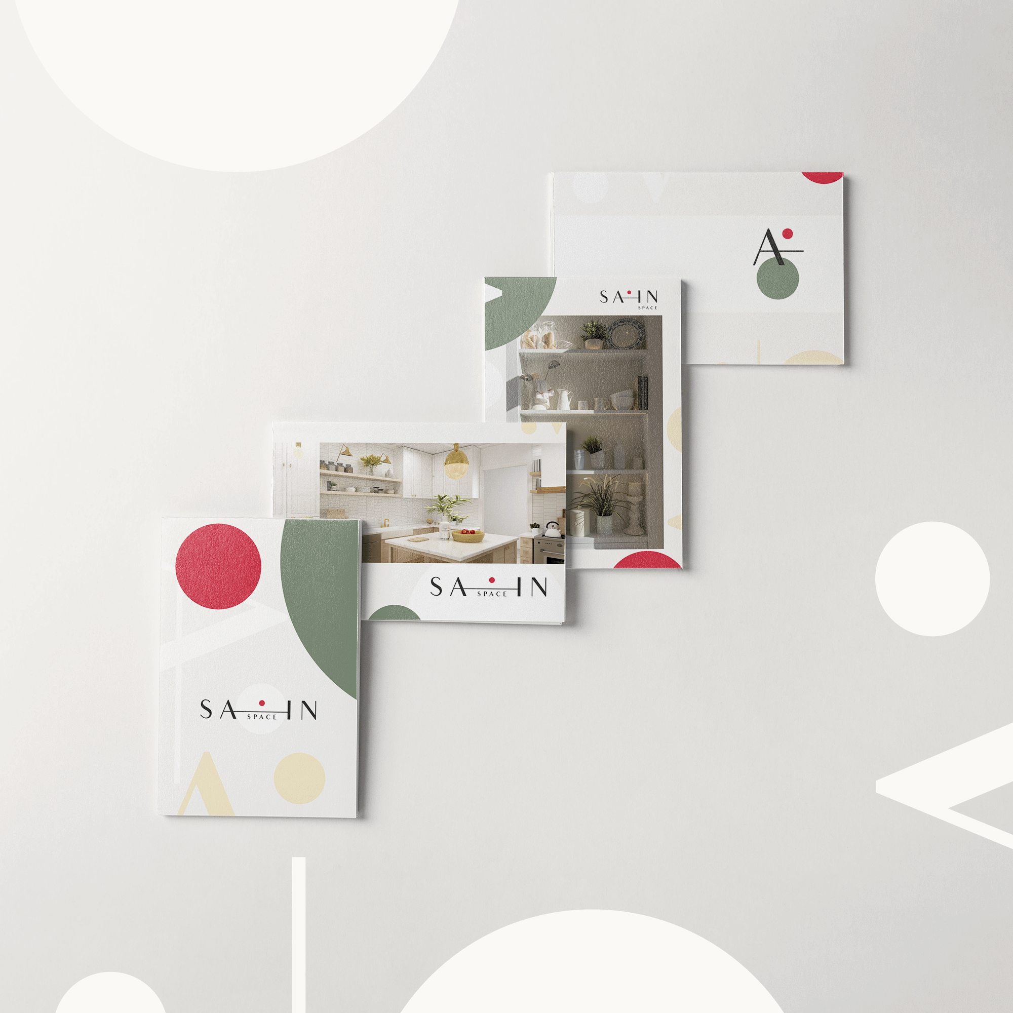
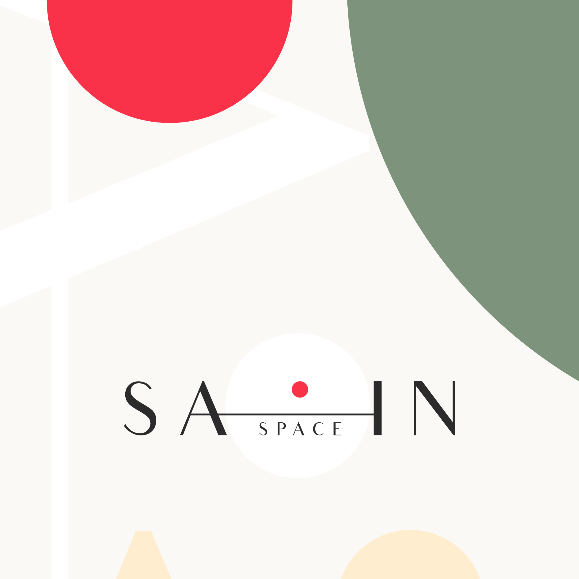
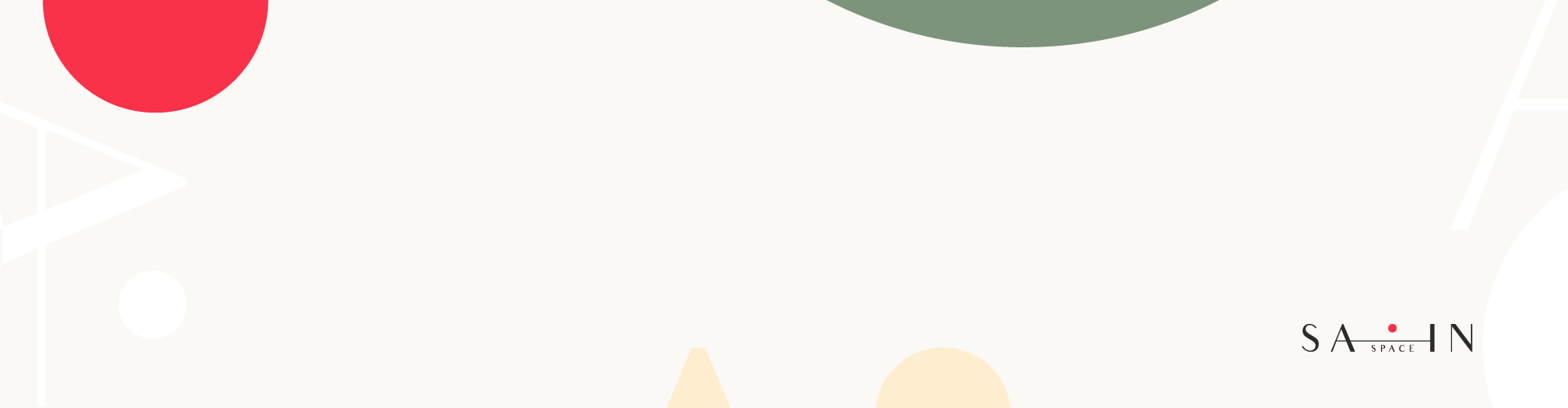
The visual identity of this project came to life inspired by simplicity, minimalism and space to breathe. Creating space creates harmony. From the geometric, clean sans serif typography to the nature inspired color palette, everything around Sain.space is balanced and carefully treated. The calming tones of beige, ivory and organic inspired sage nuance work as a cradle for the positive emotional effects of Sain.space‘s services. This is perfectly embracing the accent carmine red dot that reflects action: focus, detail and dedication. A solution oriented approach that simply works.
While society is shifting fast, time is perceived much more volatile and life is becoming more dinamic, finding balance and staying well organized really can be tough. Sain.space is sensitive to each individual set of needs, environmental sustainable, and efficient – understanding that: less is, indeed, more.