The project essence
Sain.Space believes in the poetic power of order—a life thoughtfully curated, a home that breathes joy and calm. The brief was to build a brand that doesn’t just look tidy, but feels transformative, embracing simplicity while never losing the pulse of individuality.
THE CREATIVE APPROACH
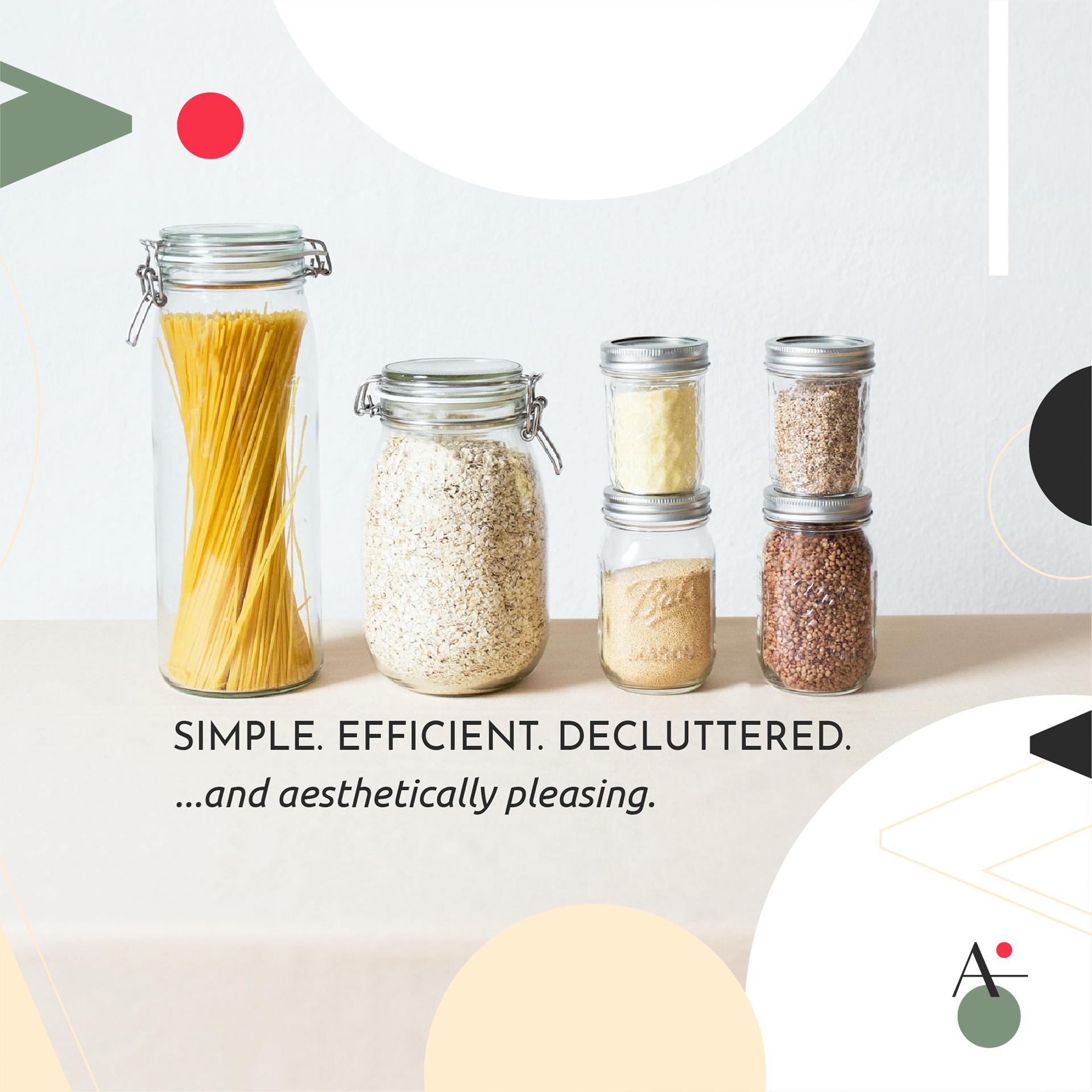
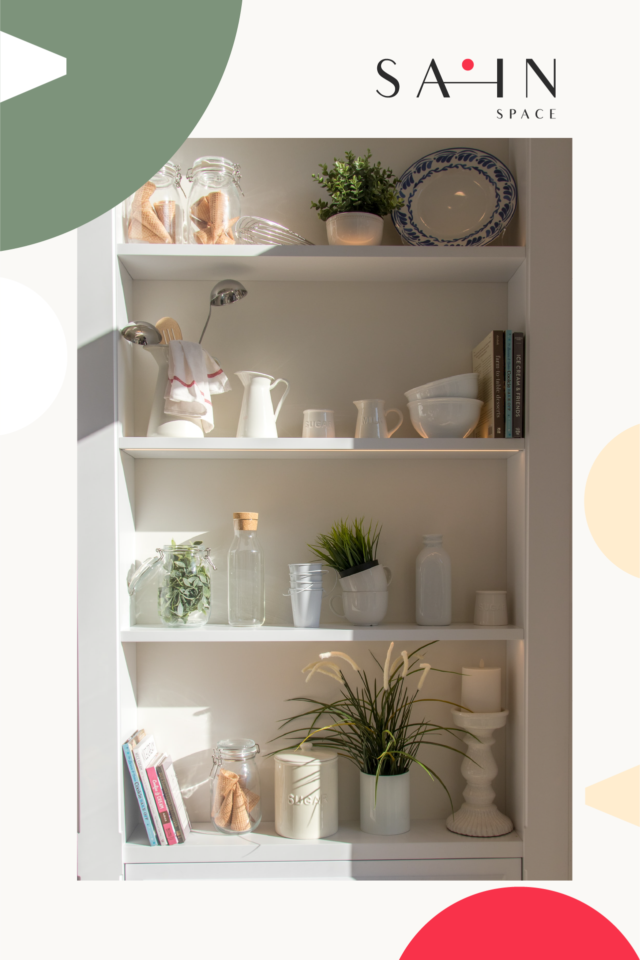
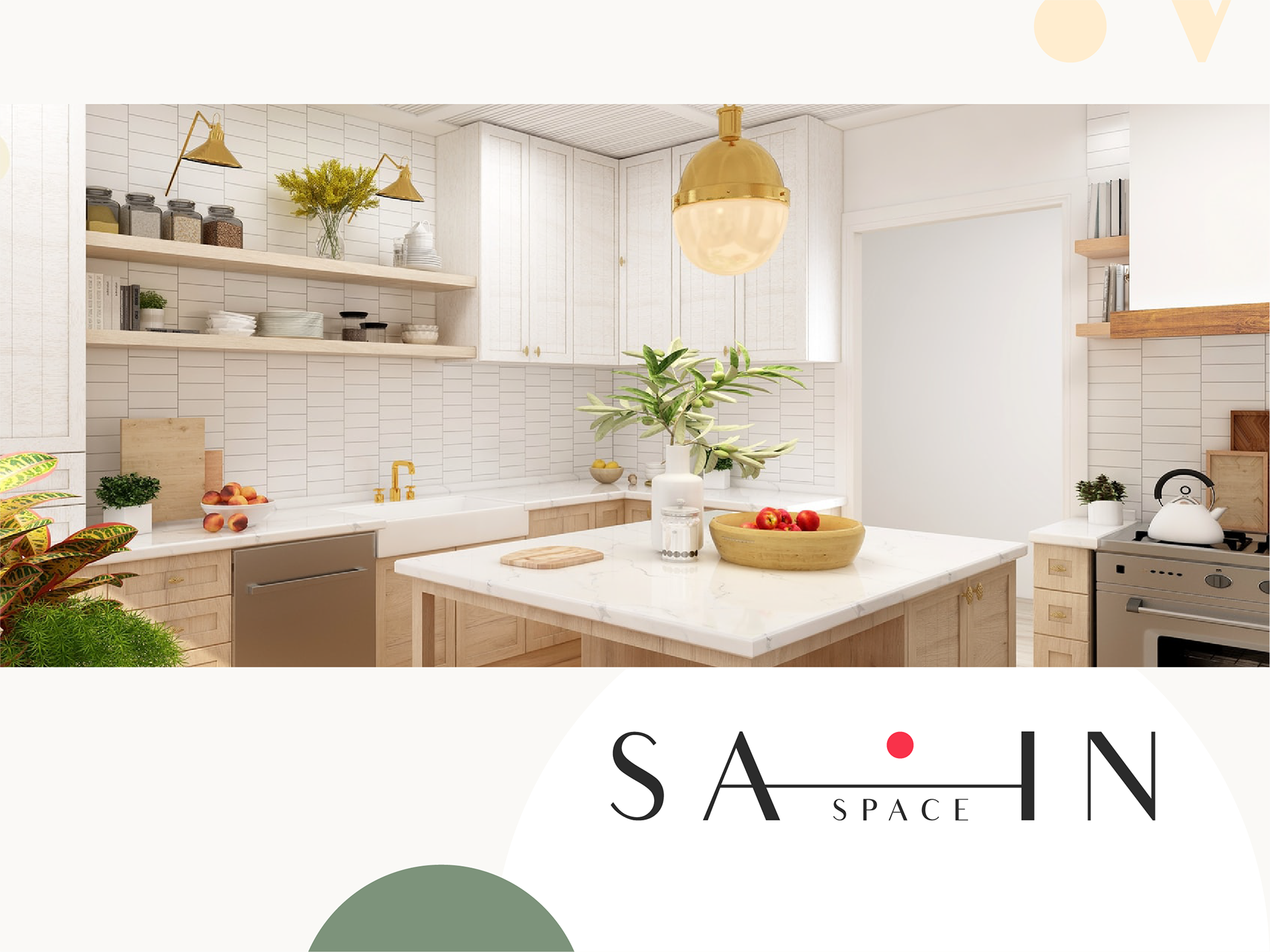
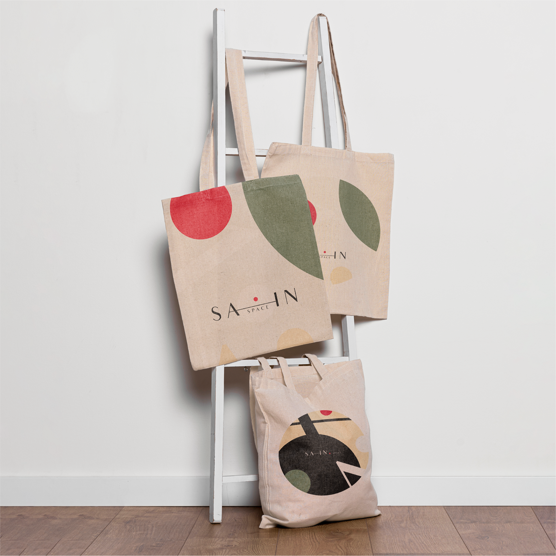
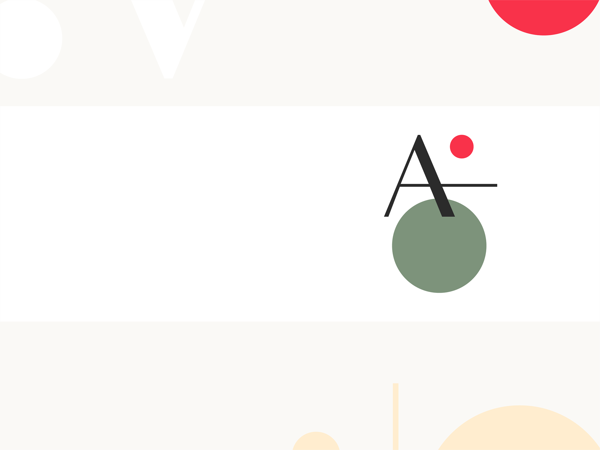
I leaned into graphic purity: geometric circles, squares, and straight lines paired with an airy, humanistic font. The colors are a hug—soft beige and ivory set the tone, together with sage green for serenity and natural roots, anchored by a lively carmine red accent that stands for action, focus, and loving detail.
The Creative Harvest
Every detail resonates with those who crave order and balance—a minimalist identity with a big heart, inviting clients to inhale, exhale, and rediscover the little pleasures life has to offer. Sain.Space’s identity is not just a look, it’s a feeling—a celebration of harmony and the beauty of less.