The project essence
Hercules Marathon is a legend in motion—the pulse of the Cerna Mountains every wild October. The challenge: update the visual identity after a decade, without losing the spirit, friendships, and heritage that runners hold dear.
THE CREATIVE APPROACH
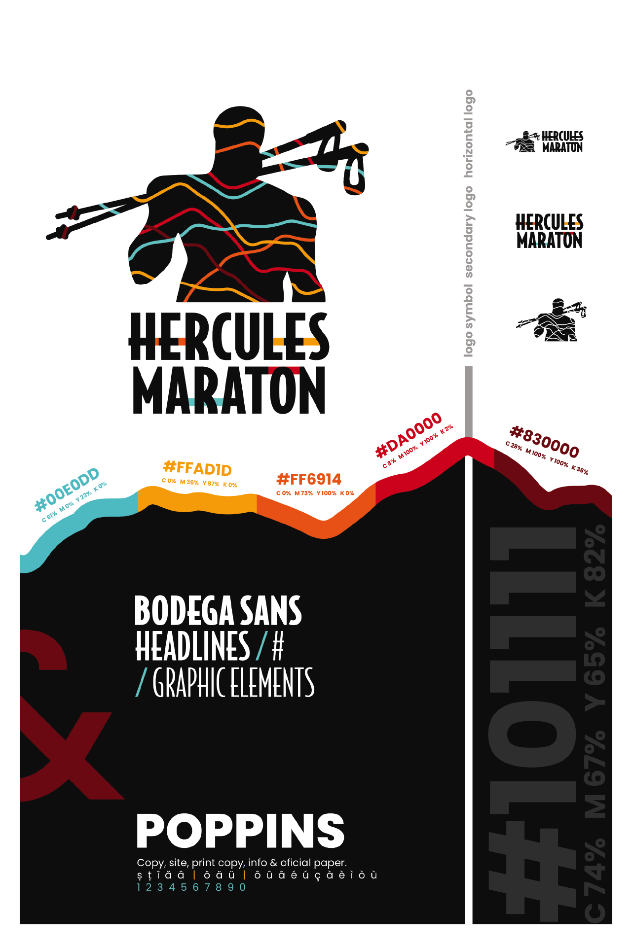
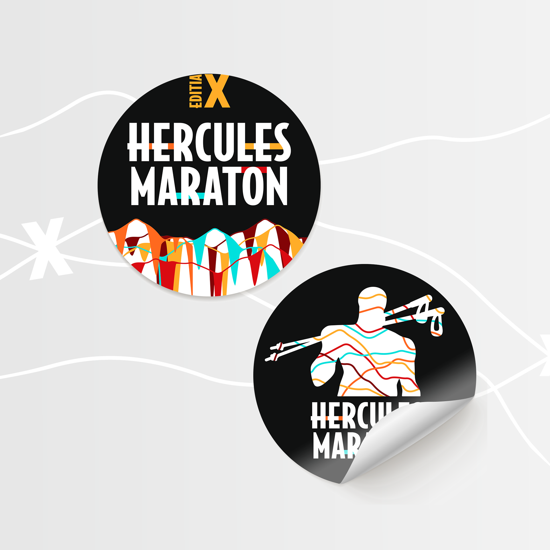
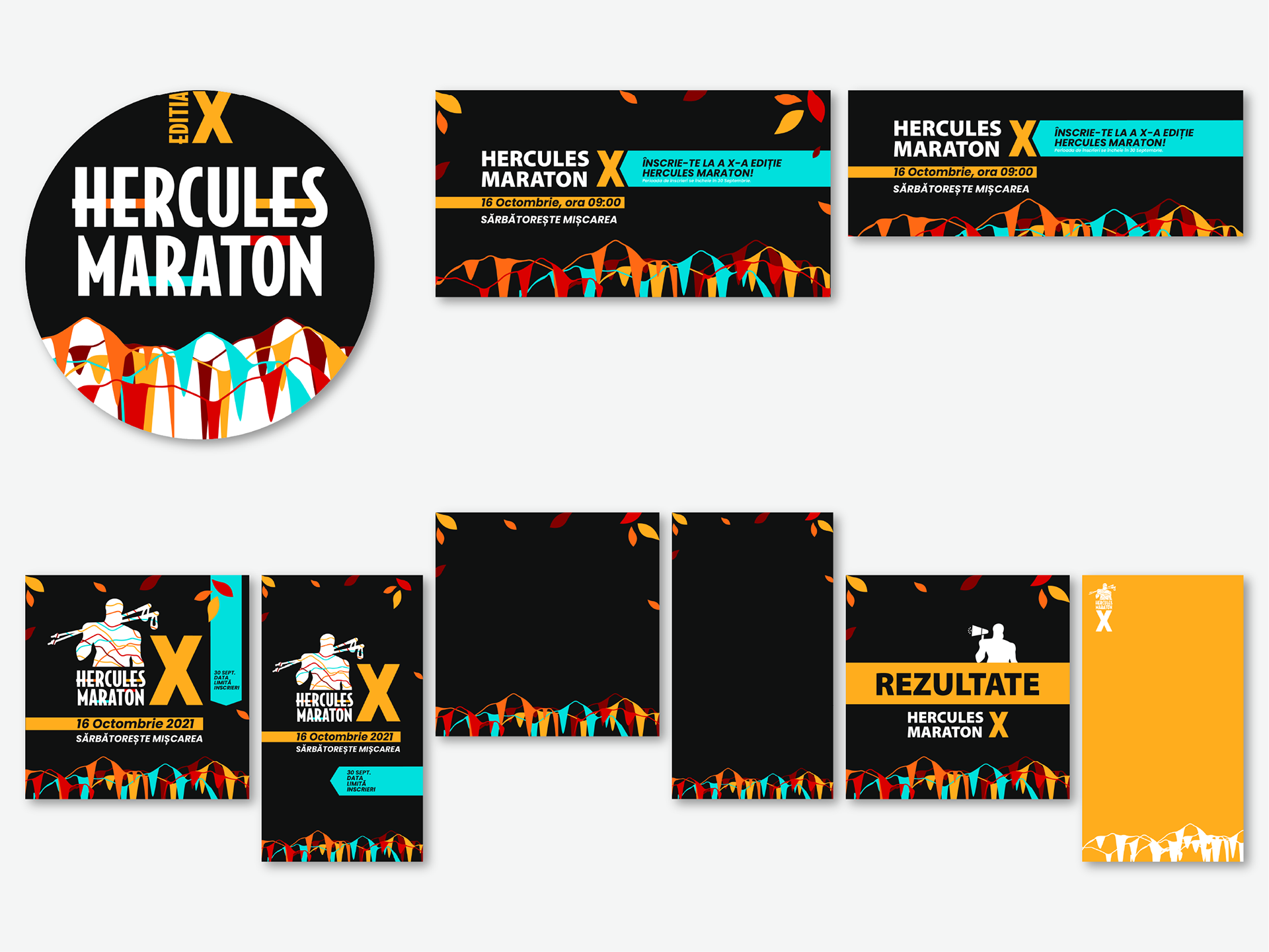
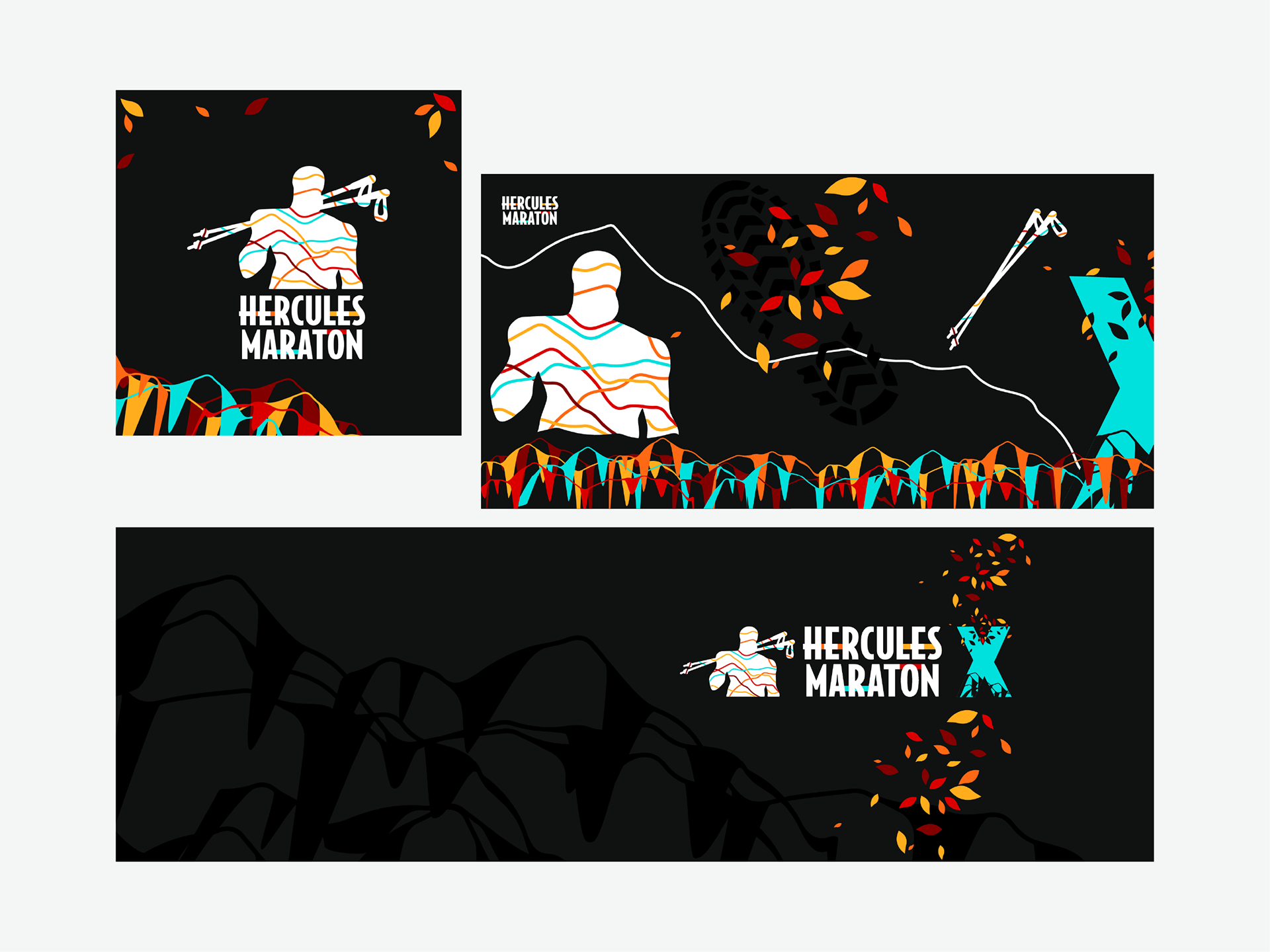
I built the logo around three imagery pillars: Hercules (history and courage), autumn (season and color), and trail run (adventure and movement). The colors come alive straight from nature—jet black for the forest, electric yellow for sunlit paths, fiery reds and oranges for autumn leaves, and cyan blues for mountain rivers and clear skies. Each year invites new vibes: the palette shifts subtly for the edition, making the identity feel alive and grown—just like the race.
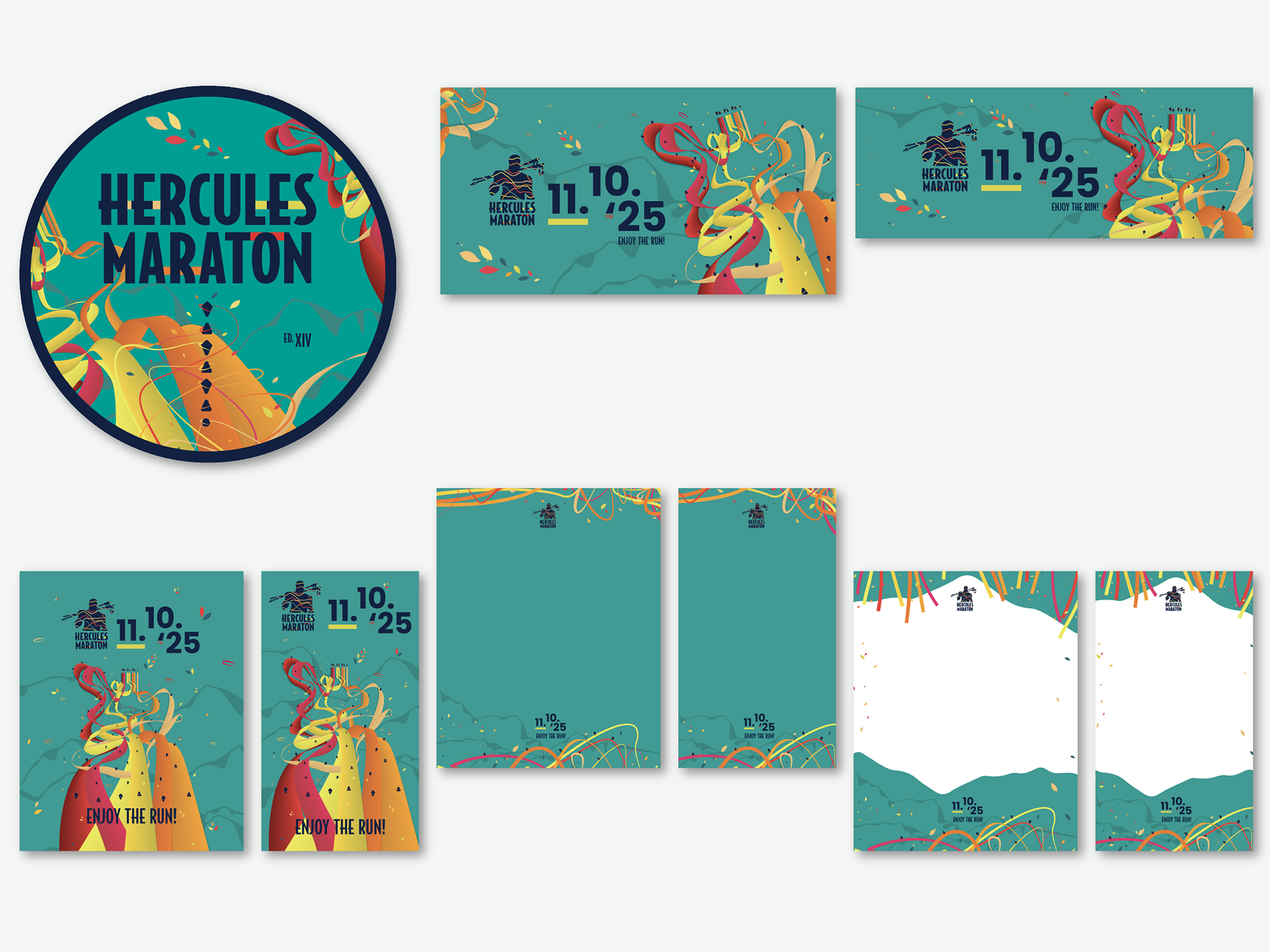
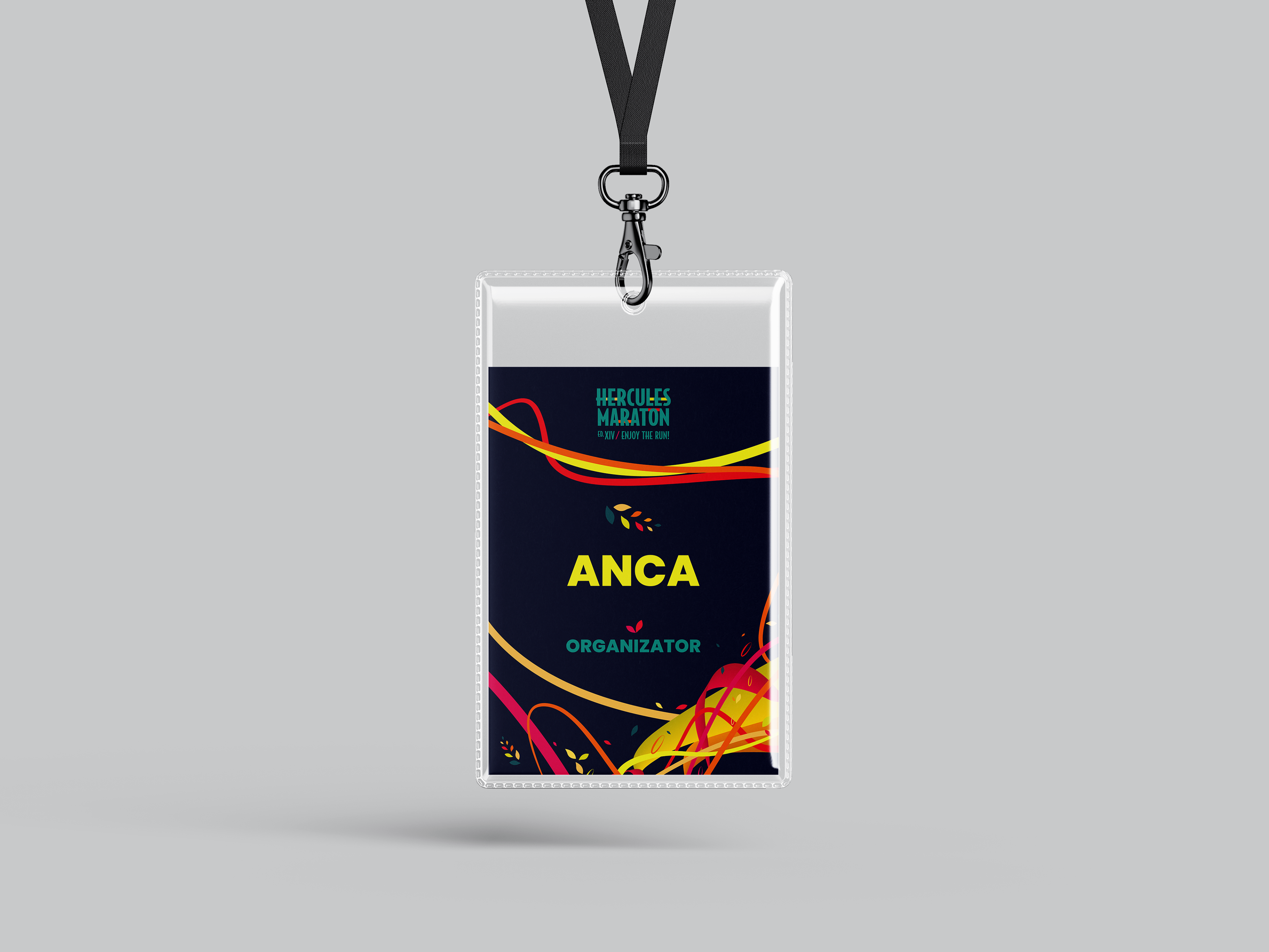
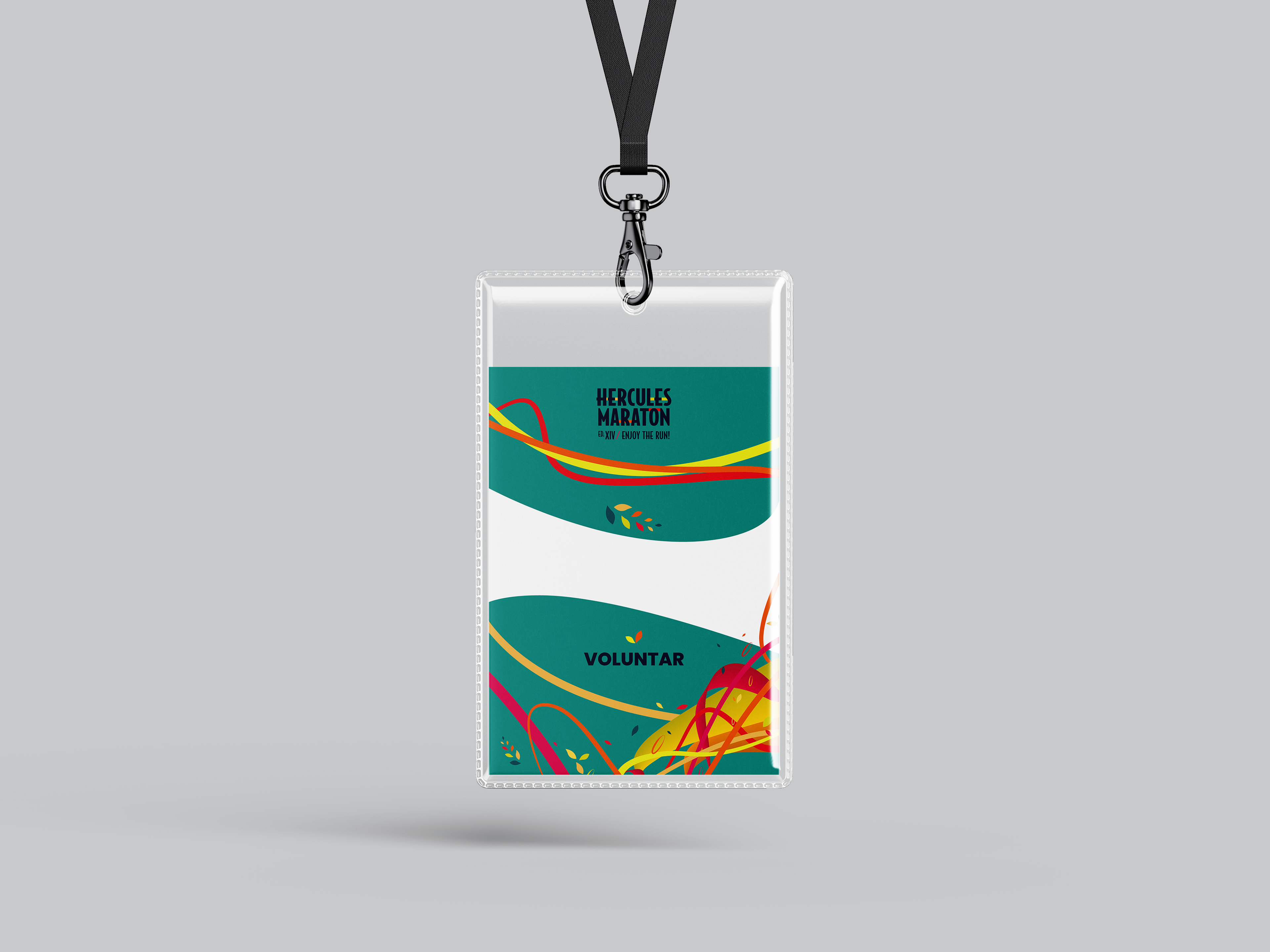
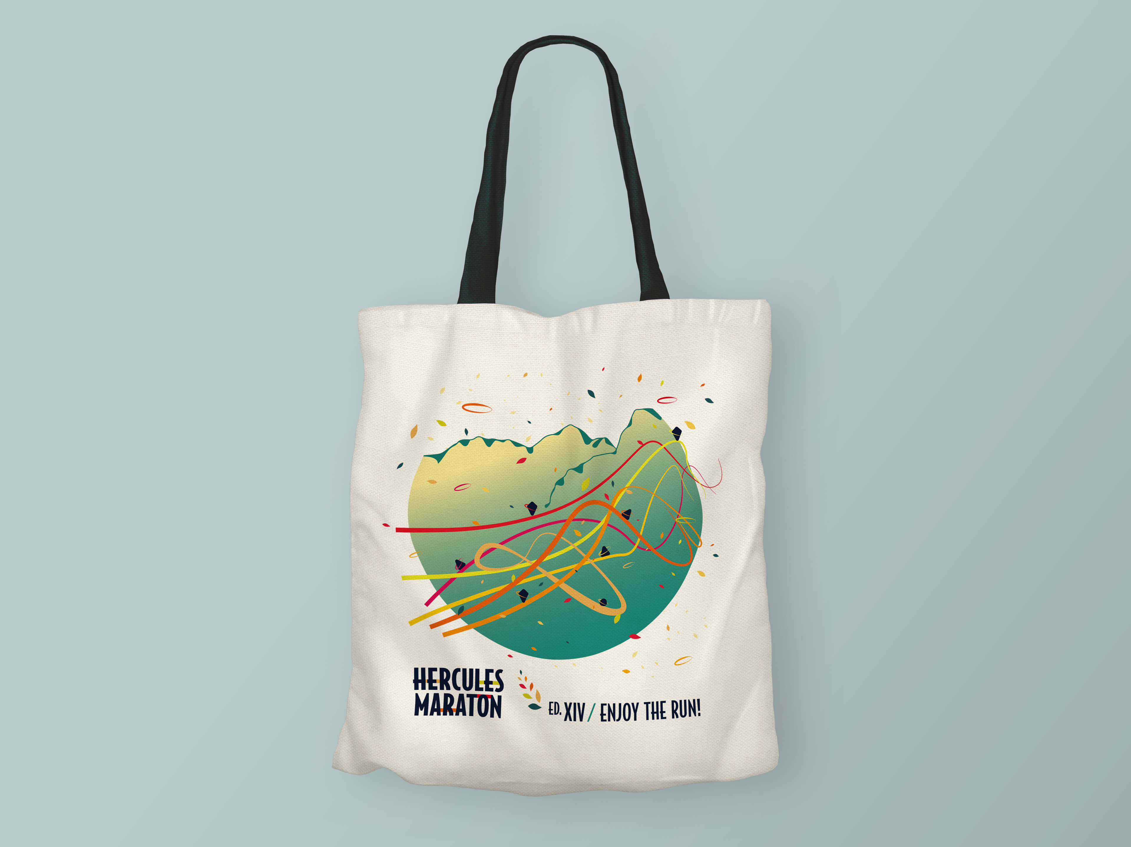
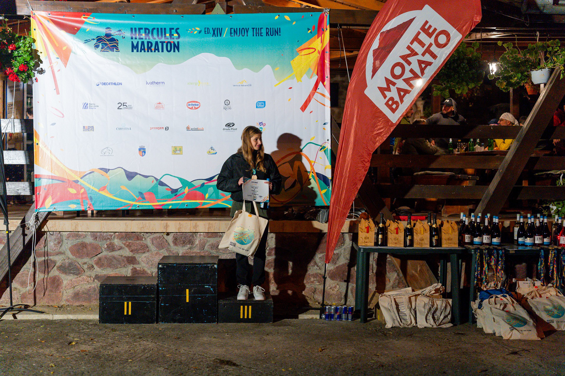
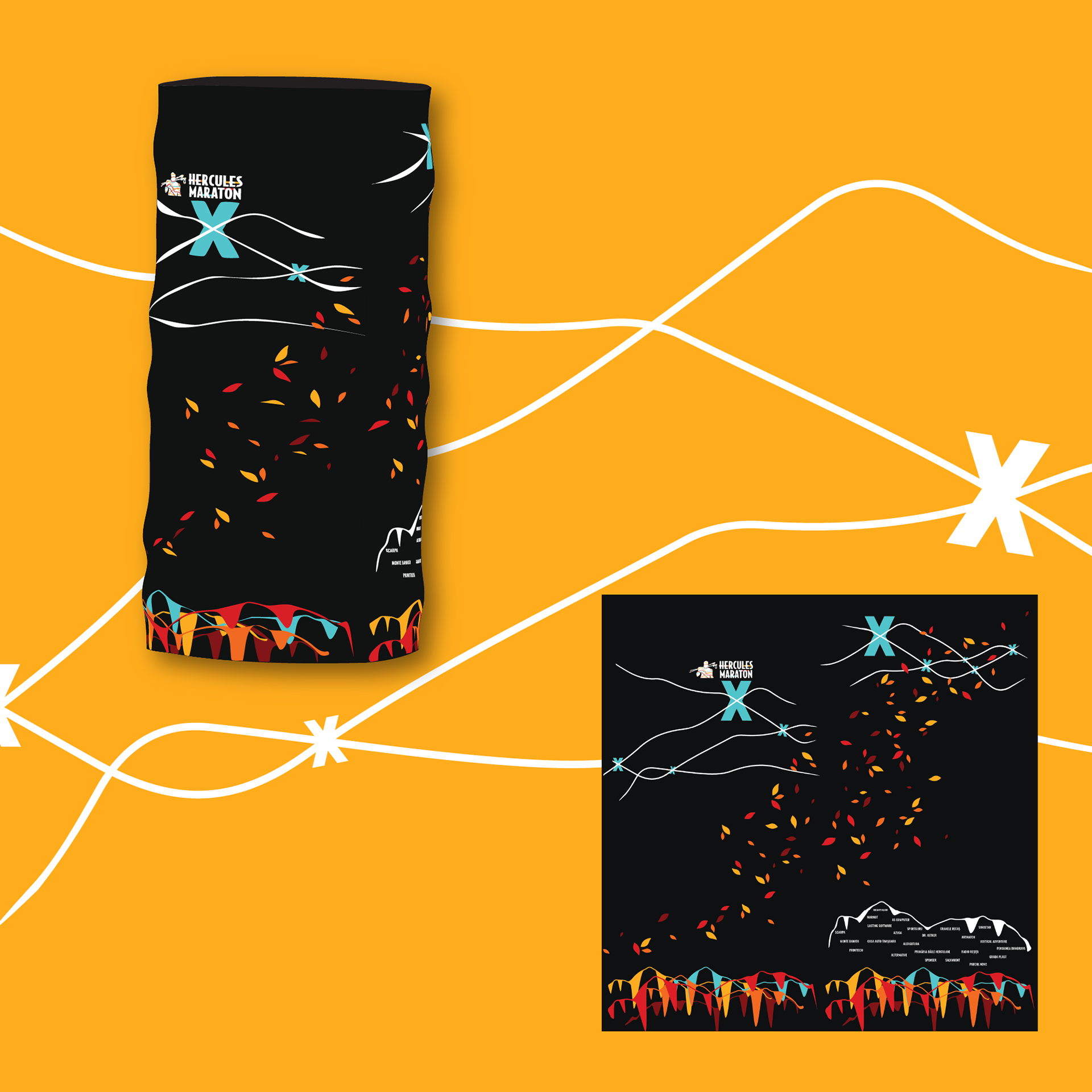
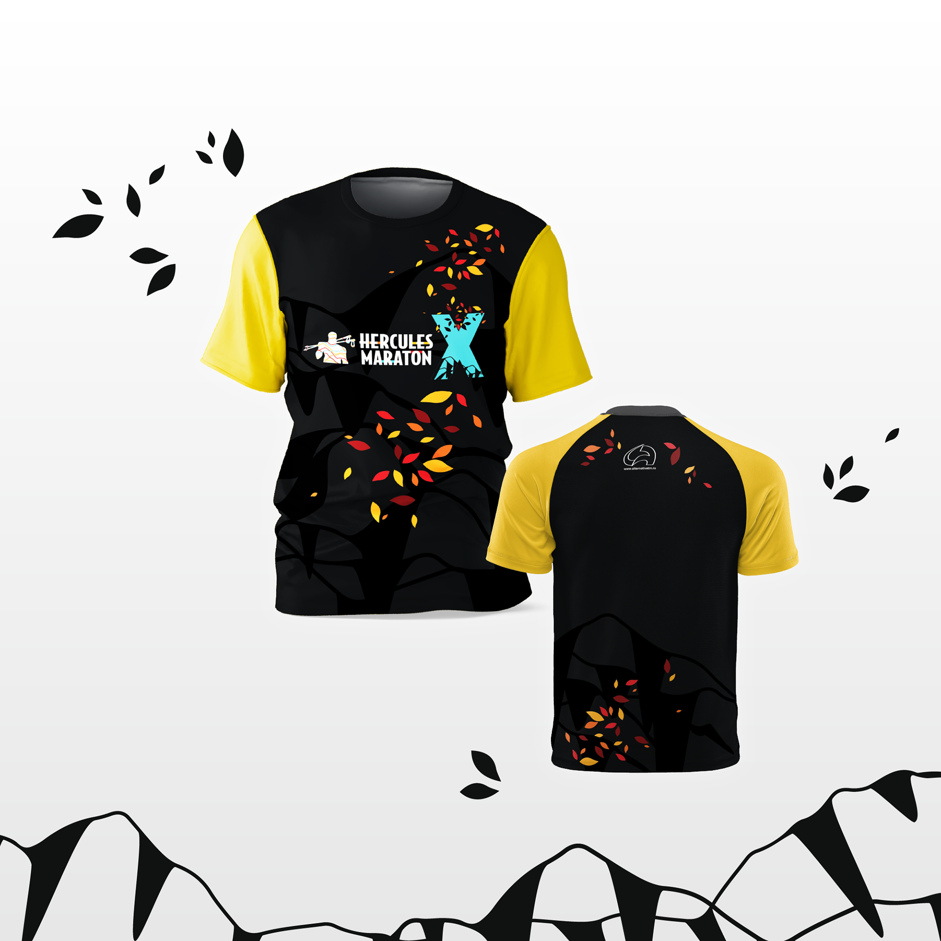
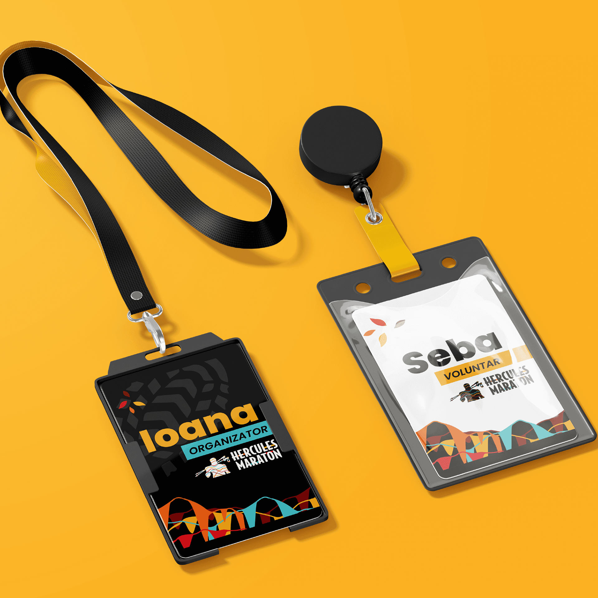
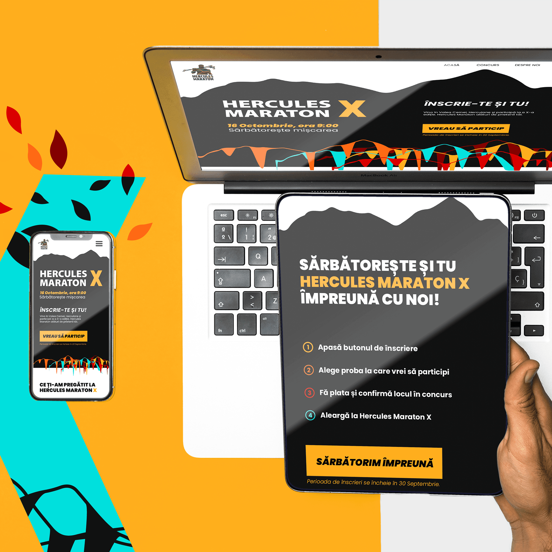
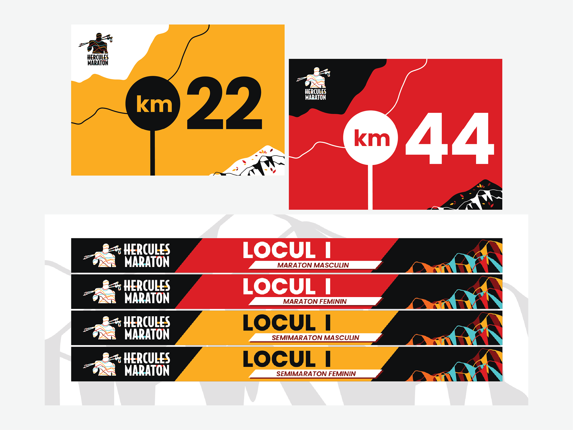
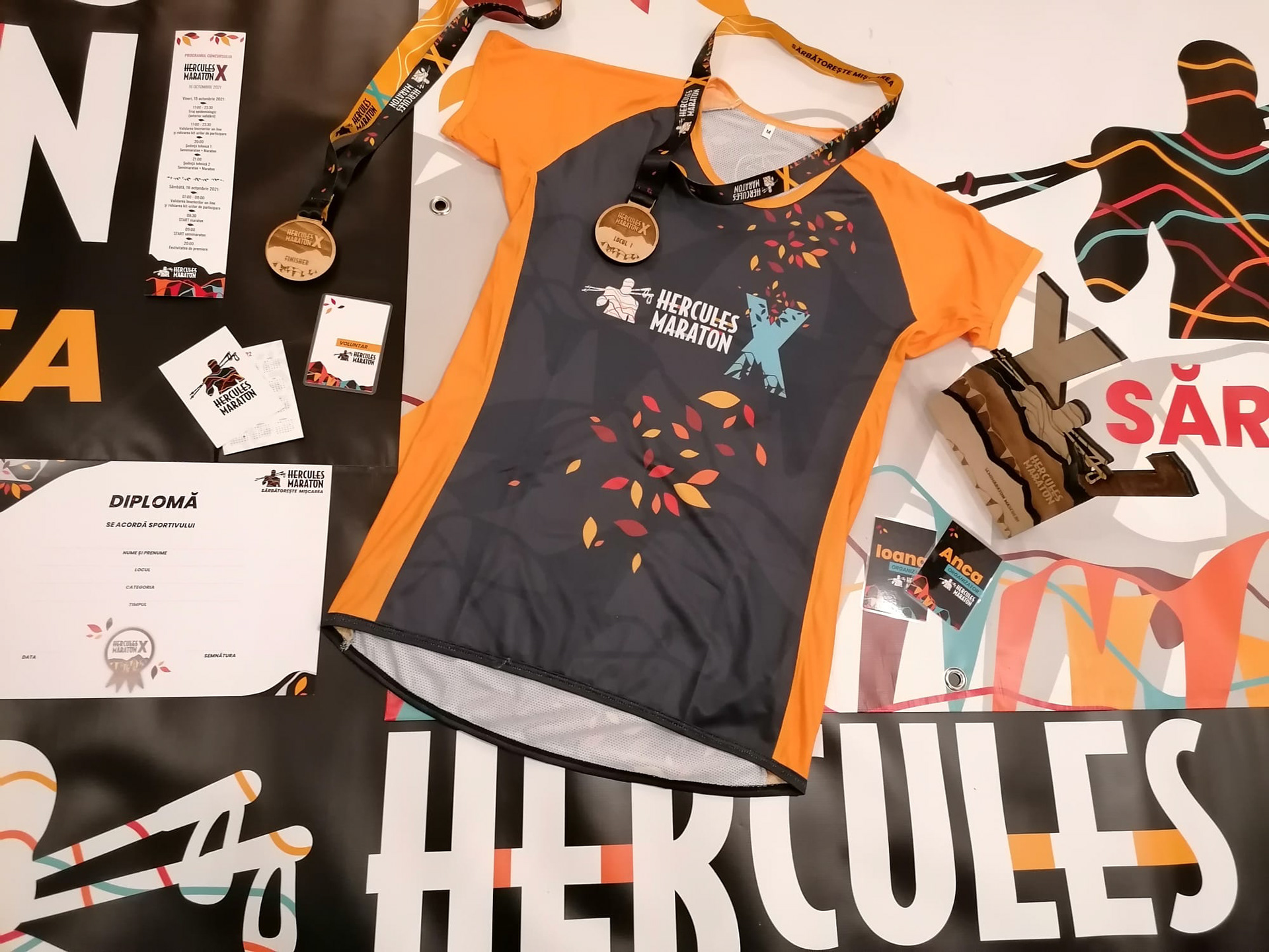
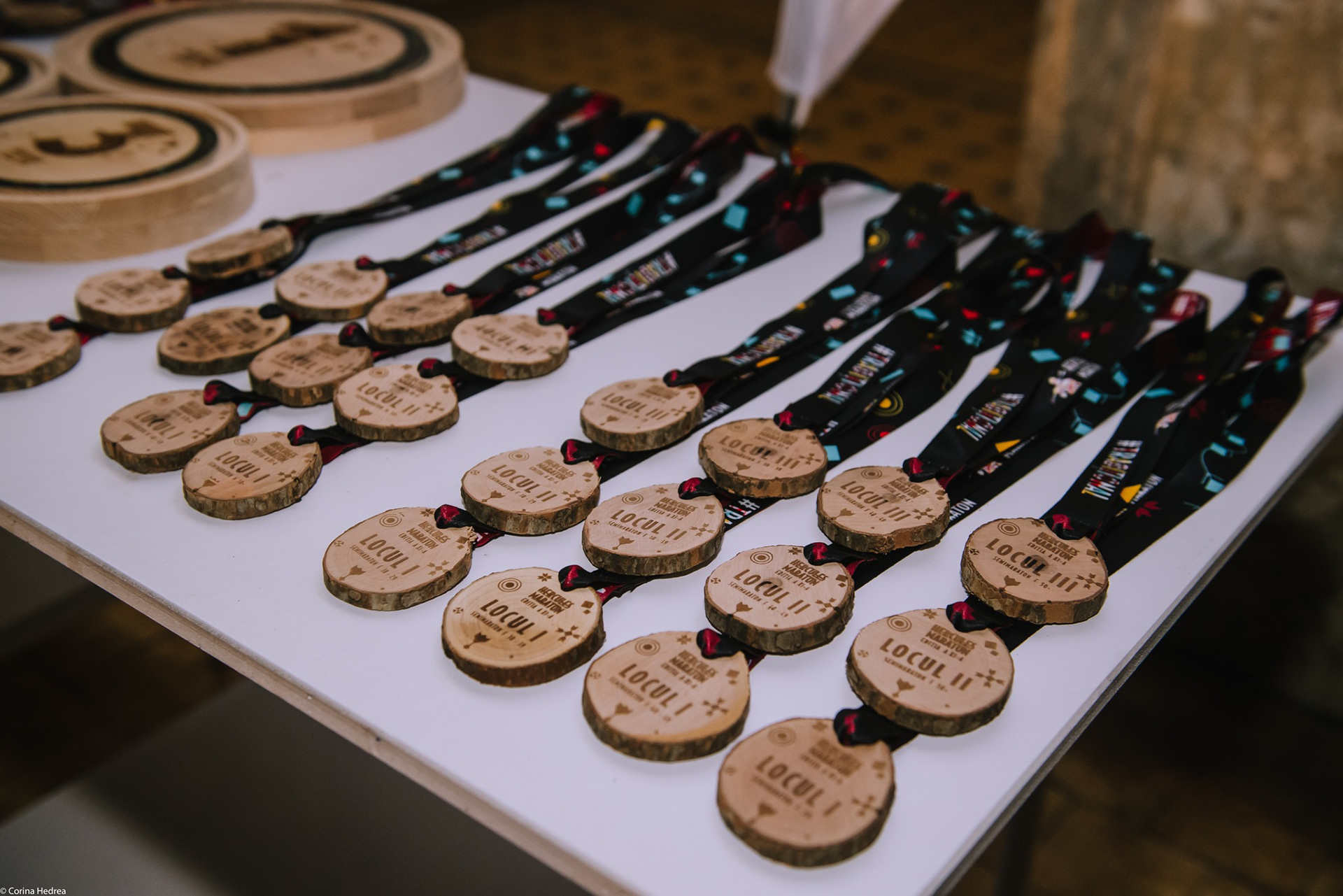
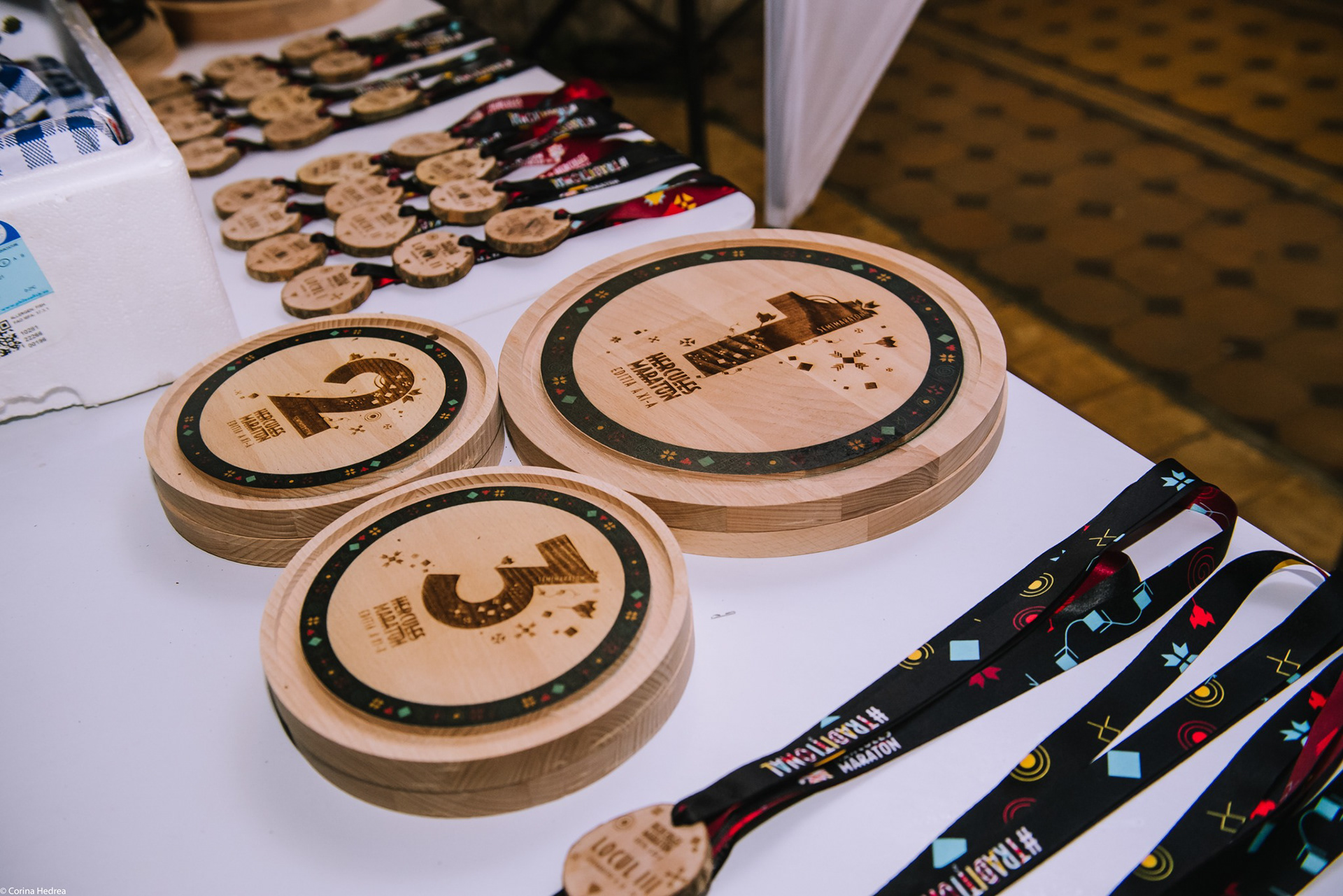
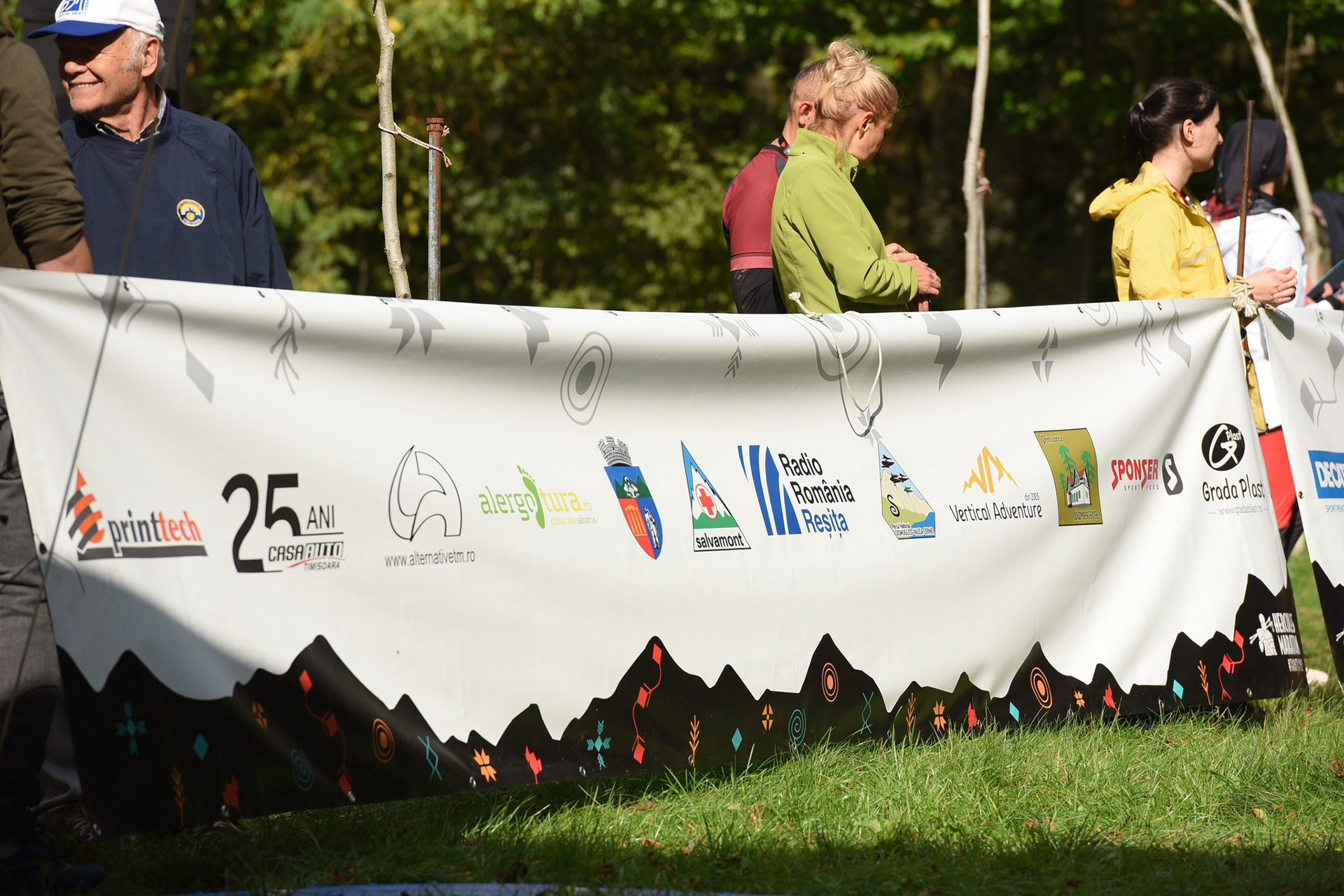
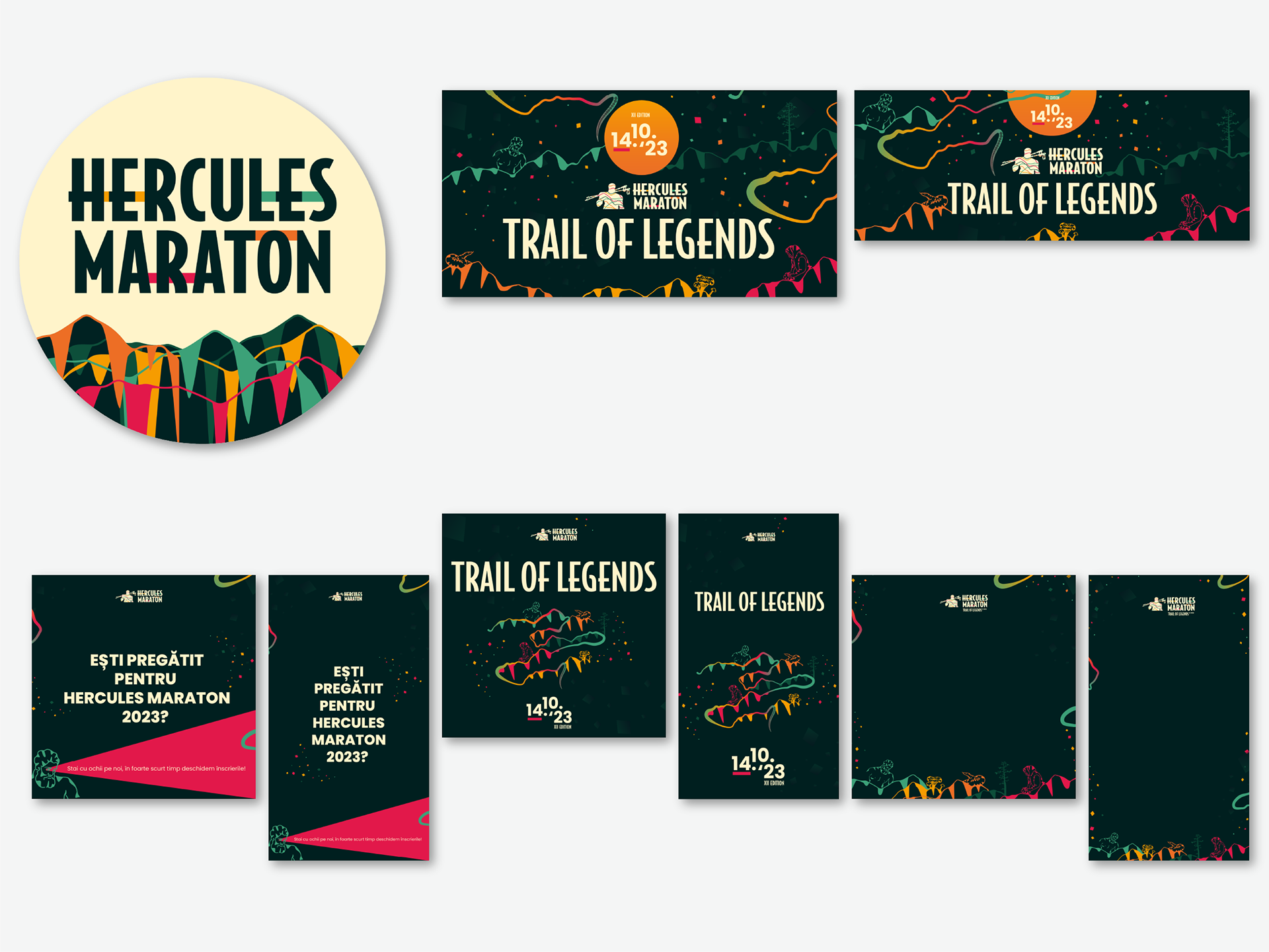
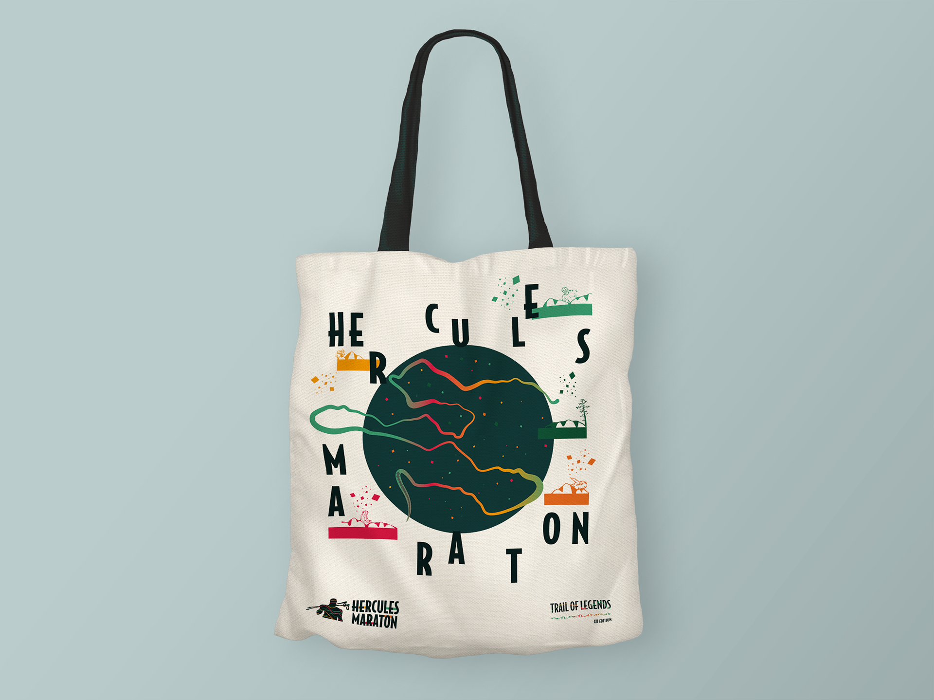
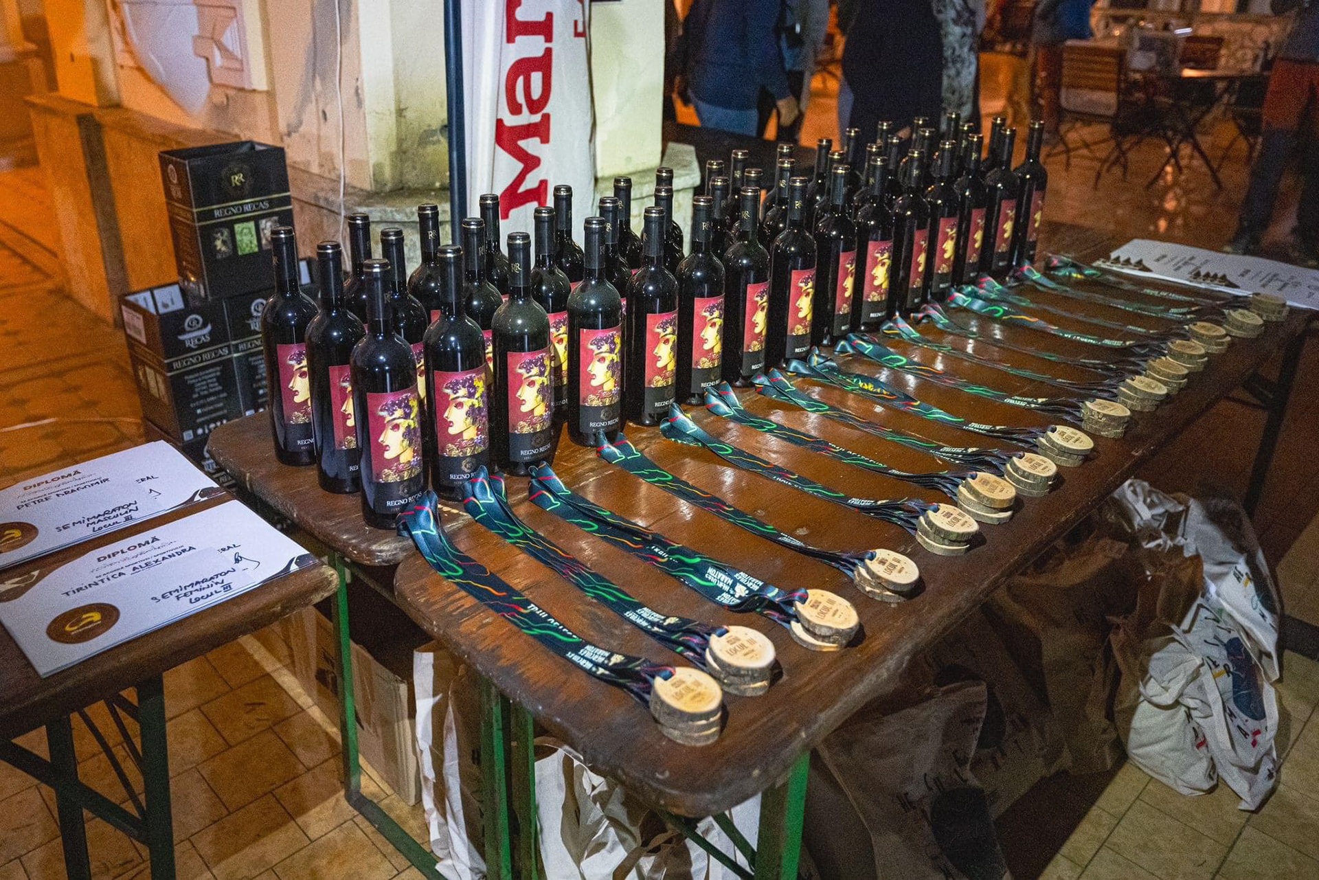
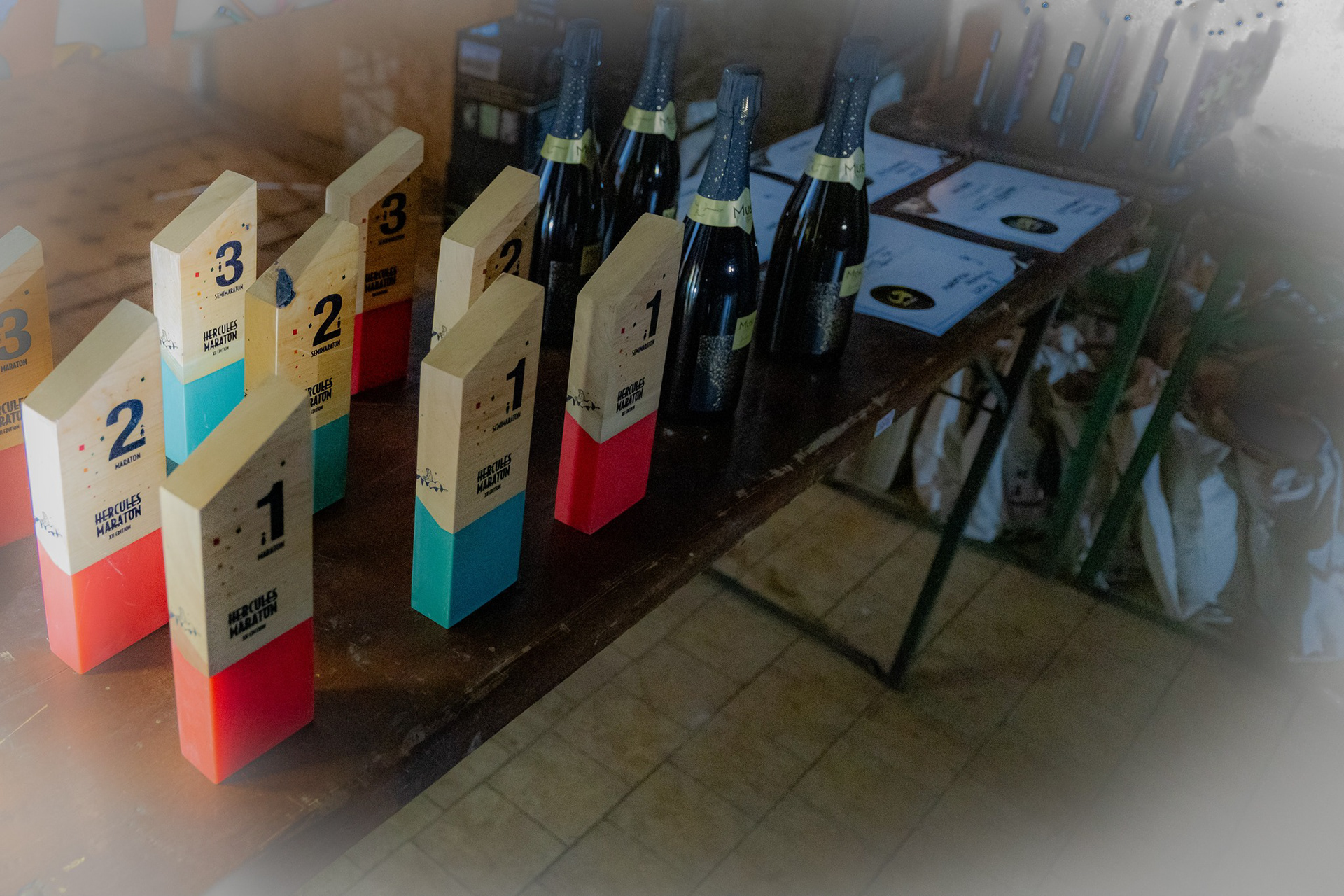
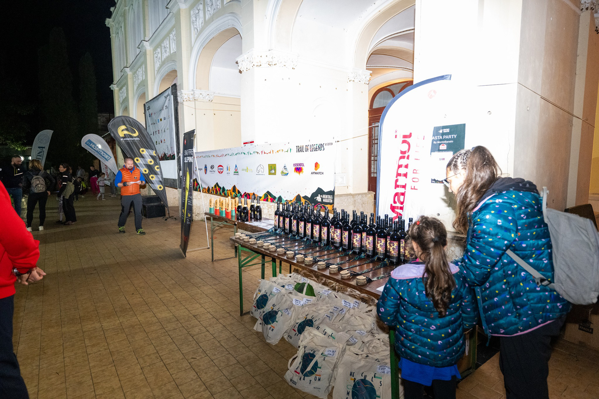
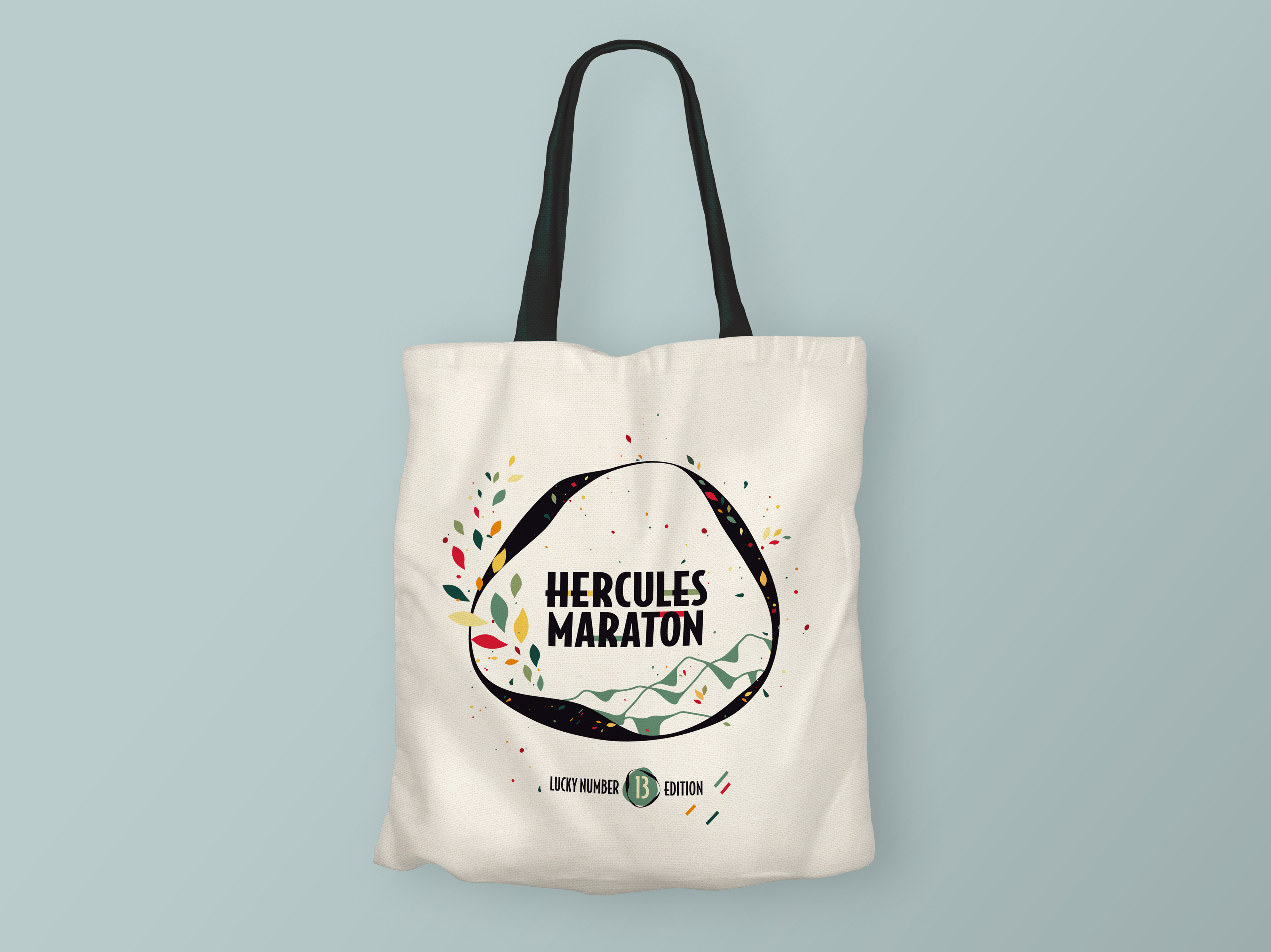
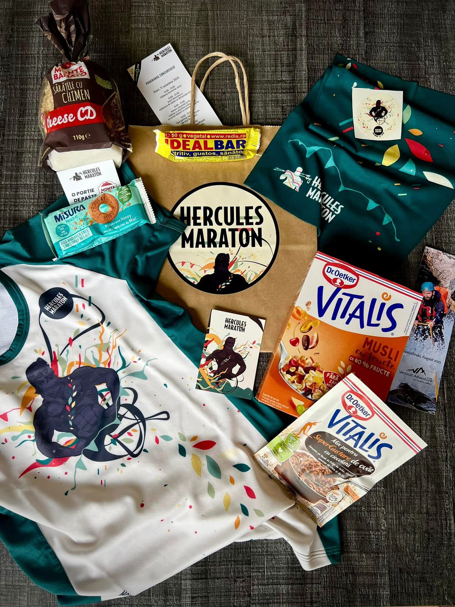
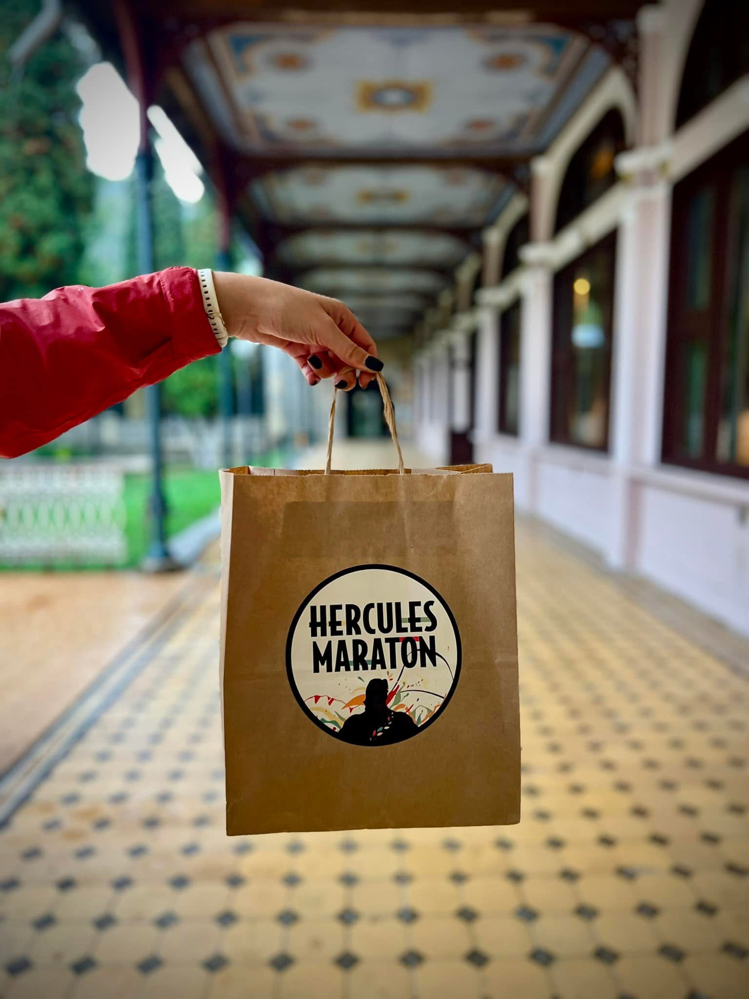
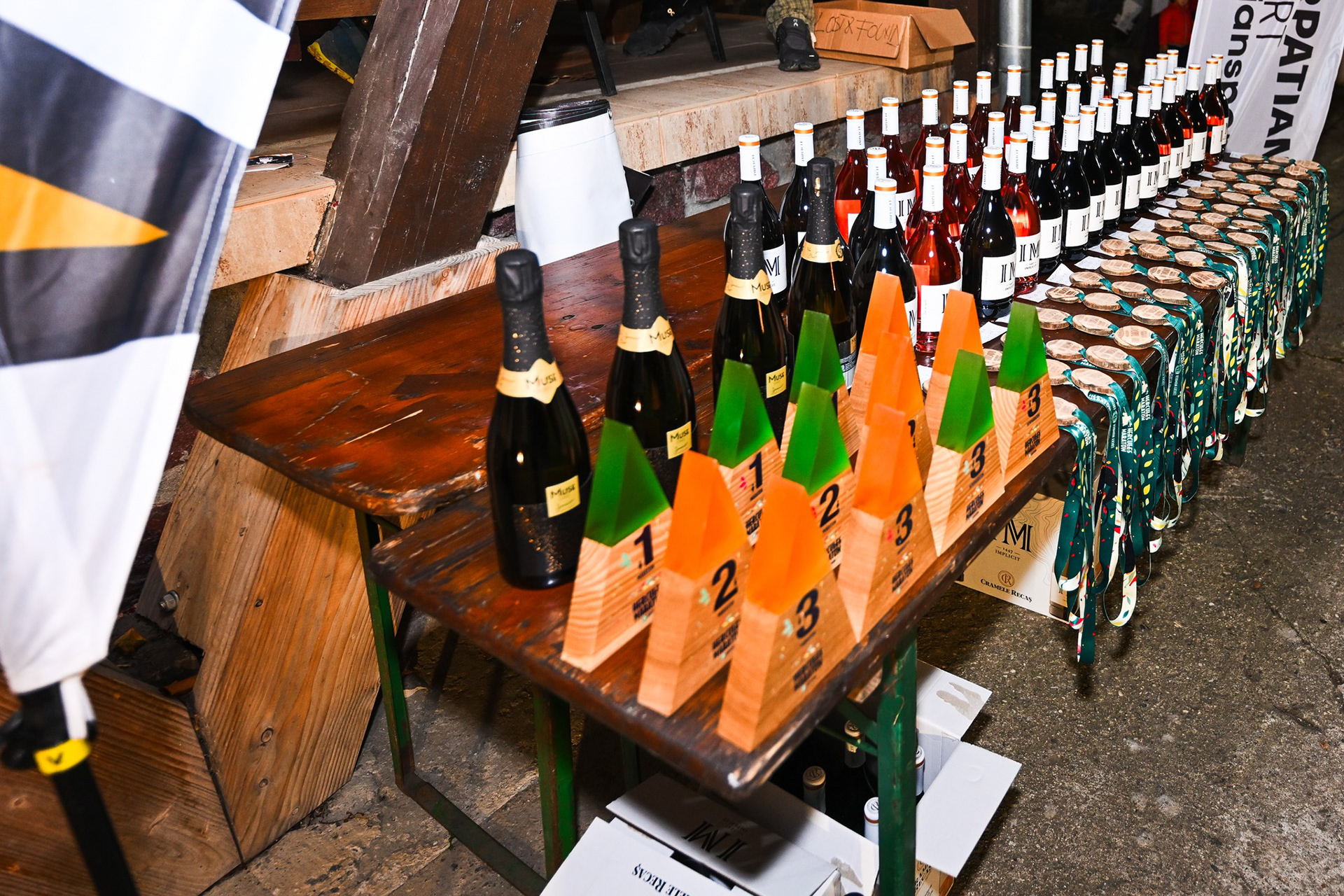
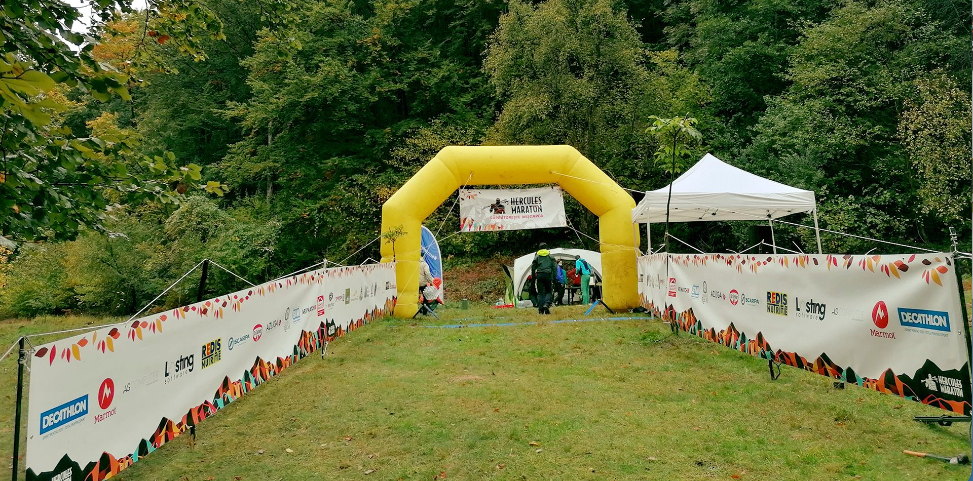
The process included mapping real trail profiles onto Hercules’ silhouette, designing medals and trophies that capture his spirit, and creating a digital landscape where warmth and story pull people in. Deliverables ranged from hero banners and event signage to web design and merch (t-shirts, badges, ribbons).
The process included mapping real trail profiles onto Hercules’ silhouette, designing medals and trophies that capture his spirit, and creating a digital landscape where warmth and story pull people in. Deliverables ranged from hero banners and event signage to web design and merch (t-shirts, badges, ribbons).
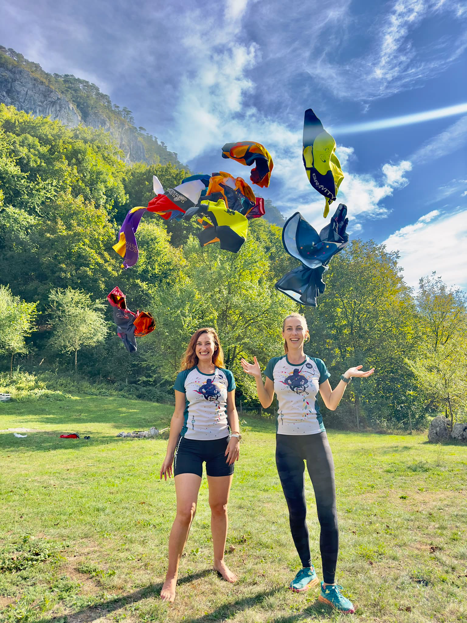
The Creative Harvest
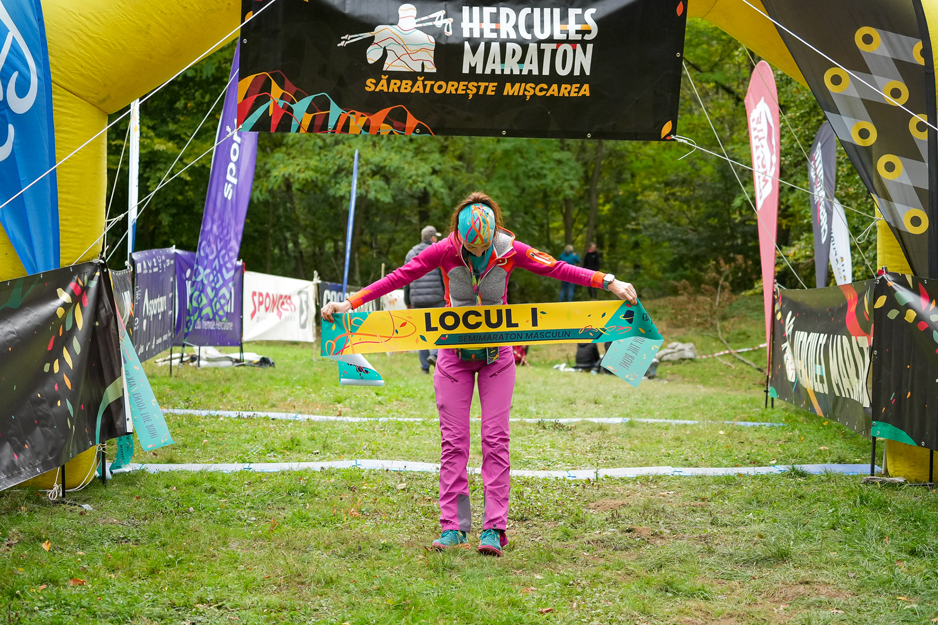
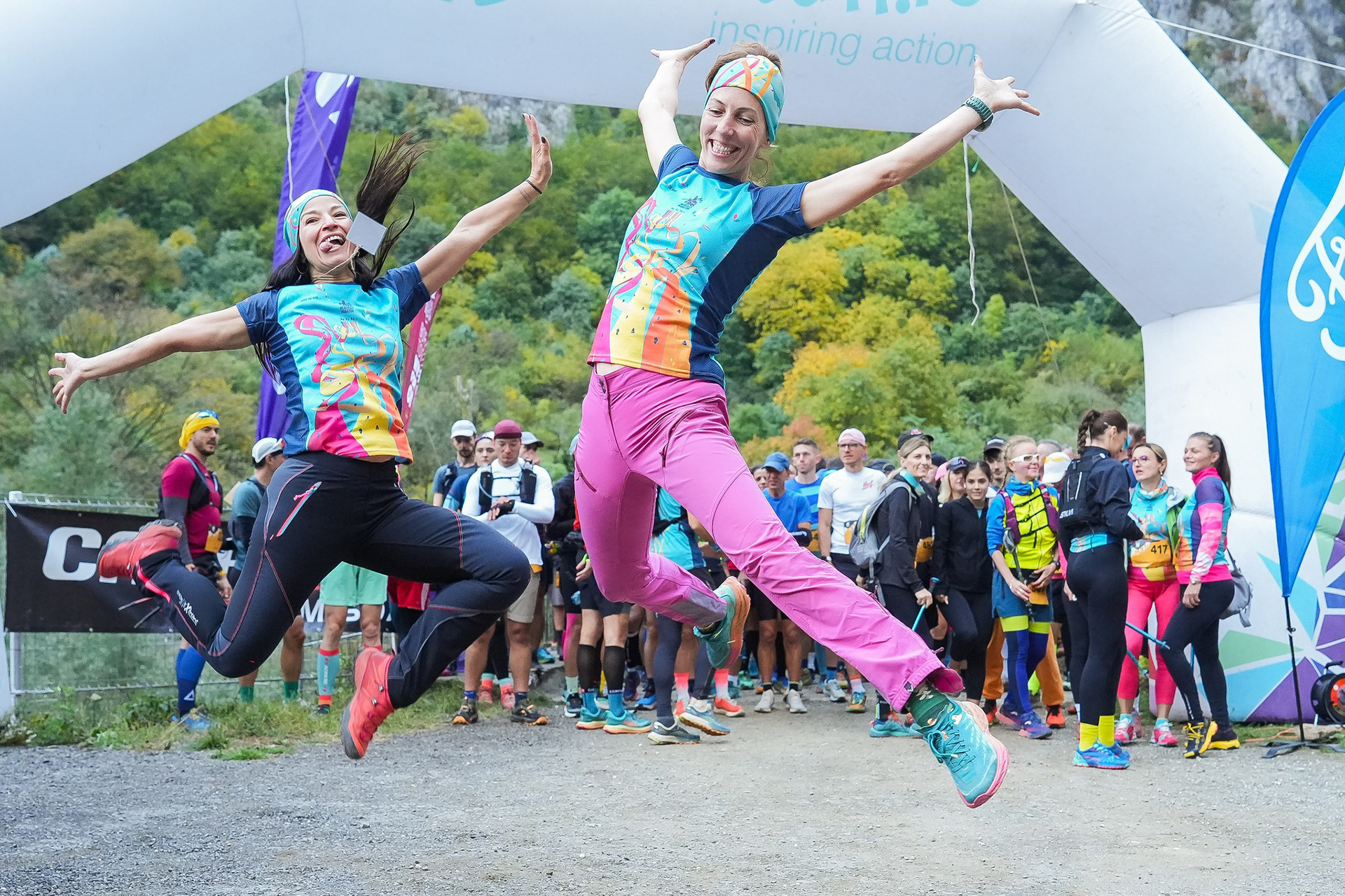
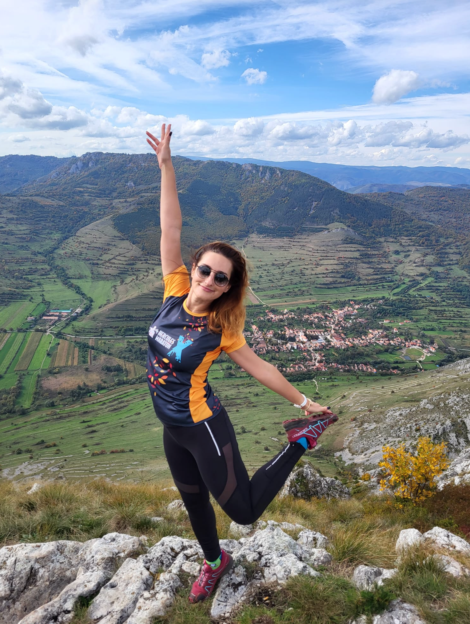
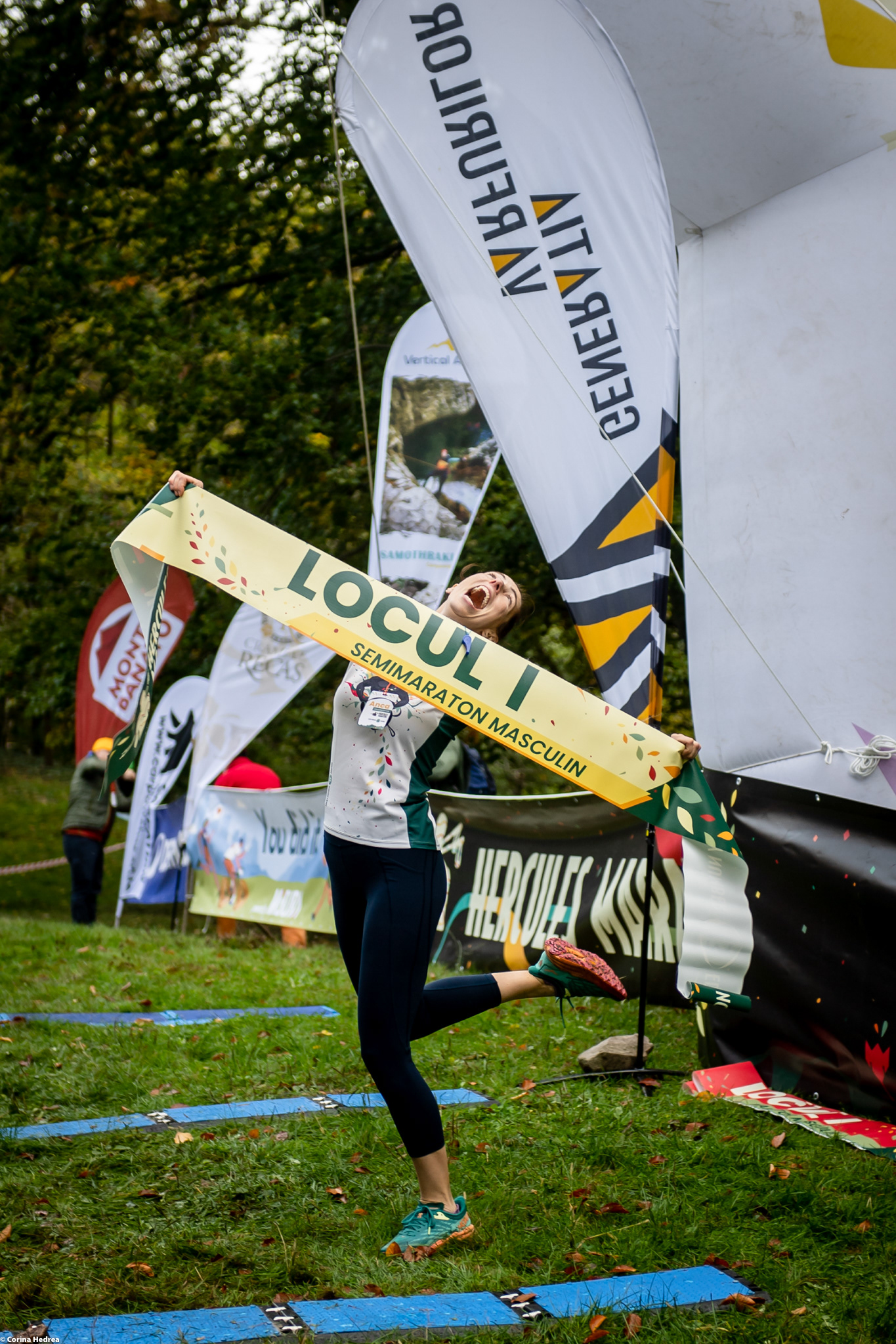
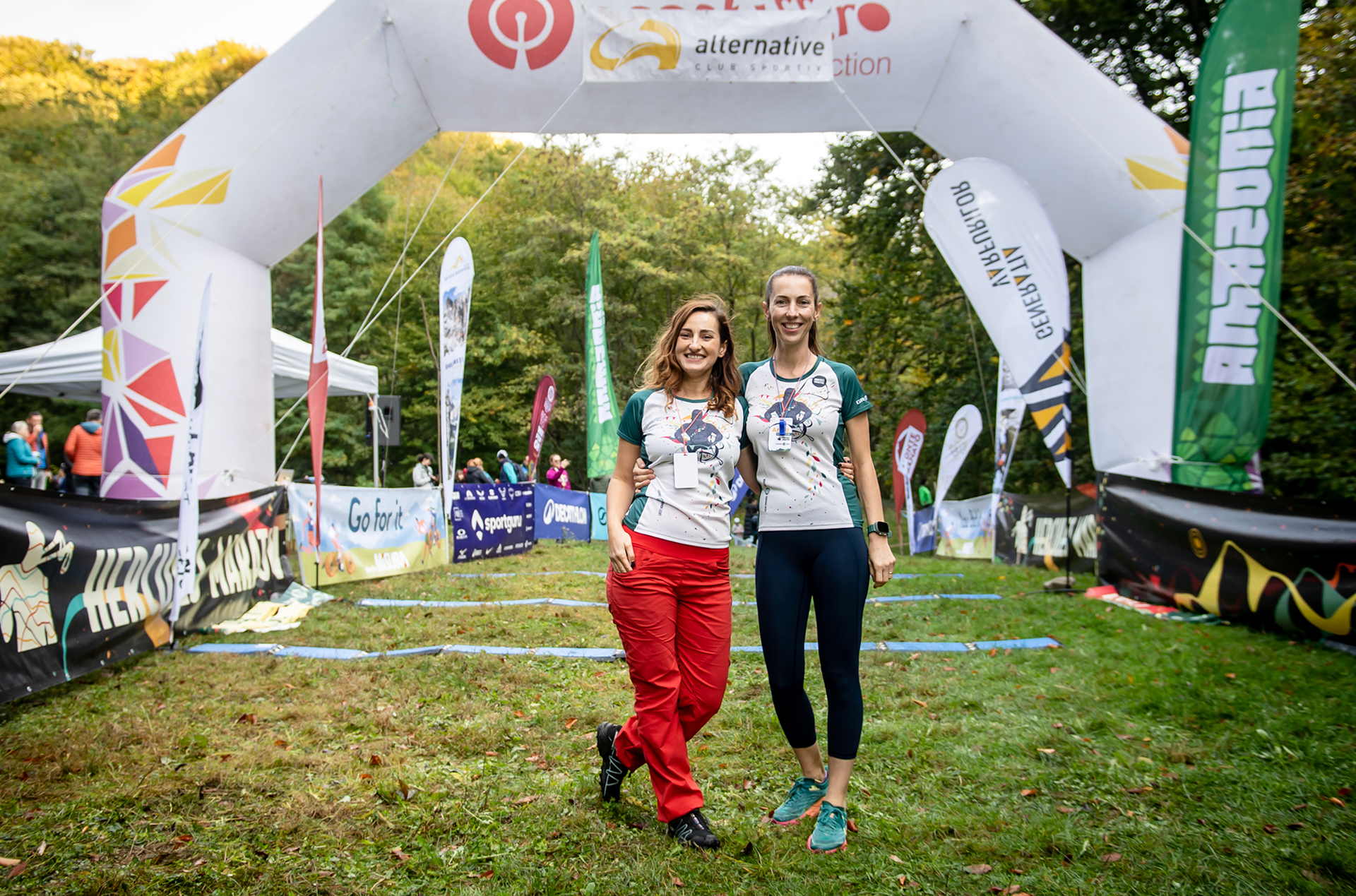
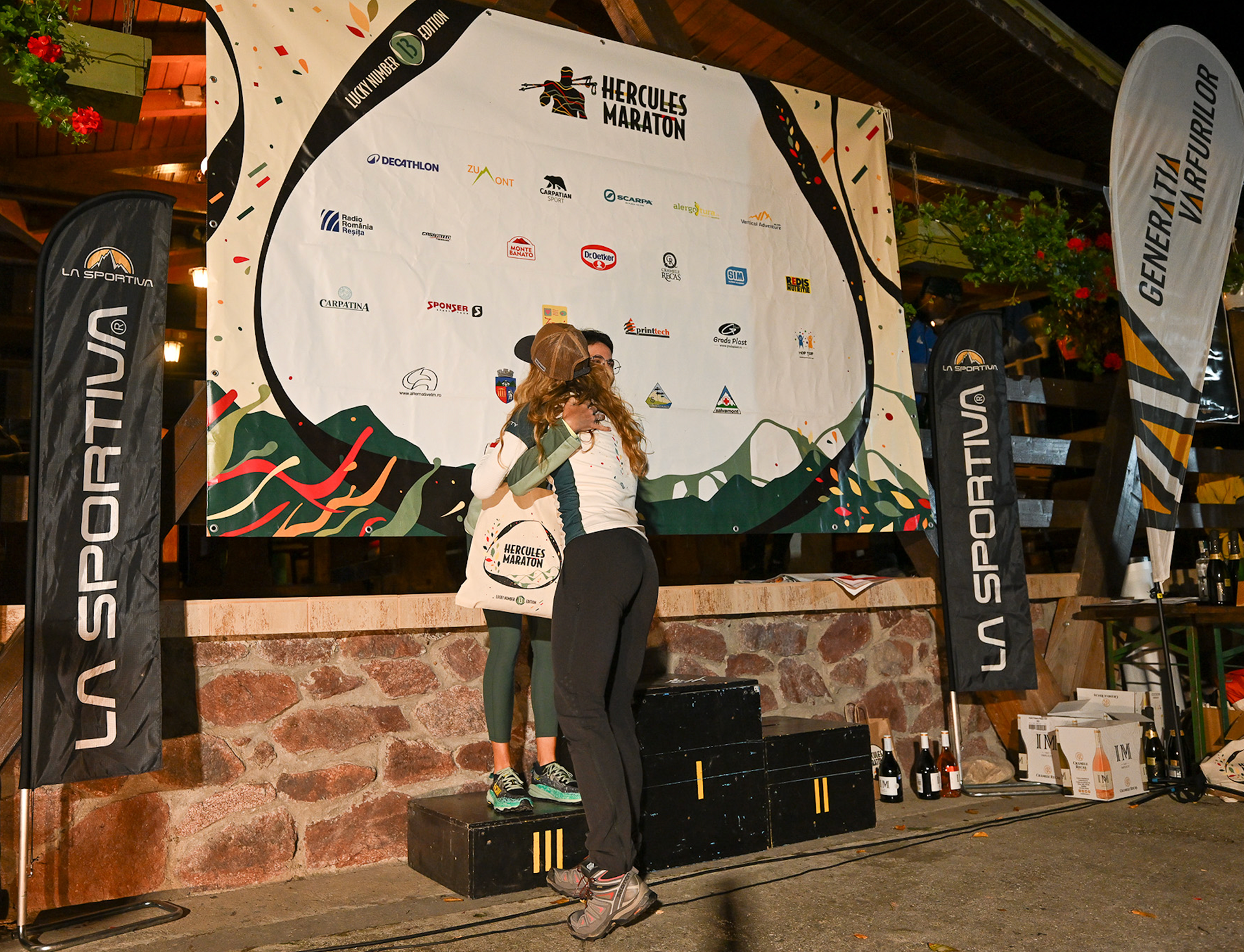
The finished brand glowed with joyful energy—a tale not only about racing but communal celebration, local pride, and personal transformation. Whether you’re running or cheering, you feel the thrill, the sport, and the kinship that Hercules inspires. The visual journey becomes a personal invitation to experience Romanian natural beauty through colours. Every visual became a burst of hapiness not just for the runners but for the memory-keepers, volunteers, and spectators. Medals, banners, digital templates—each is a celebration of local pride and the thrilling vibe of togetherness, fresh for each edition

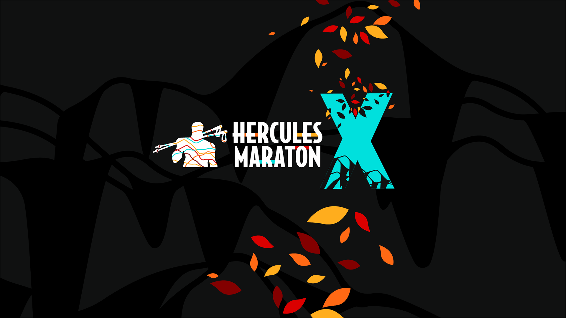
HERCULES MARATON | 10th edition
The 12th edition marked a fresh visual chapter for Căsuța Piticilor, with a redesigned identity rooted in the idea of a magical forest where children can simply be themselves. The graphics invite little ones into a luminous world of trees, music, and play, where they sing, dance, learn French, and explore together. The illustration style captures children in motion and in connection, surrounded by soft, dreamlike details that suggest laughter, curiosity, and imagination. This edition’s visual universe set the tone for the festival’s new era: warm, playful, and full of gentle adventure.
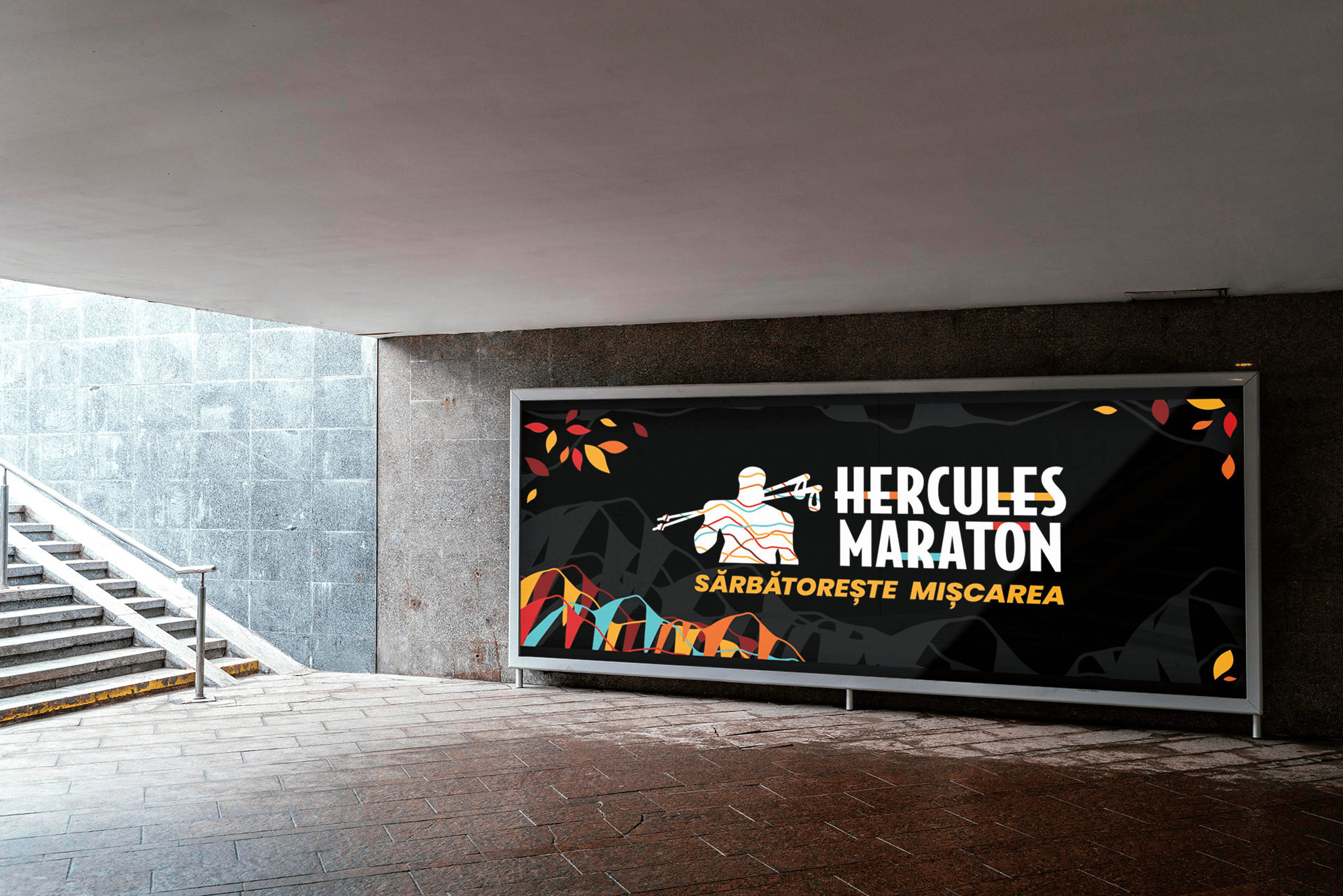
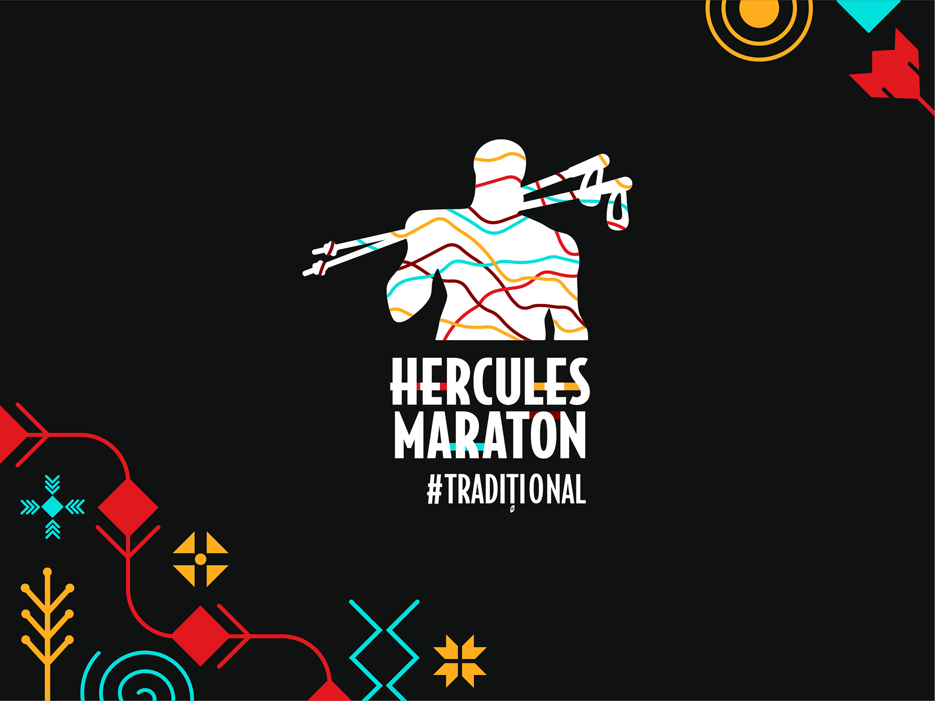
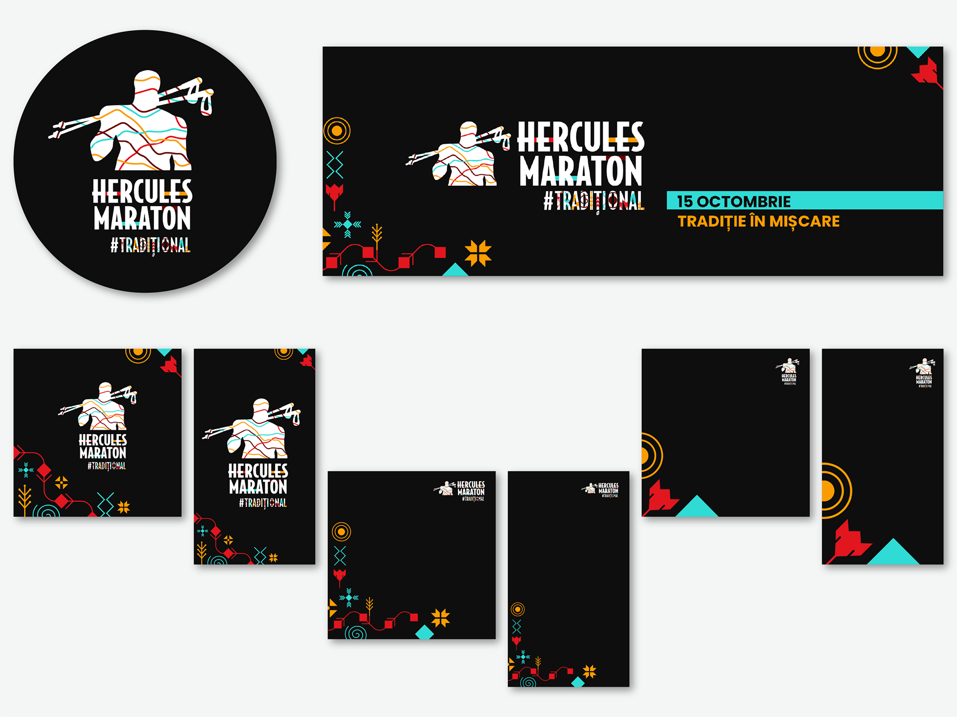
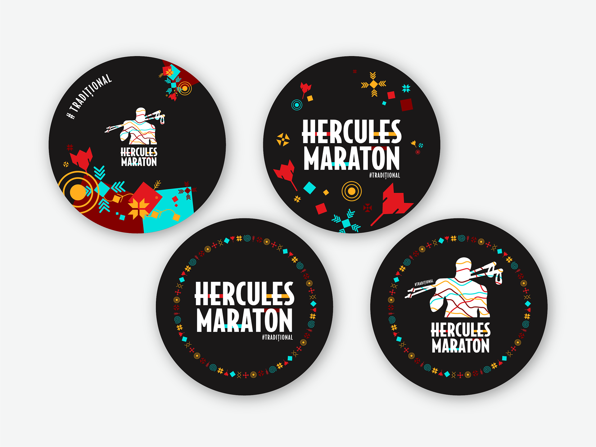
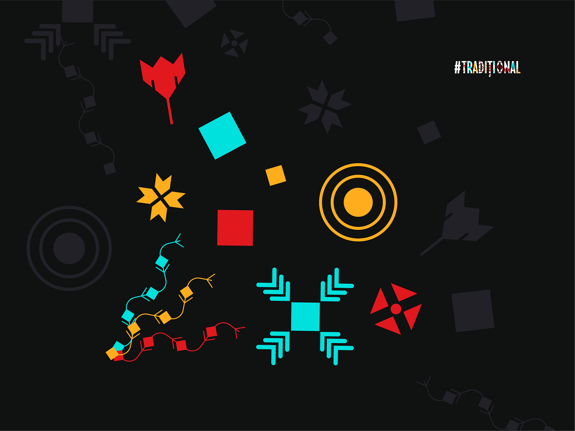
HERCULES MARATON 11th edition | Roots and Folklore
For the 11th edition, the design journey dove deep into Romania’s rich traditional roots and folklore. I chose to bring old Romanian ethnographic symbols into contemporary light—stylized to respect their sacred meanings while giving them a fresh, vibrant energy. The dark background was carefully selected to evoke mystery and focus the eye, making the bright colors—drawn directly from Romanian identity—a striking celebration of heritage. This edition honored the primal connection to the land, history, and spirit through graphic elements that felt timeless yet alive.
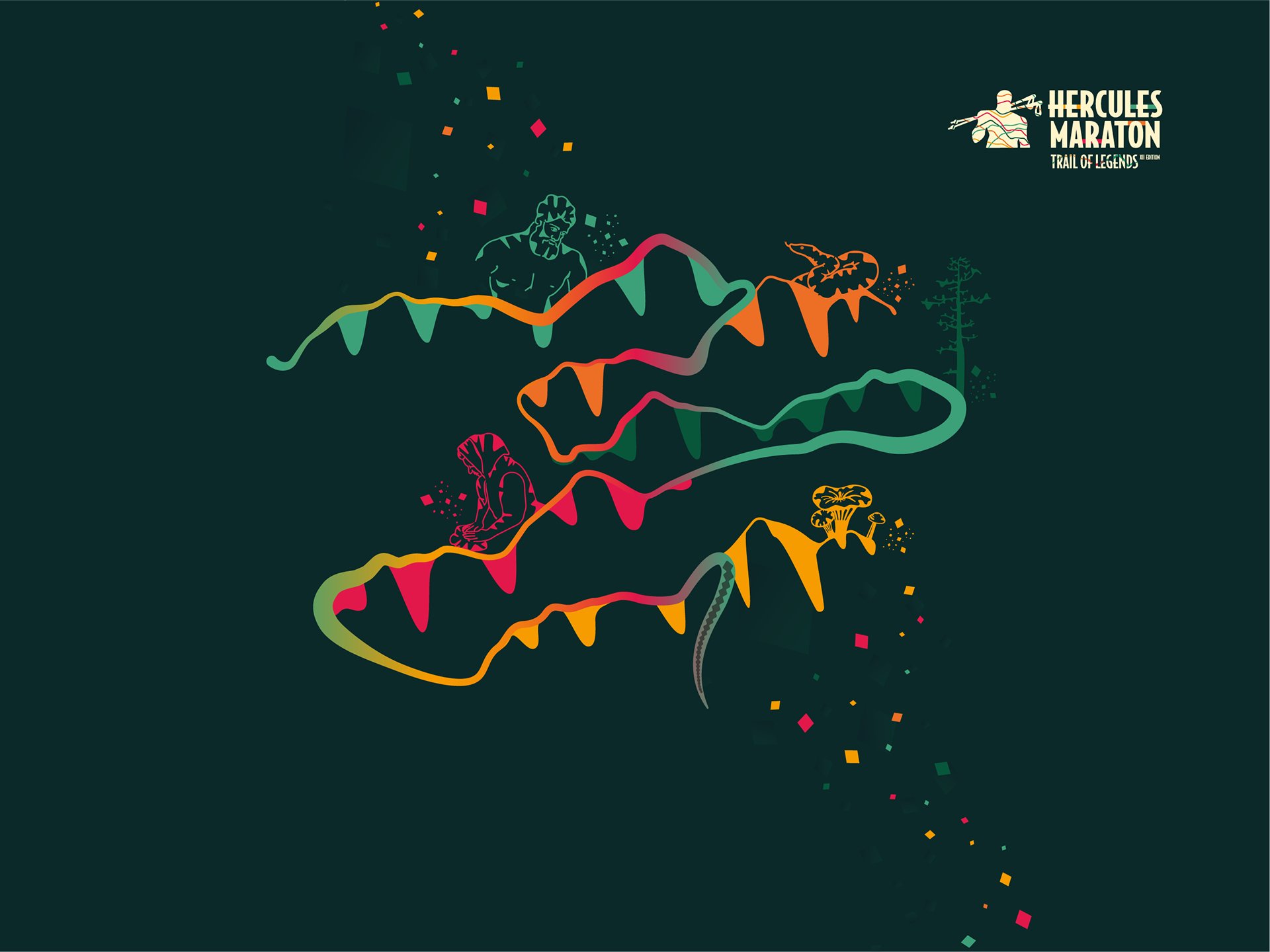
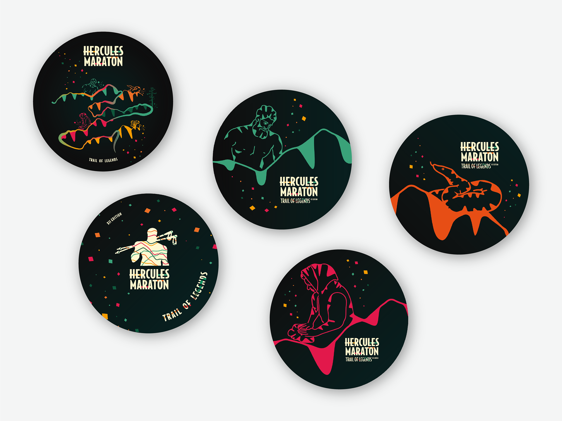
HERCULES MARATON 12th edition | Landscape, People, and Mythical Heritage
The 2023 edition asked for a storytelling approach that would celebrate not only the place—the Cerna Mountains—but its people, food, and local legends. I created five core visual elements representing these facets, linked humorously and spiritedly by a colorful, stylized snake weaving through the design—an homage to the region’s emblematic viper. This snake doubles as the marathon trail itself, carrying mythical stories and local culture in every curve. The visuals acted as a vibrant, living map—bringing heritage and nature to the forefront, inviting participants to run amidst stories and legends.
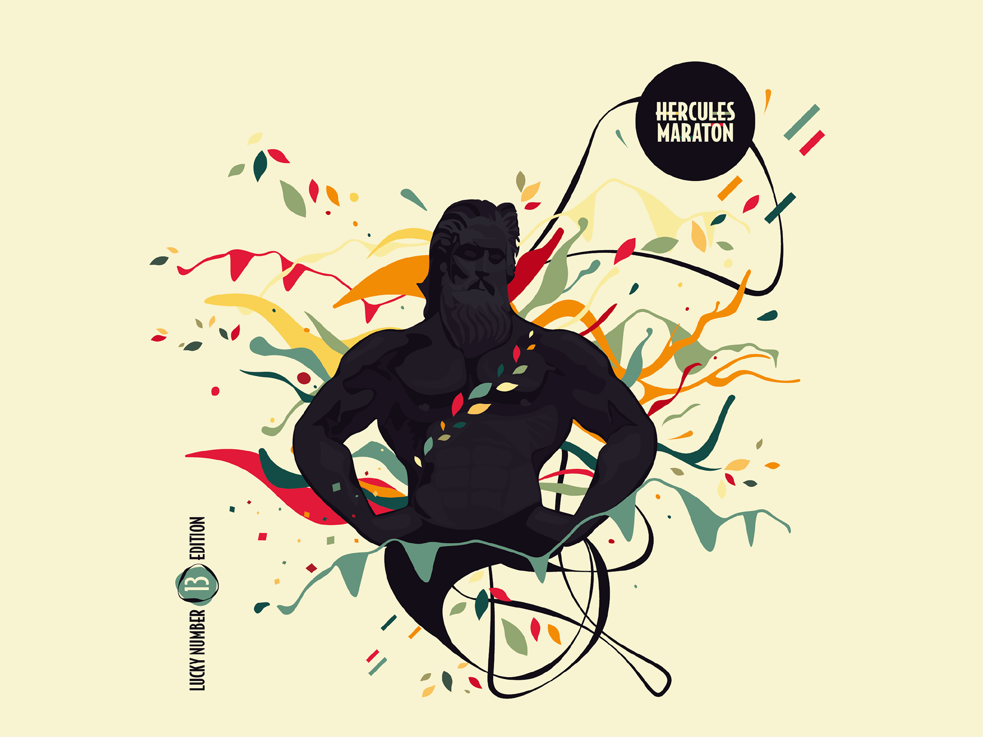
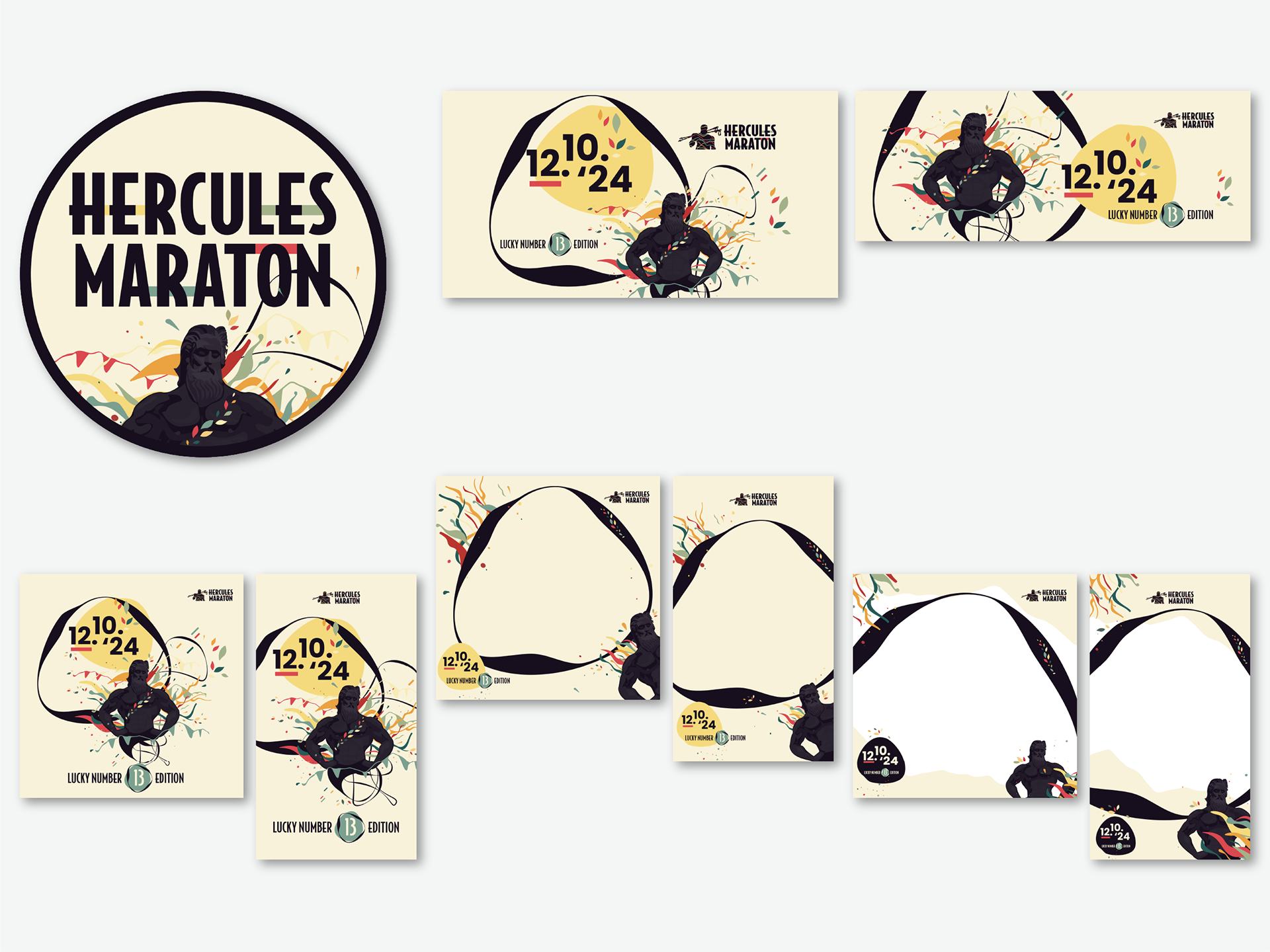
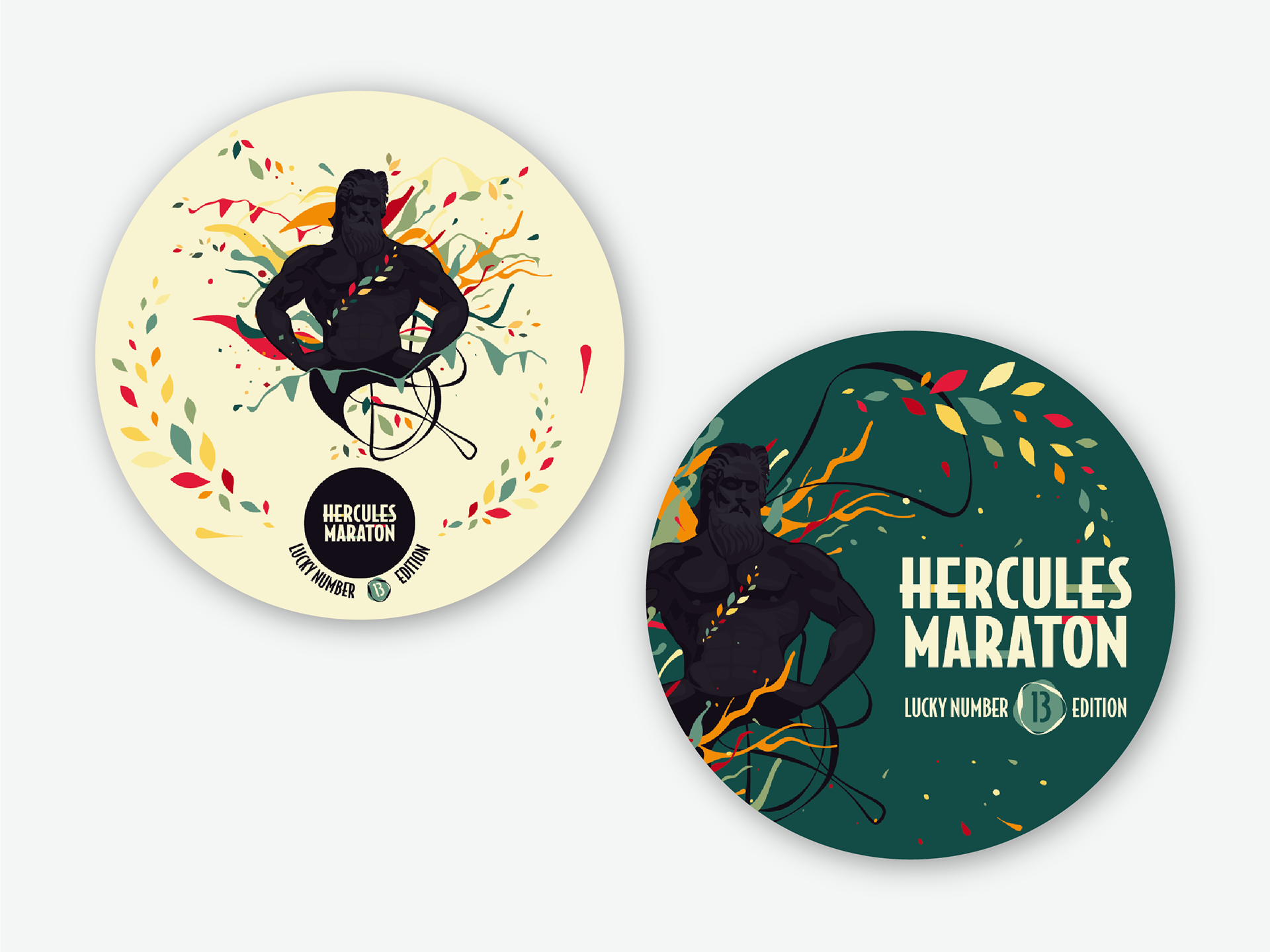
HERCULES MARATON 13th edition | The Lucky Black Cat
Breaking with superstition, the 13th edition of the marathon embraced the “lucky black cat” as its new symbol. The design reversed the traditional color scheme, casting Hercules himself as a playful black cat—a mythical creature that now brings good fortune to runners. Alongside this whimsical twist came a burst of colors that infused the visuals with warmth, fun, and invitation. This iteration aimed to lighten the spirit, making the marathon a joyful rite of passage filled with color, playfulness, and camaraderie.
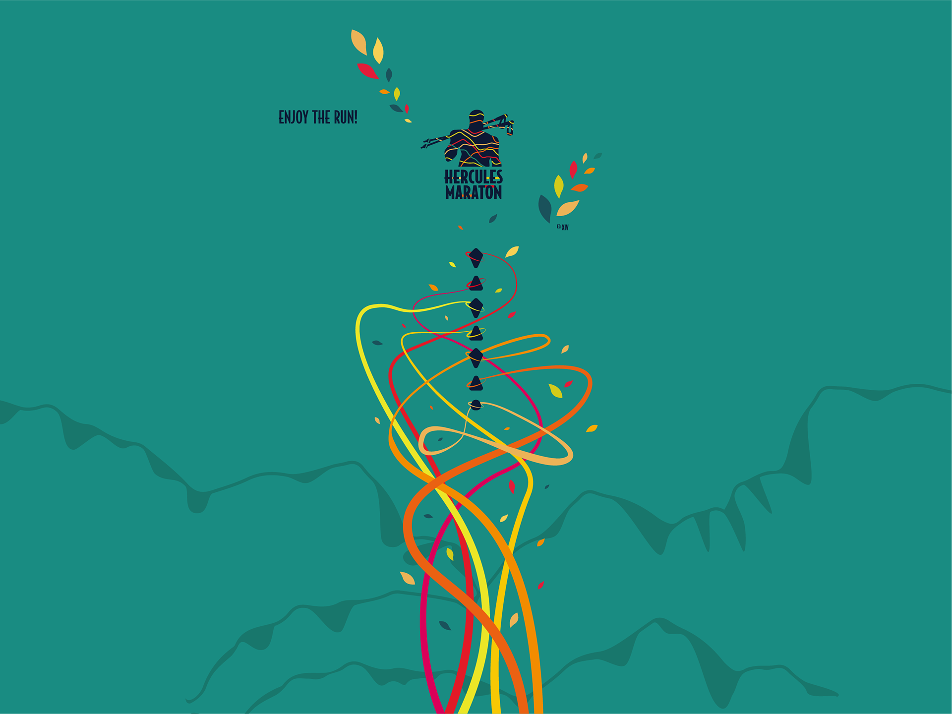
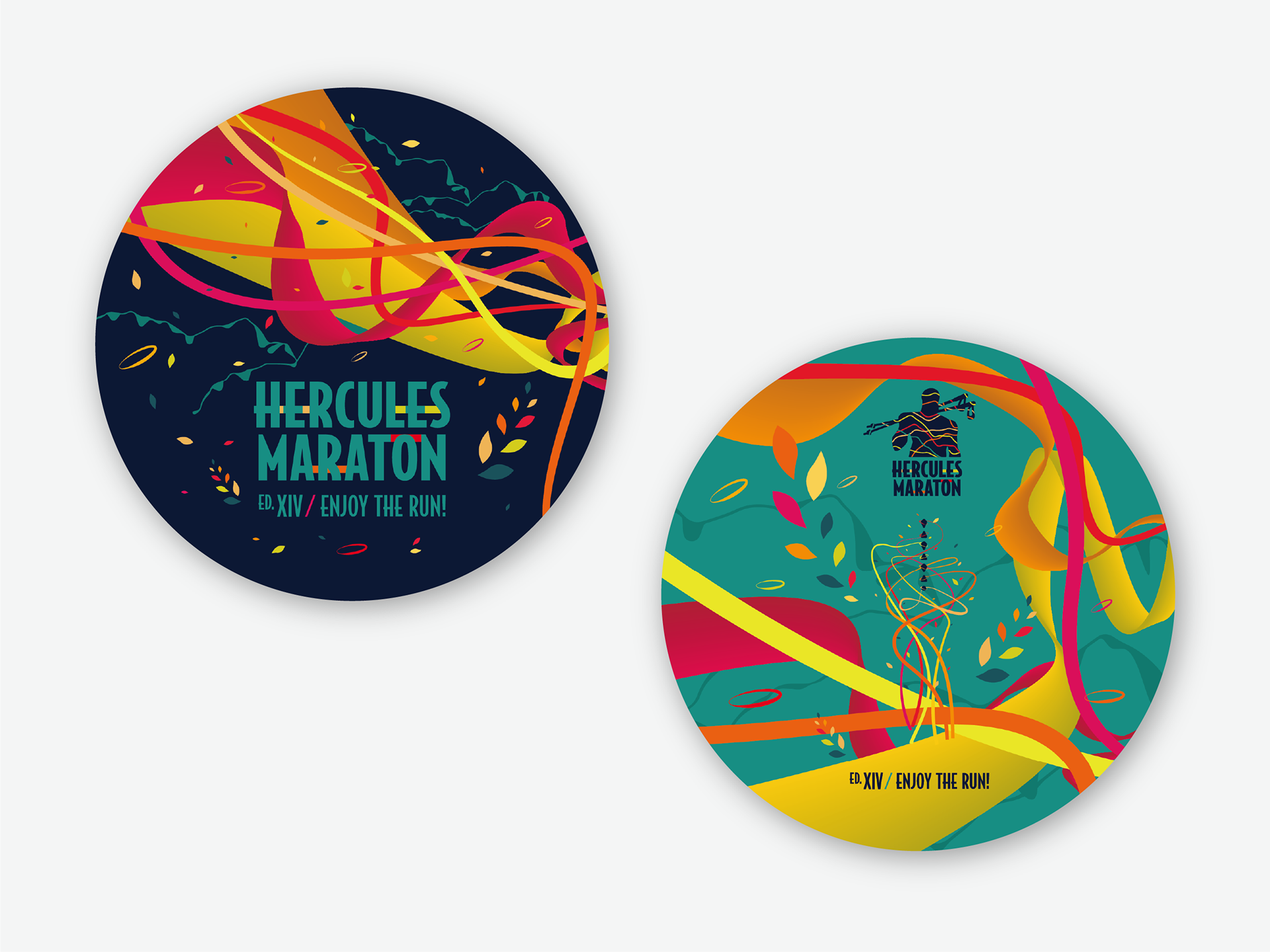
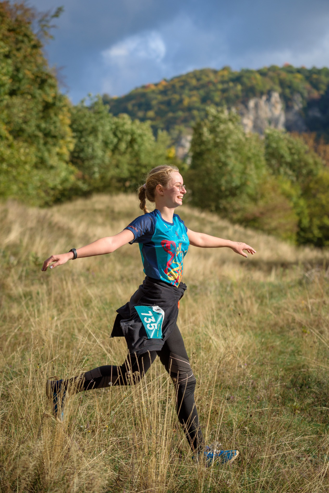
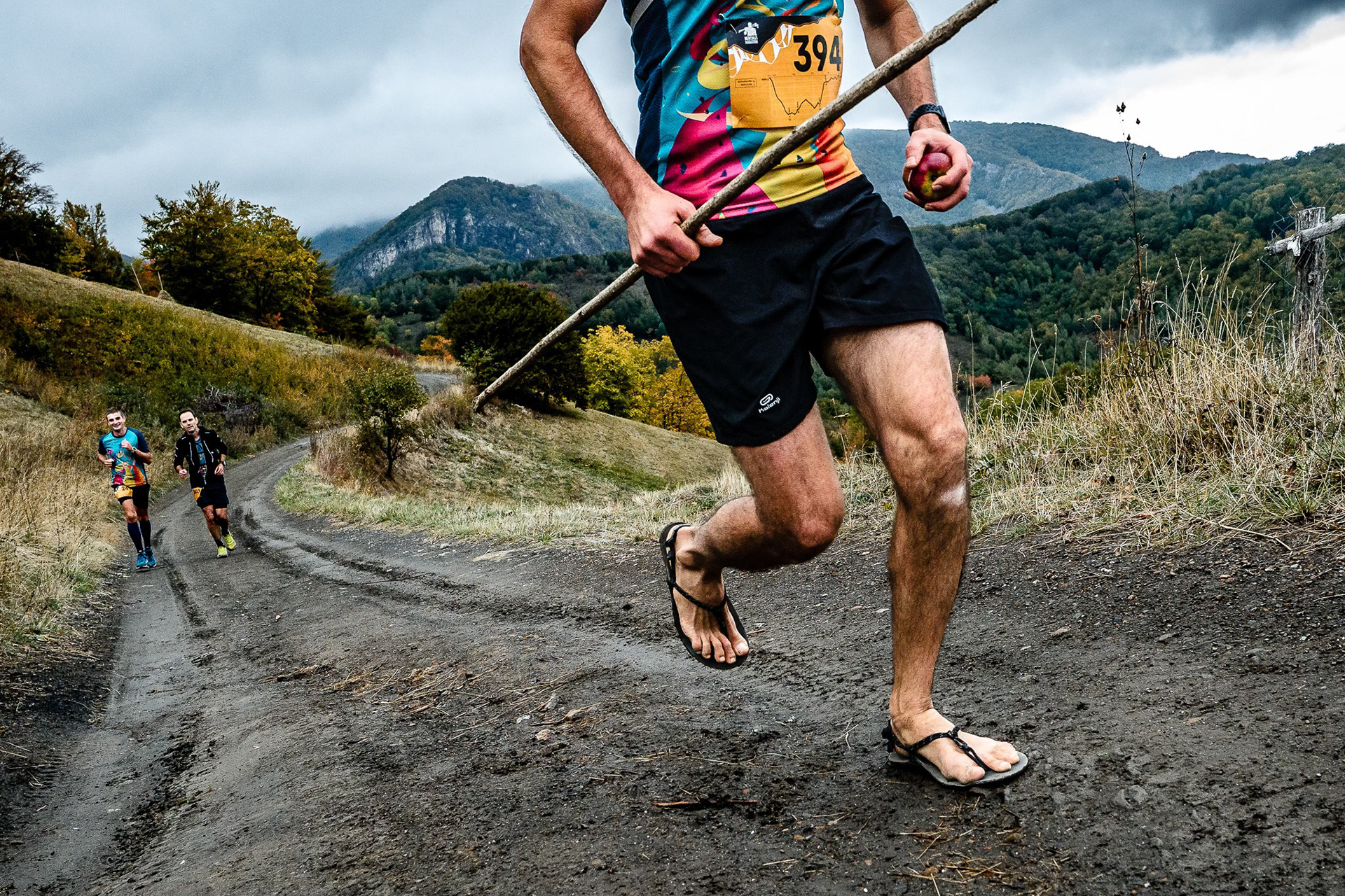
HERCULES MARATON 14th edition | Colours and Celebration of Diversity
The 2025 edition was a jubilant homage to color, energy, and the pure joy of trail running amid spectacular autumn scenery. With the introduction of a new trail category aimed at welcoming beginners, the visual identity embraced diversity and inclusivity. The graphics combine vibrant hues and dynamic forms to evoke excitement and community spirit. This edition celebrates the event’s growing character as a fun and friendly gathering space, showcasing both the natural beauty of the mountains and the colorful energy of its runners.
Each text guides viewers through the evolving visual narratives of your Hercules Marathon identity work, connecting design to story and spirit. If you’d like, these can be expanded into fuller website content or remain as engaging captions.
Each text guides viewers through the evolving visual narratives of your Hercules Marathon identity work, connecting design to story and spirit. If you’d like, these can be expanded into fuller website content or remain as engaging captions.