The project essence
Faerie Wood is a brand born from reverence—a love letter to craftsmanship, nature, and heritage. They aspire to create beautiful wooden products that tell stories stretching across generations, rooted in sustainability and inspired by legends of trees as magical dwellings for fairies. Their clientele cherishes authenticity and timeless quality, embracing fewer but better things, valuing meaning over mass consumption..
THE CREATIVE APPROACH
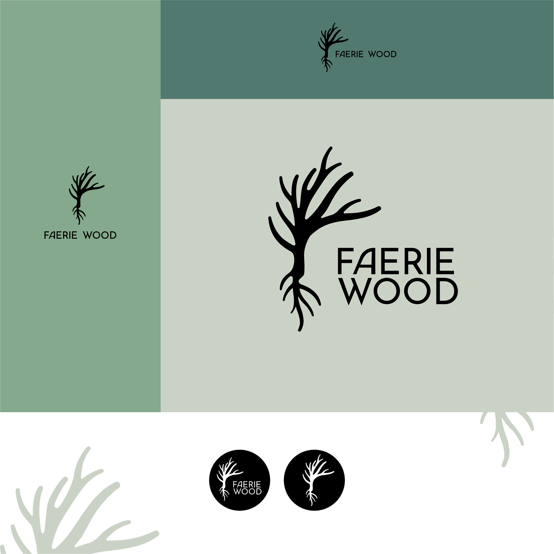
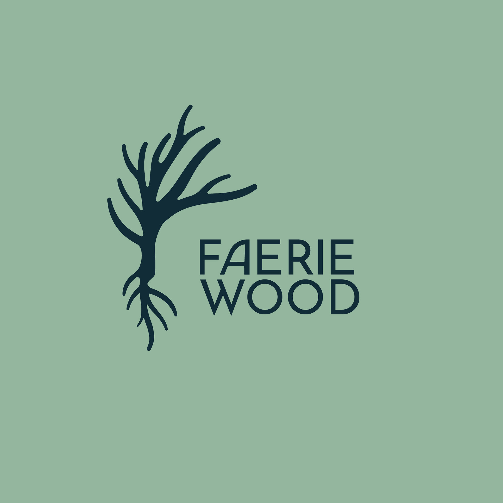
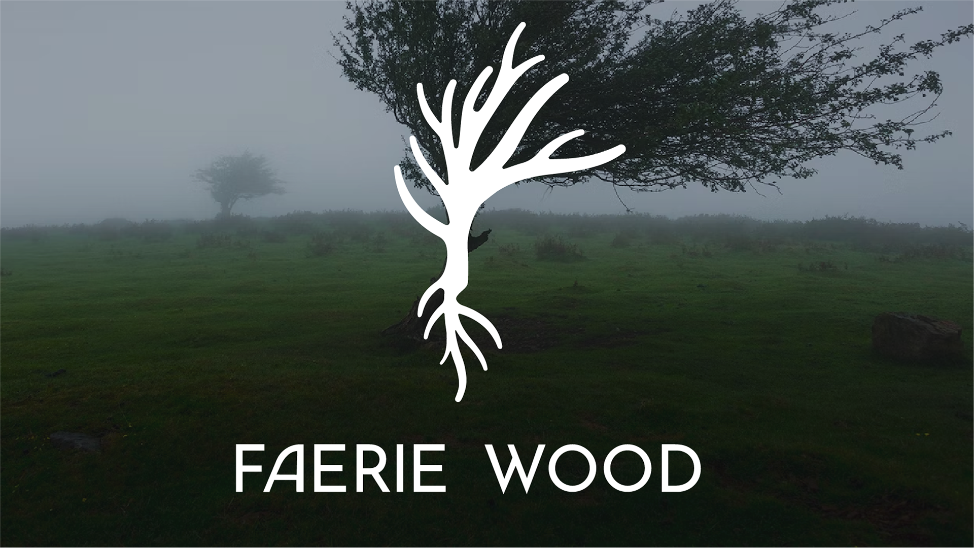
I embraced this poetic spirit by grounding the identity in the ancient symbol of Axis Mundi—the world’s sacred axis connecting earth and sky. Drawing inspiration from mythic “Tree of Life” imagery, the logomark embodies roots, growth, and infinite continuity, serving as a cosmic bridge between nature and humanity.
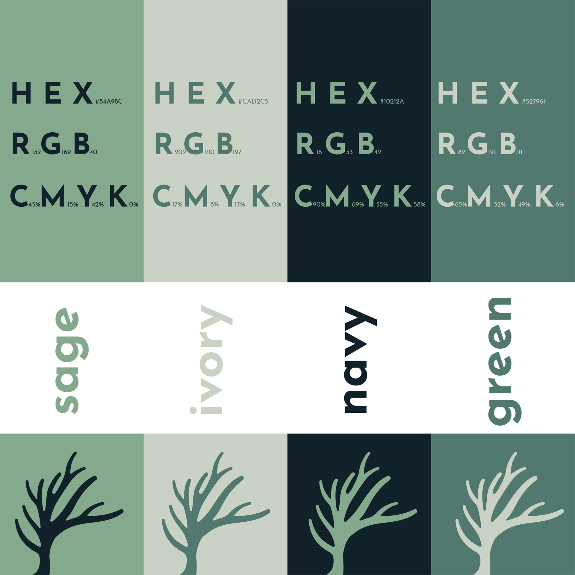
The palette mirrors Irish landscapes and timeless elegance—deep, fertile greens evoke dense forest canopies; soft sage bring quiet sophistication; navy blues speak of moonlit nights and enduring heritage. This nuanced, serene range balances refinement and warmth. Typography and layouts follow suit: minimalist yet rich with emotion and texture, the design is high-end but approachable—each product feels like a heirloom, a story waiting to be touched and told.
The Creative Harvest
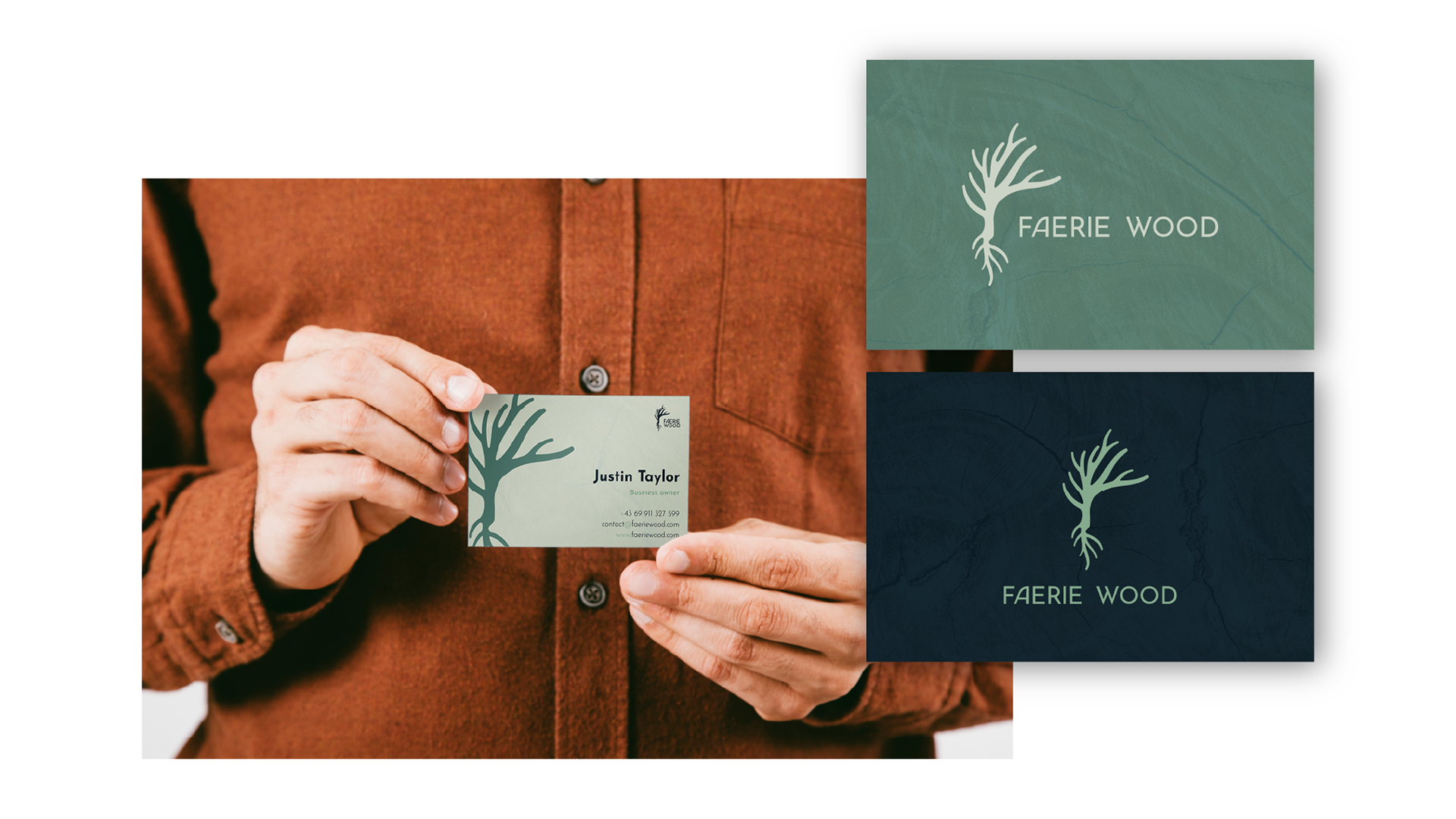
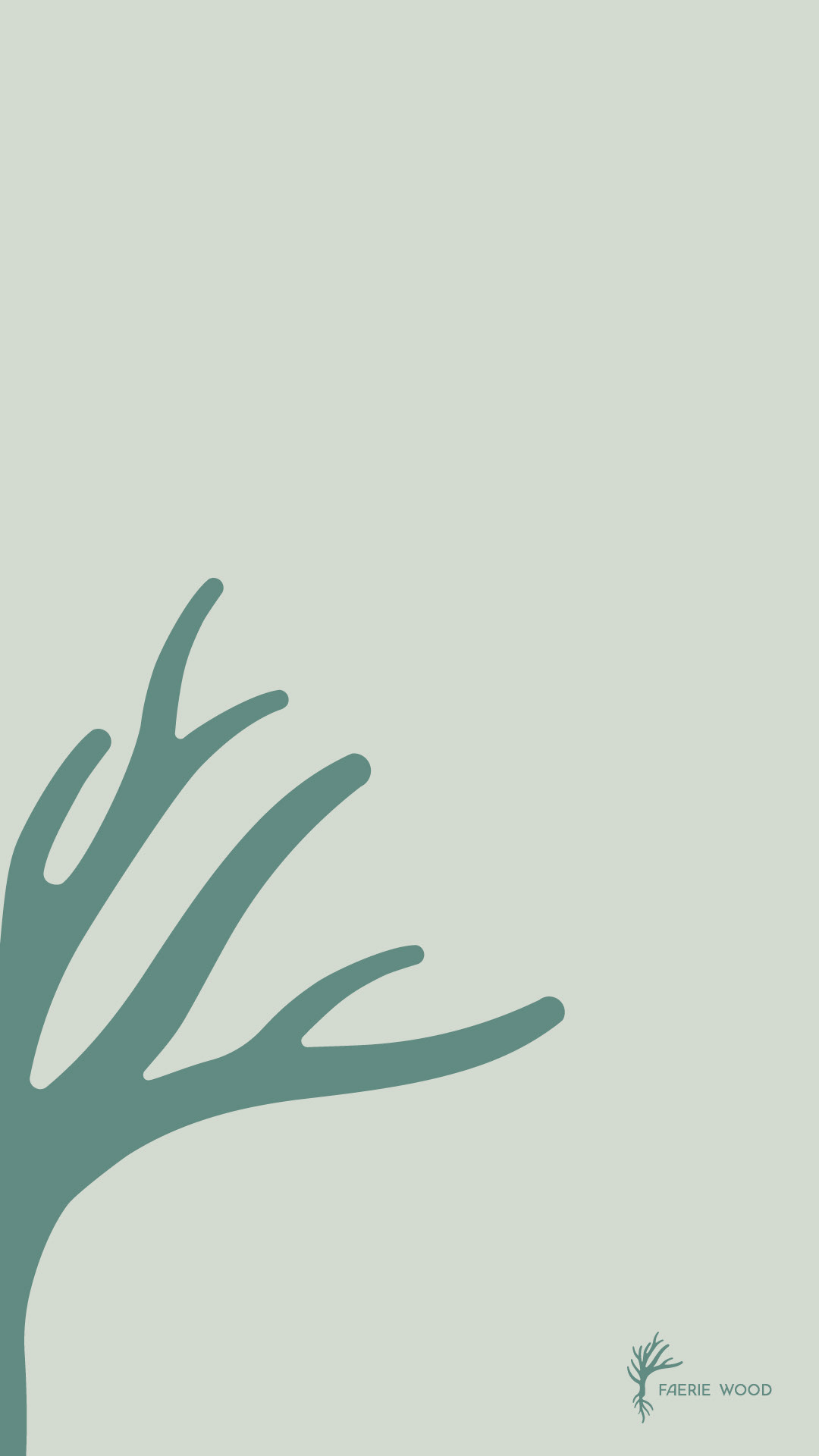
Deliverables included logo packages, brand guidelines, business cards, and social media templates, all conveying a deep connection to nature’s quiet magic. The identity stands as a bridge—between craftsmanship and storytelling, tradition and modernity, earth and imagination. Like wood itself, this design whispers across time, offering Faerie Wood not just a market presence but a soulful narrative. This project reminded me that exceptional design carries stories that wait to grow with their owners, forever rooted in care and creativity.