The project essence
When Norian Munteanu approached me, he was embarking on a new professional voyage as a psychologist and systemic psychotherapist. His vision required a brand identity that felt warm and welcoming but also elegant, minimalist, and deeply professional. The goal was a masculine, neutral tone that would resonate strongly with individuals and couples seeking clear emotional support, growth, and balance.
THE CREATIVE APPROACH
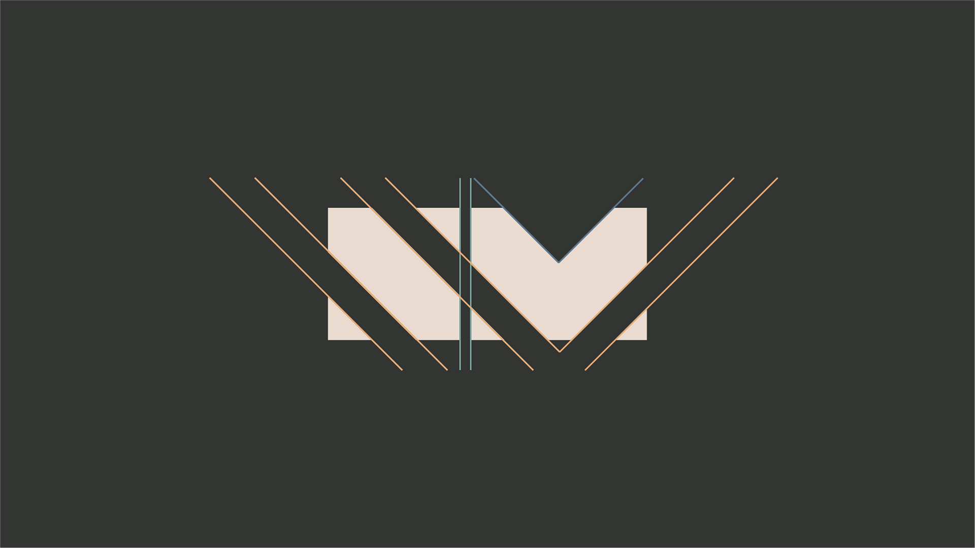
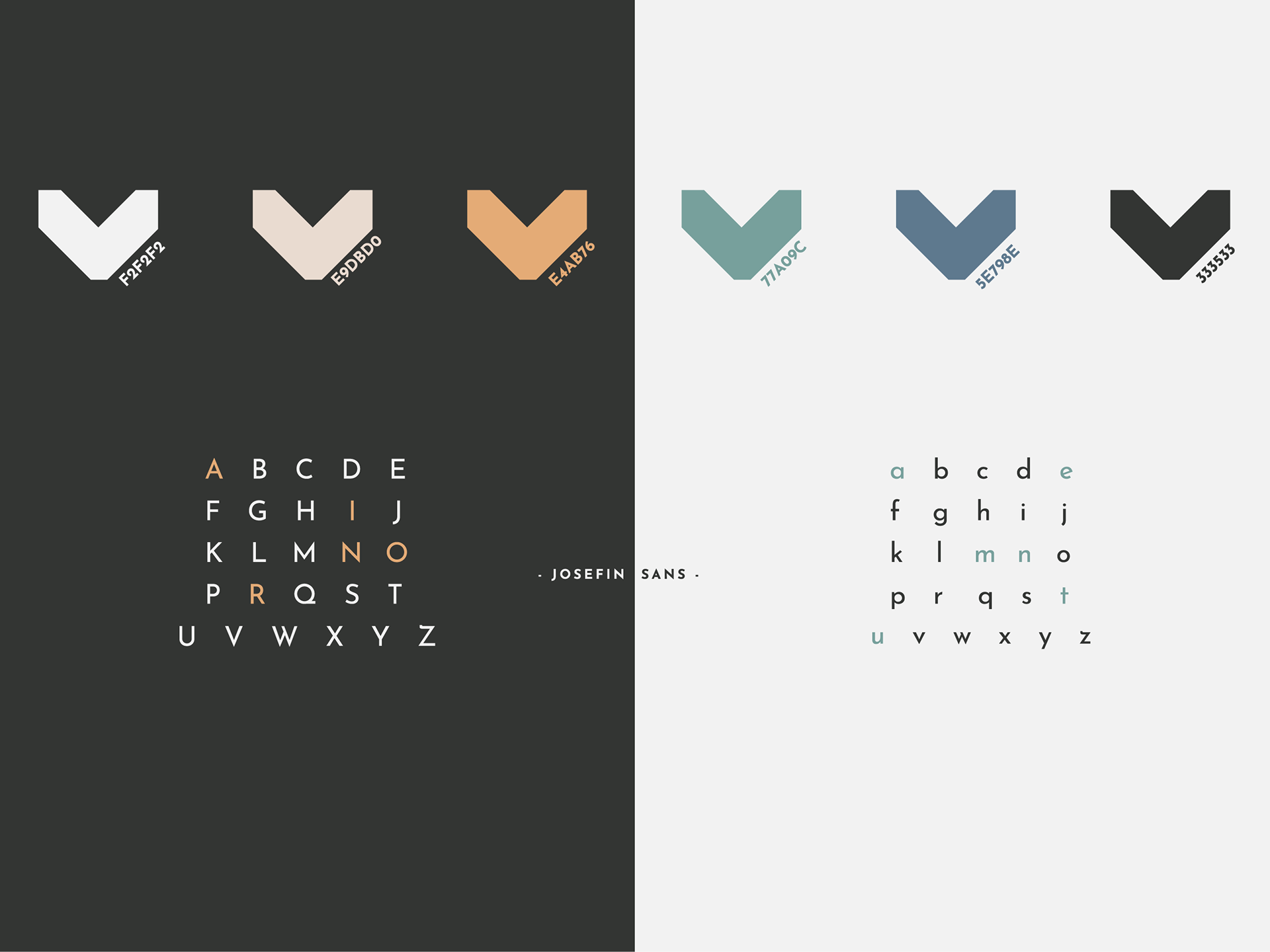
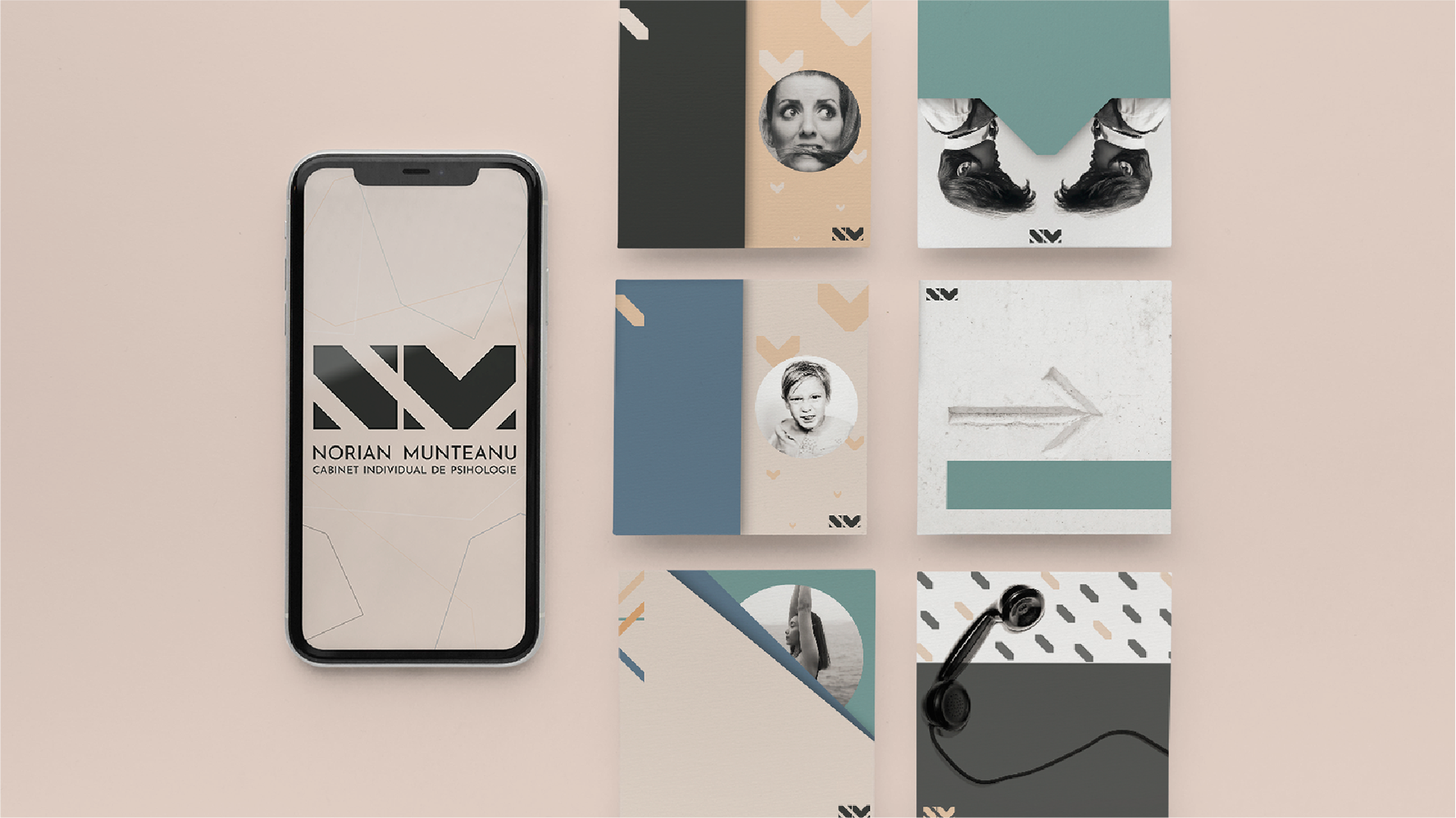
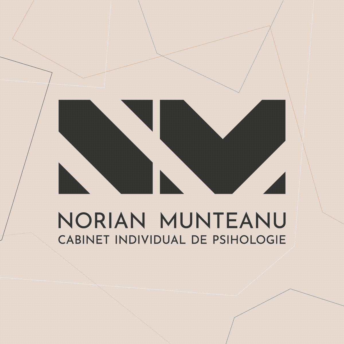
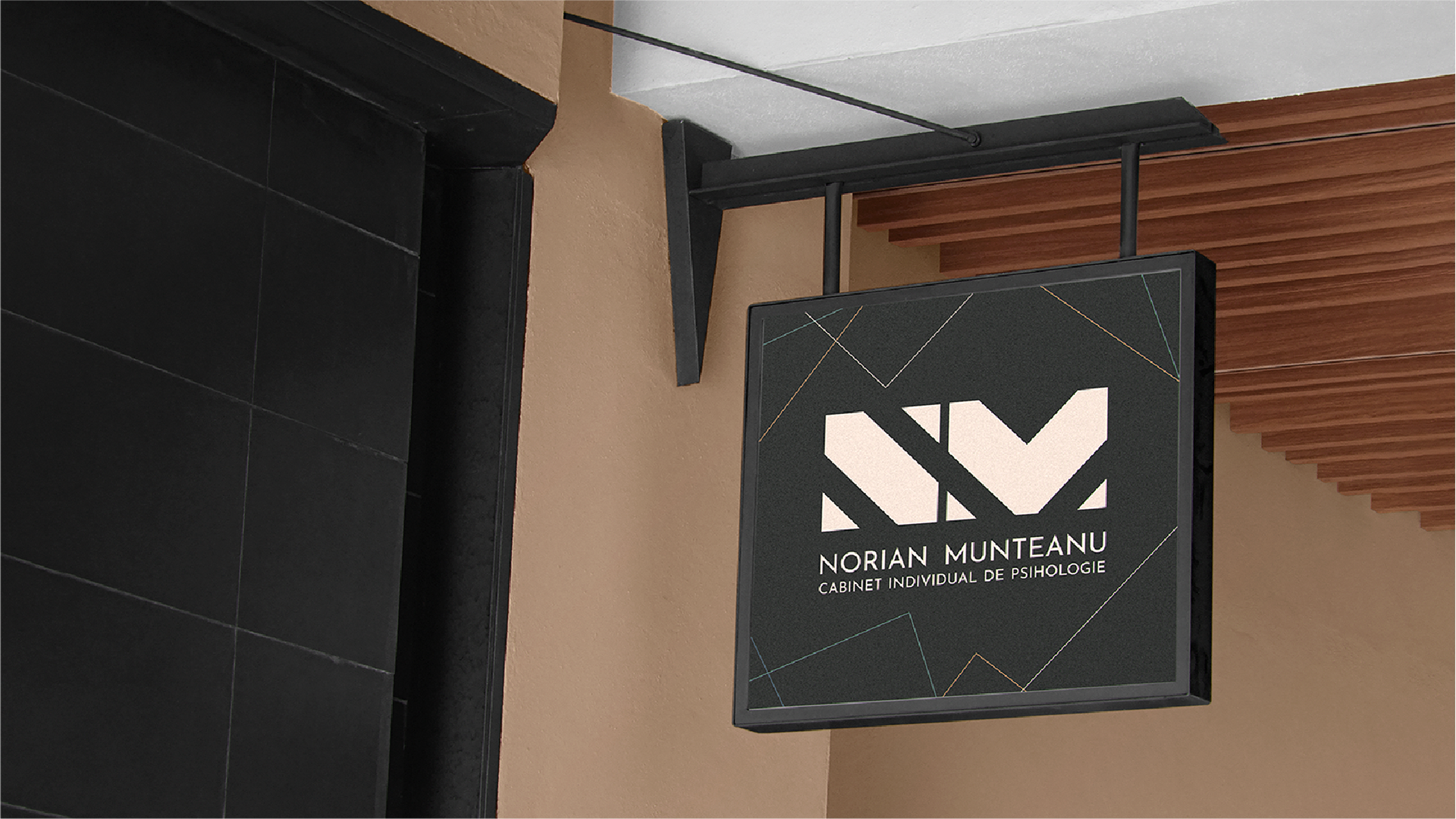
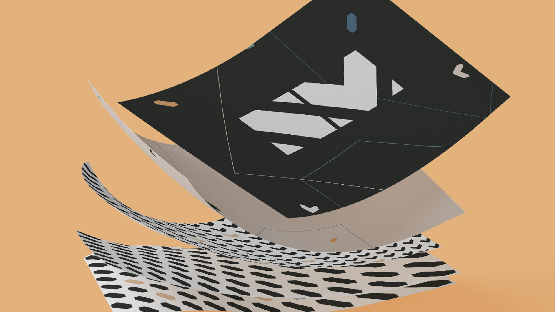
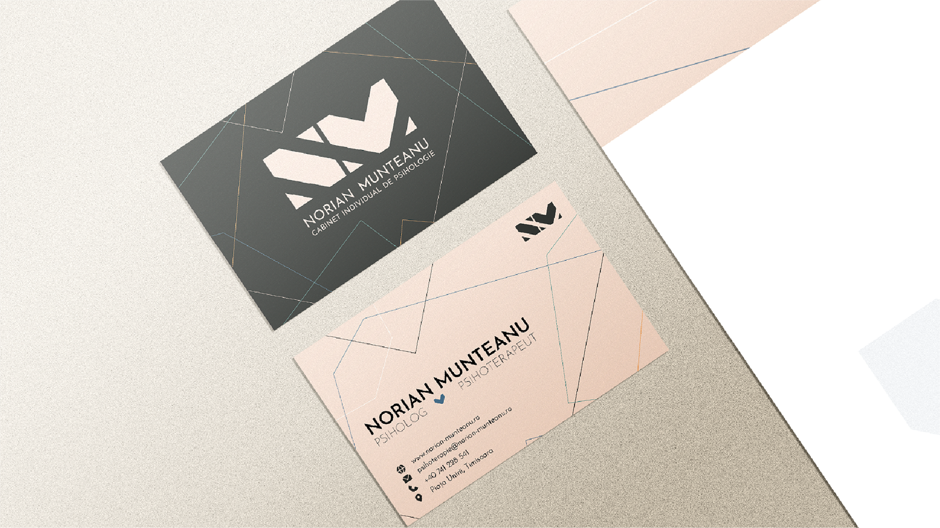
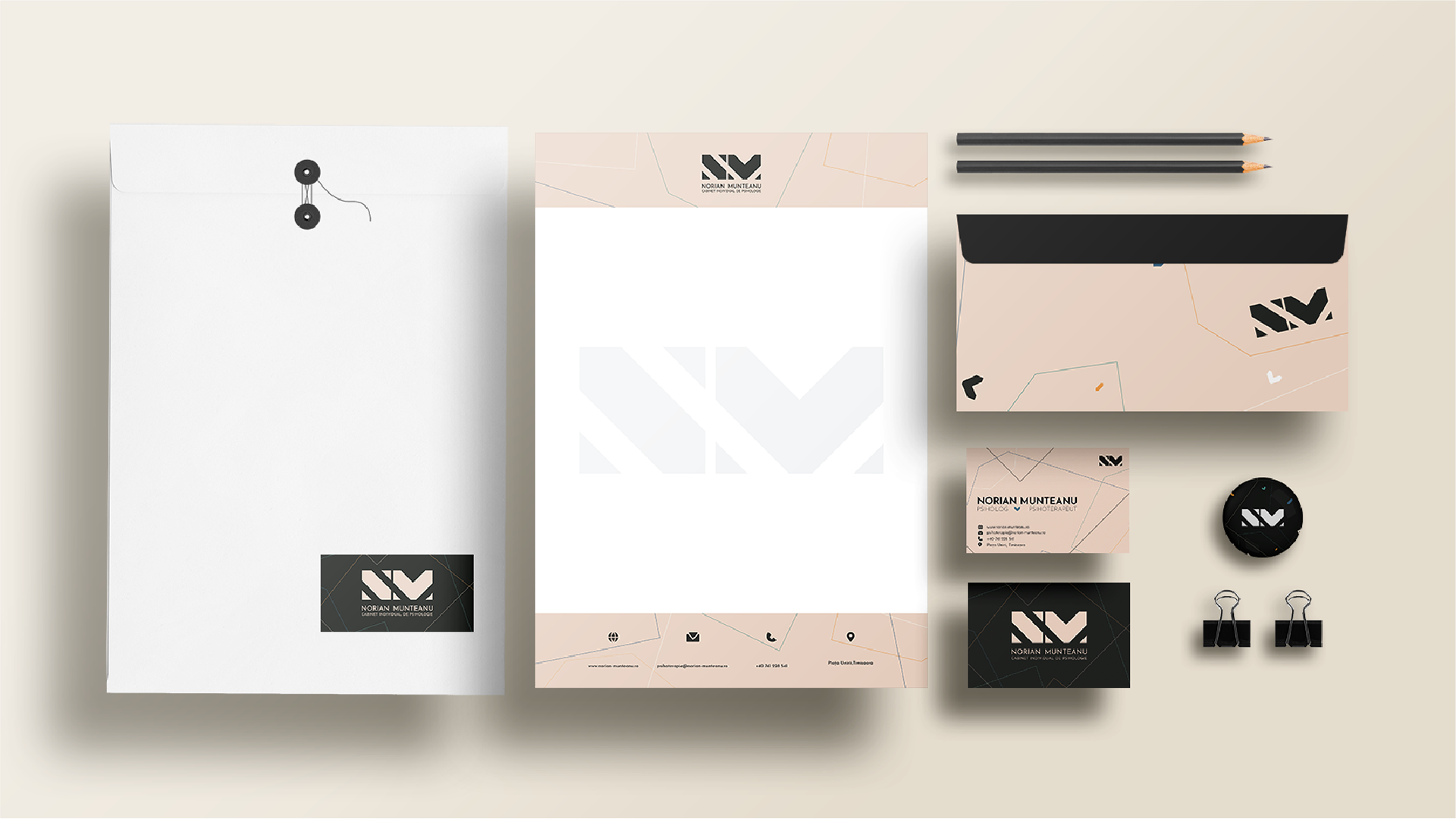
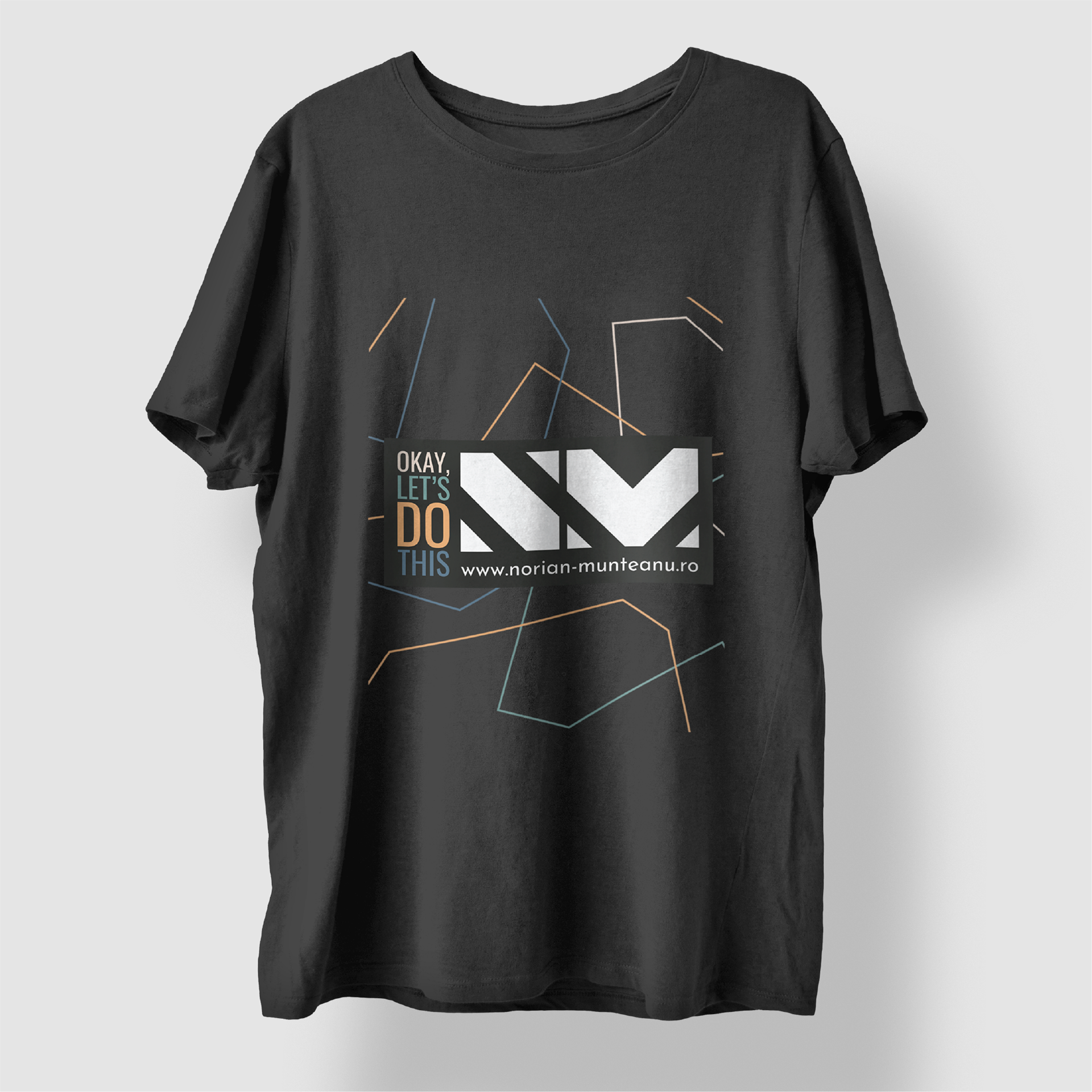
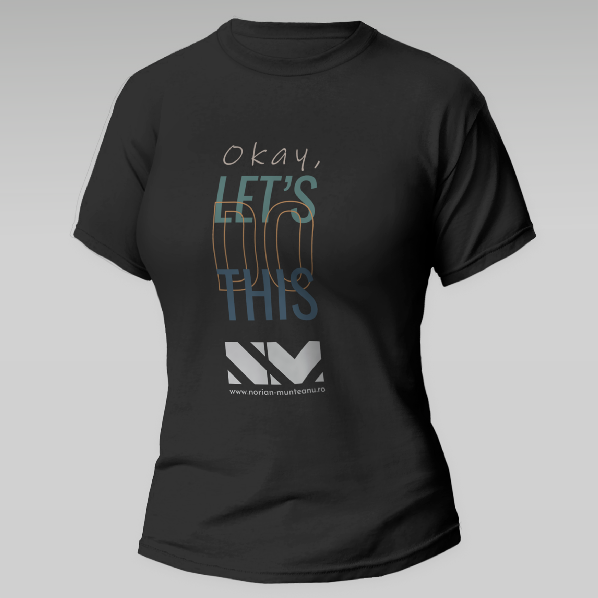
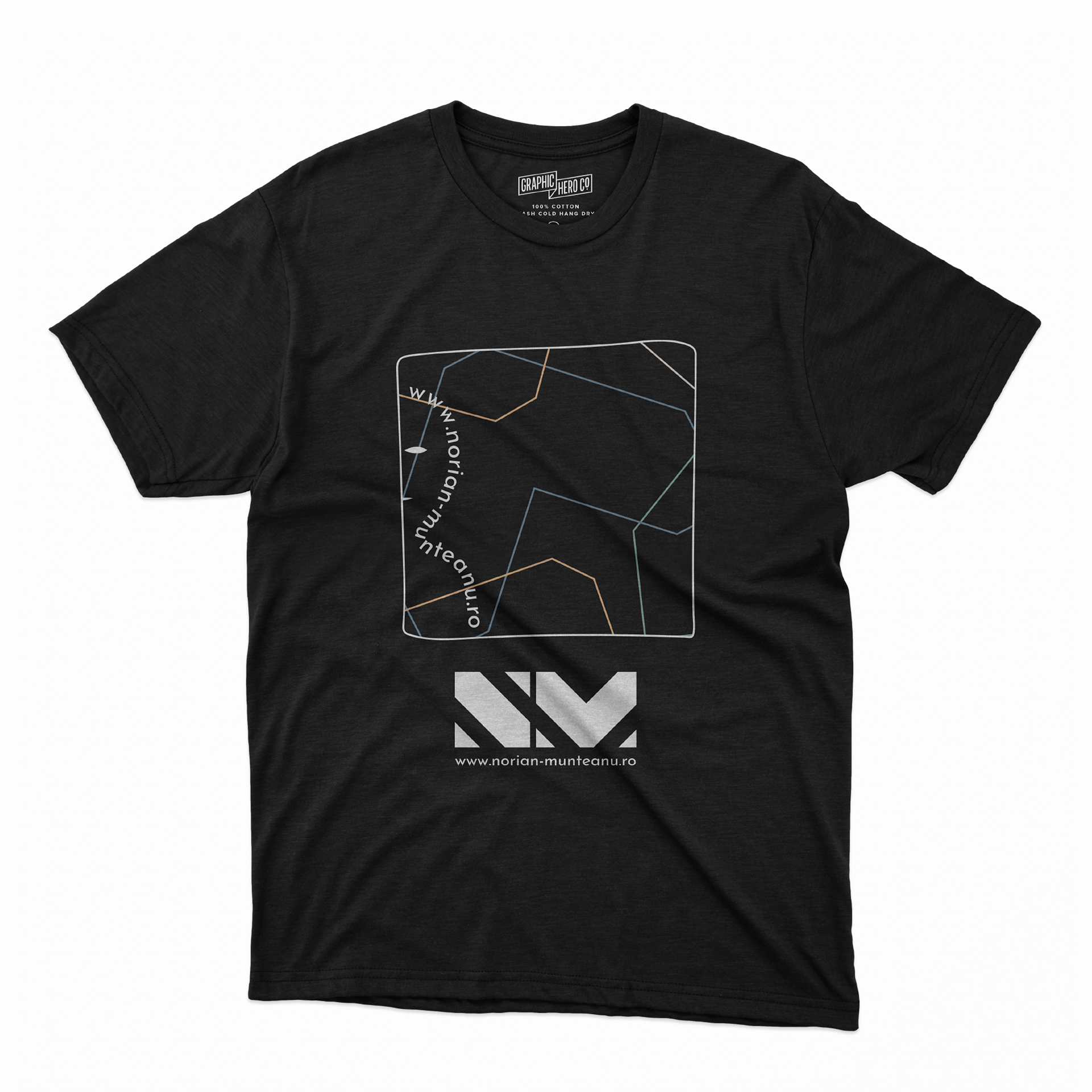
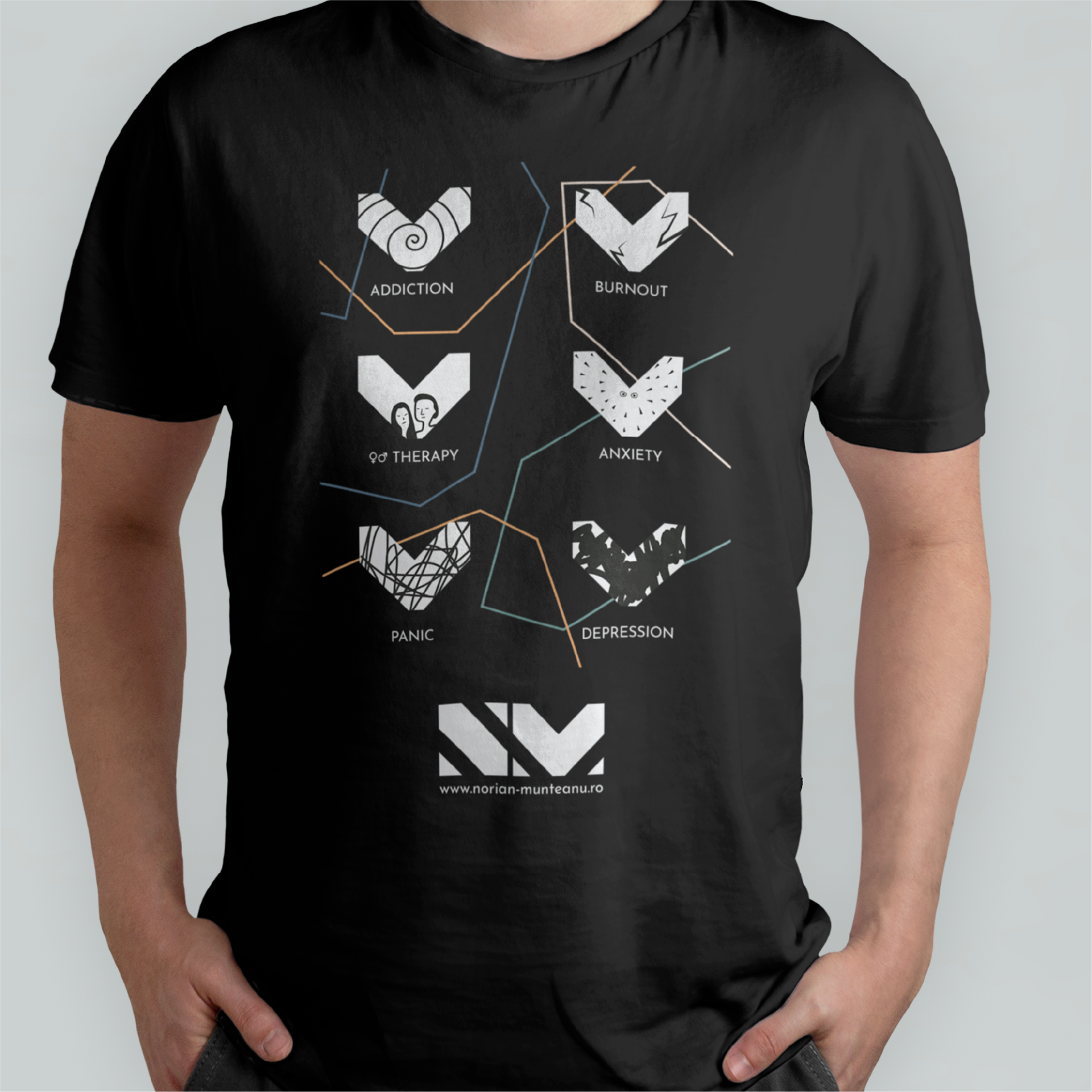
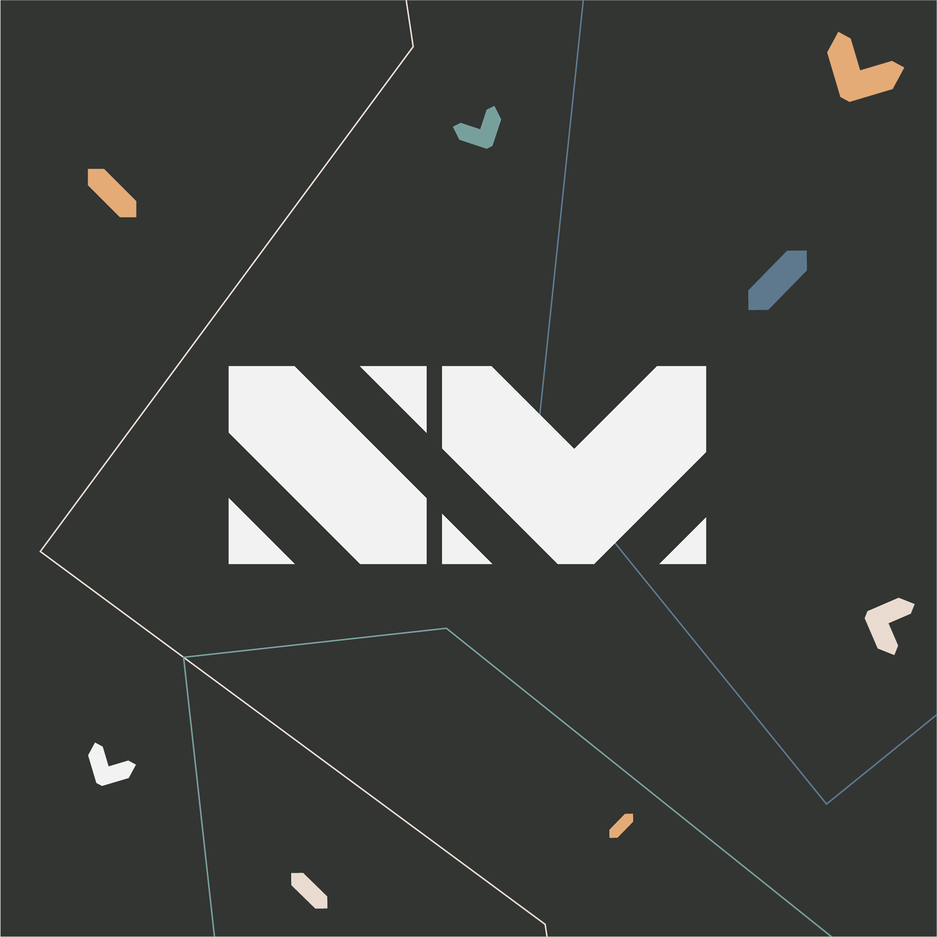
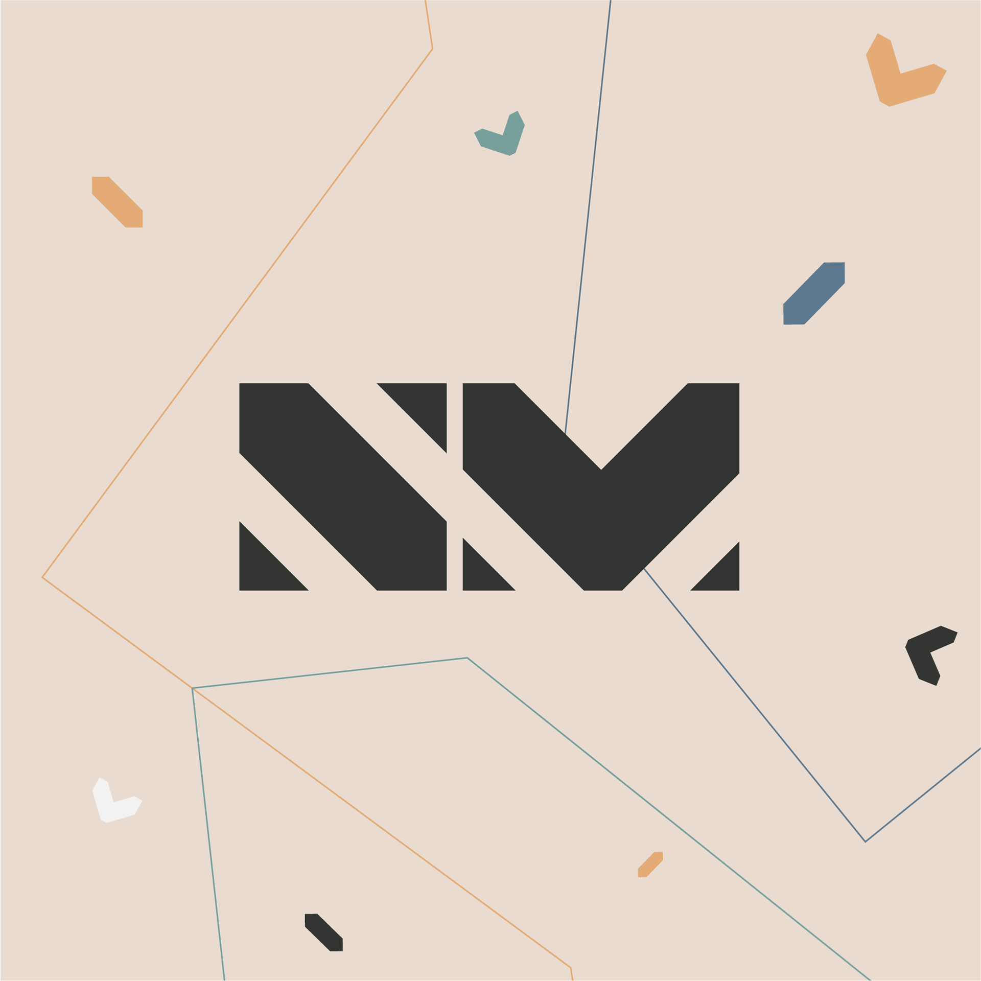
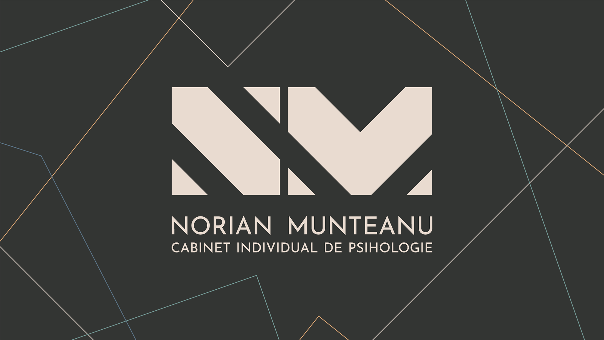
I began by sculpting clean, geometric shapes paired with typography that is both crisp and approachable, evoking calm and confidence. The logo is cleverly designed to highlight Norian’s name while embedding subtle symbolism—a hidden heart illustrates empathy, and lines that “unite the dots” reflect the therapeutic process of making connections out of complexity.
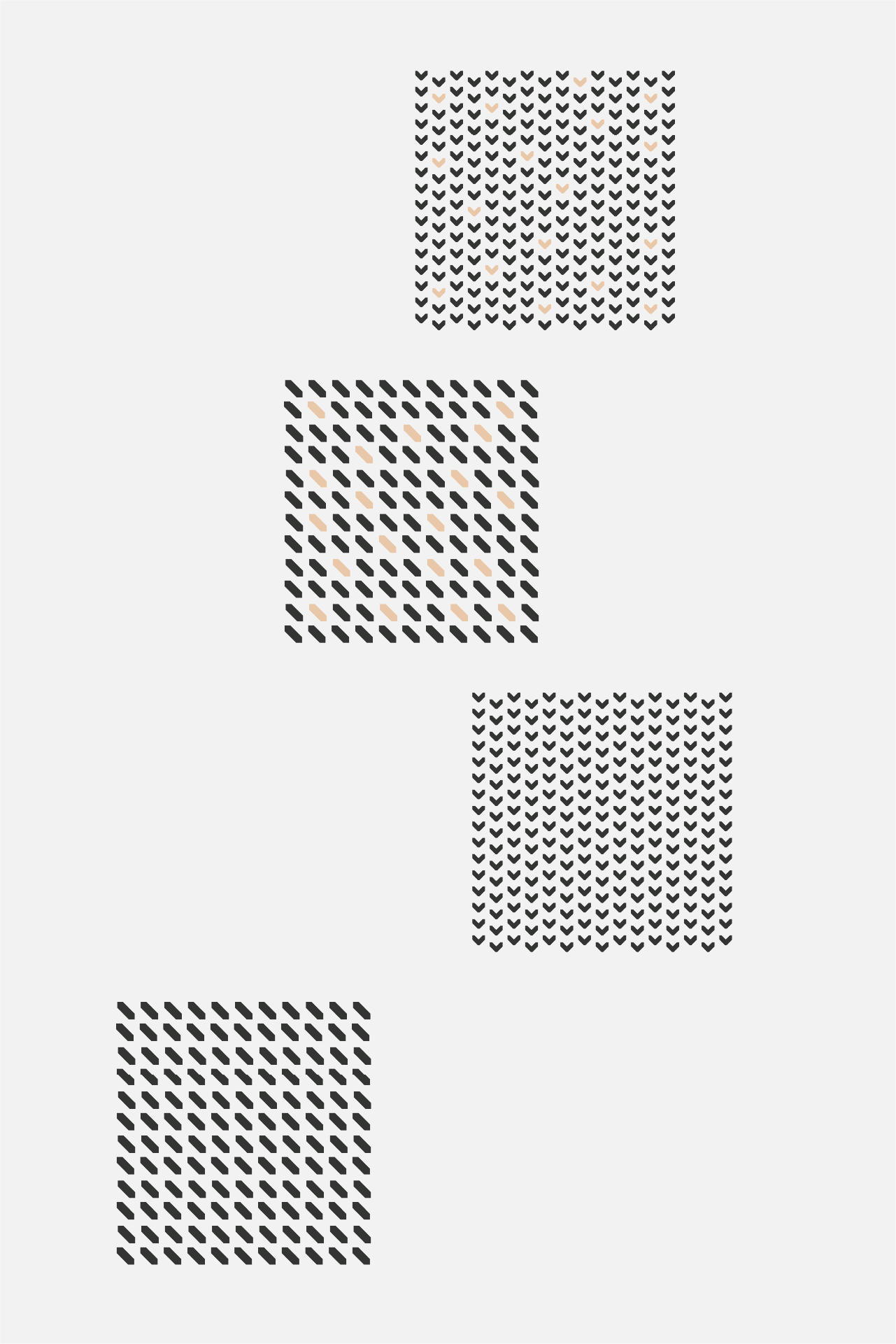
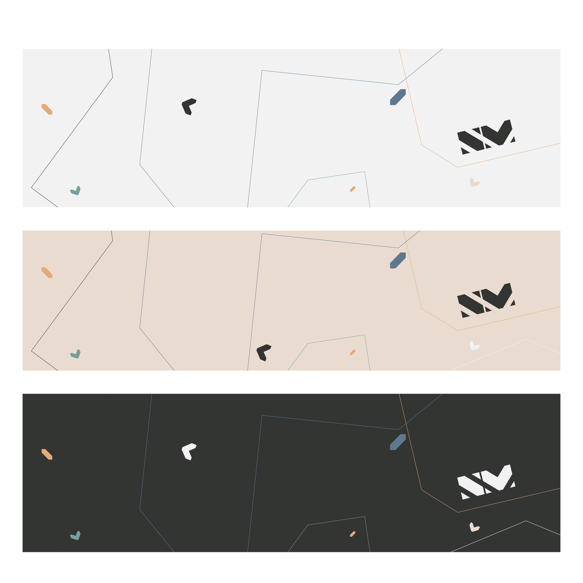
The color palette was thoughtfully chosen to speak gently yet professionally: soothing beige embodies calmness, soft black conveys trust and elegance, and accompanying hues of grey and white enhance feelings of safety. Touches of soft orange bring subtle warmth, sage-mint green symbolizes growth, and peaceful blue assures professionalism and serenity.
The final assets encompass a comprehensive logo package, brand elements, letterhead, business cards, social media templates, and even an informal T-shirt design—units that communicate a safe and timeless sanctuary for healing.
The Creative Harvest
The visual identity delivers a clear message of support and professionalism, offering a reassuring beacon for those navigating emotional complexities. The design’s minimalist beauty and symbolism communicate not only trust but a genuine invitation to transformation and healing. This brand stands as both a professional hallmark and a warm embrace—reflections of Norian’s deep dedication to his clients.