The project essence
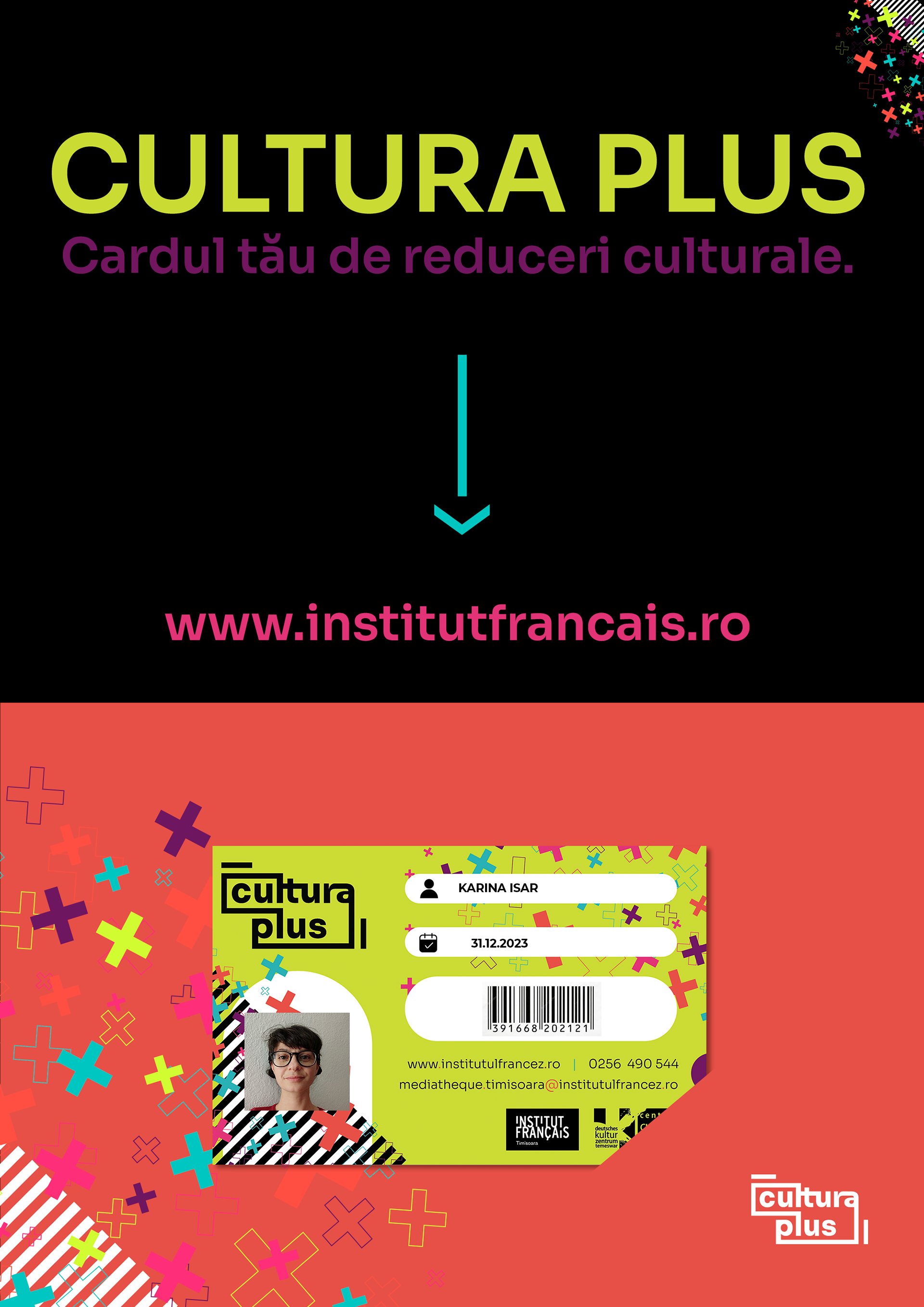
Cardul Cultura Plus is more than a card; it’s a ticket to a vibrant world of cultural events, discounts, and shared experiences. A subscription-based service designed to unlock a treasure trove of possibilities. The client wanted a fresh, catchy, urban identity that stands out and invites discovery, perfectly matching the dynamic energy of culture itself.
THE CREATIVE APPROACH
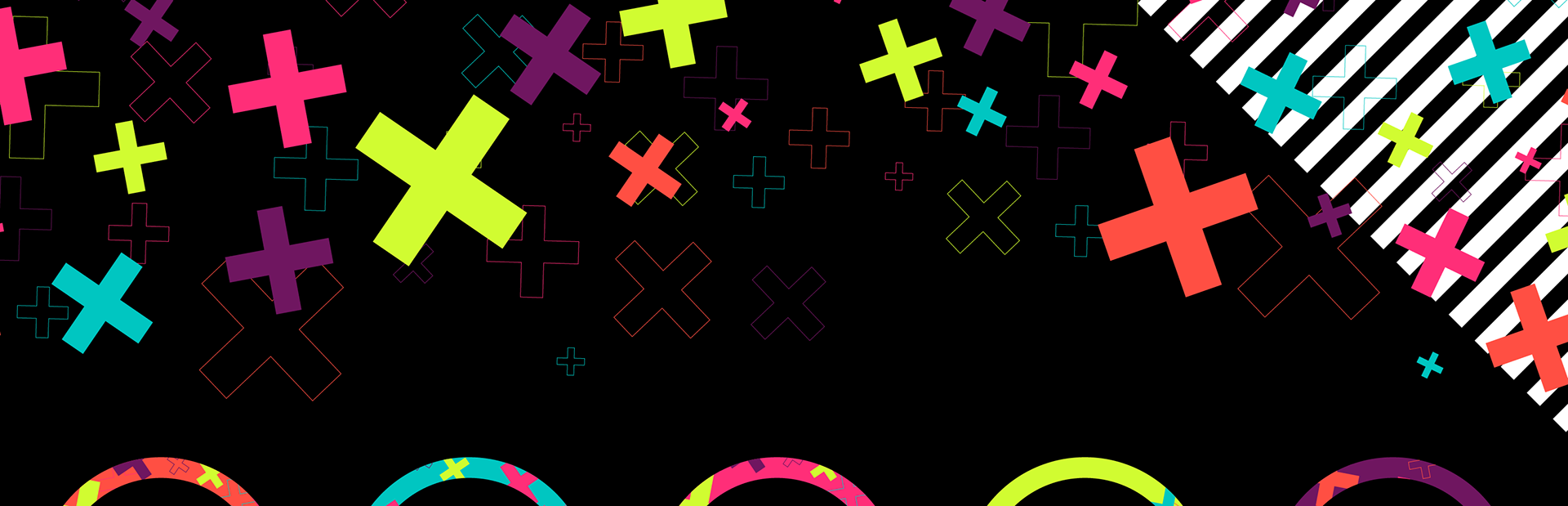
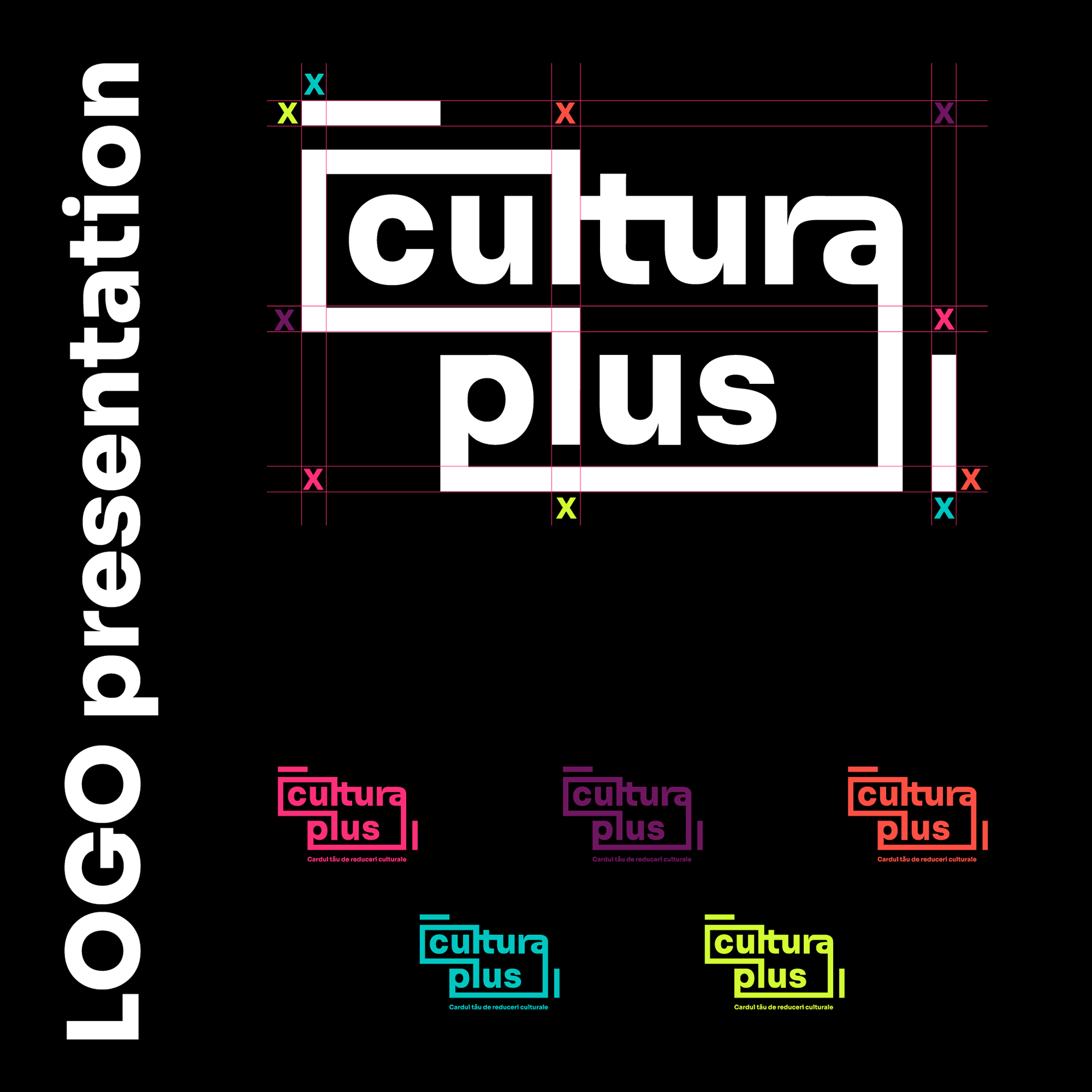
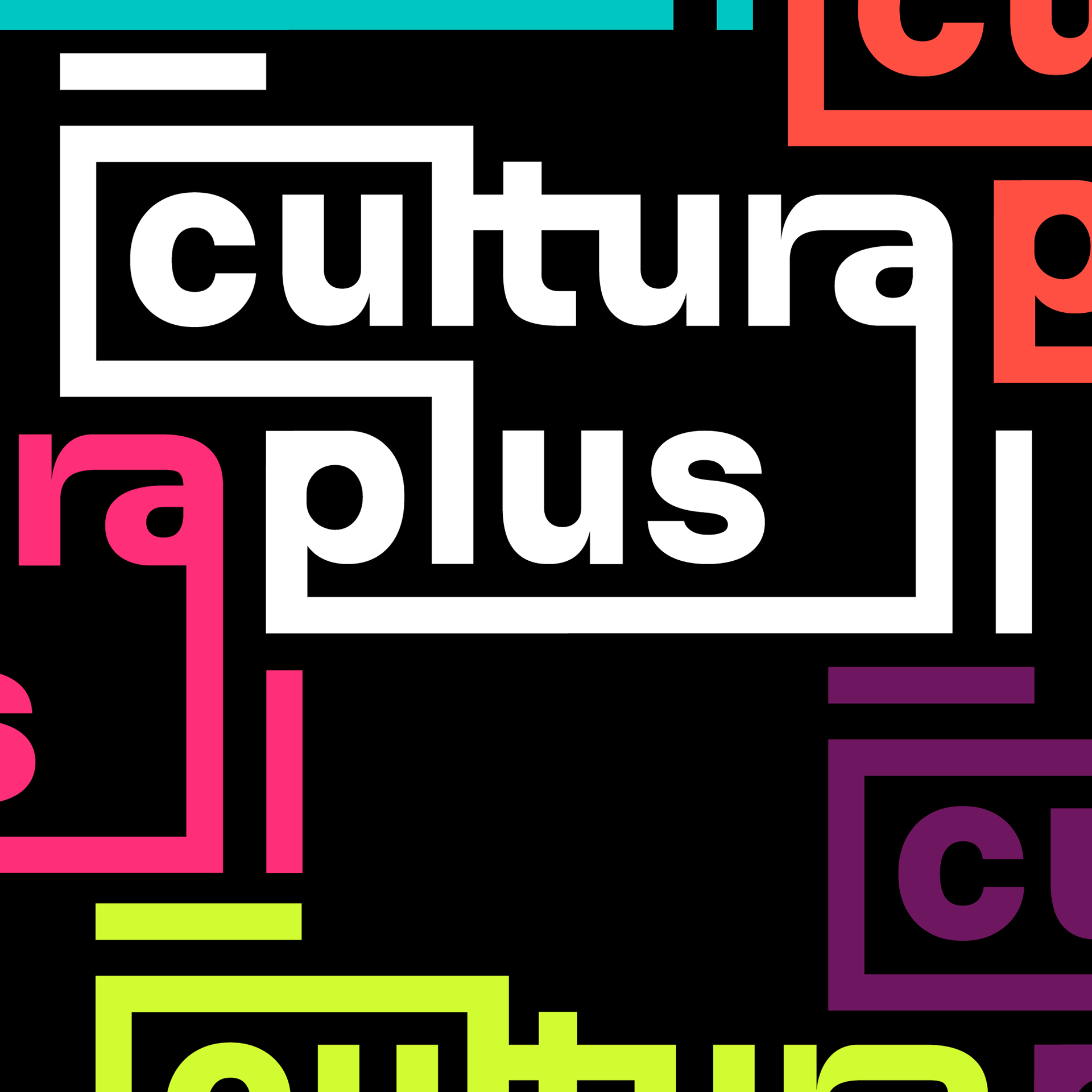
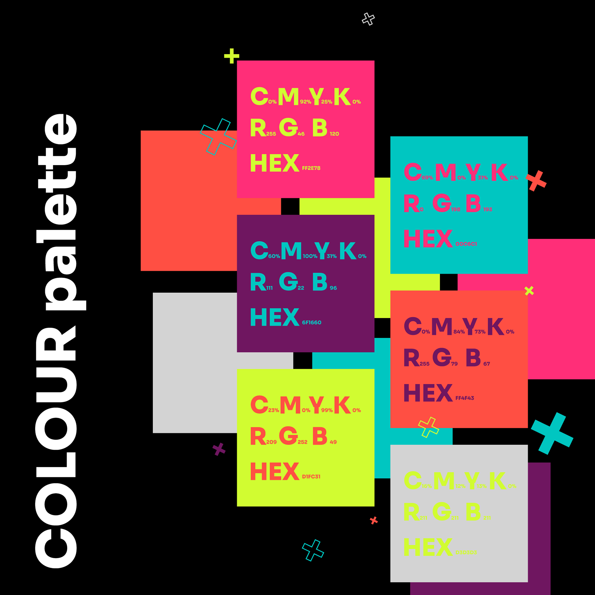
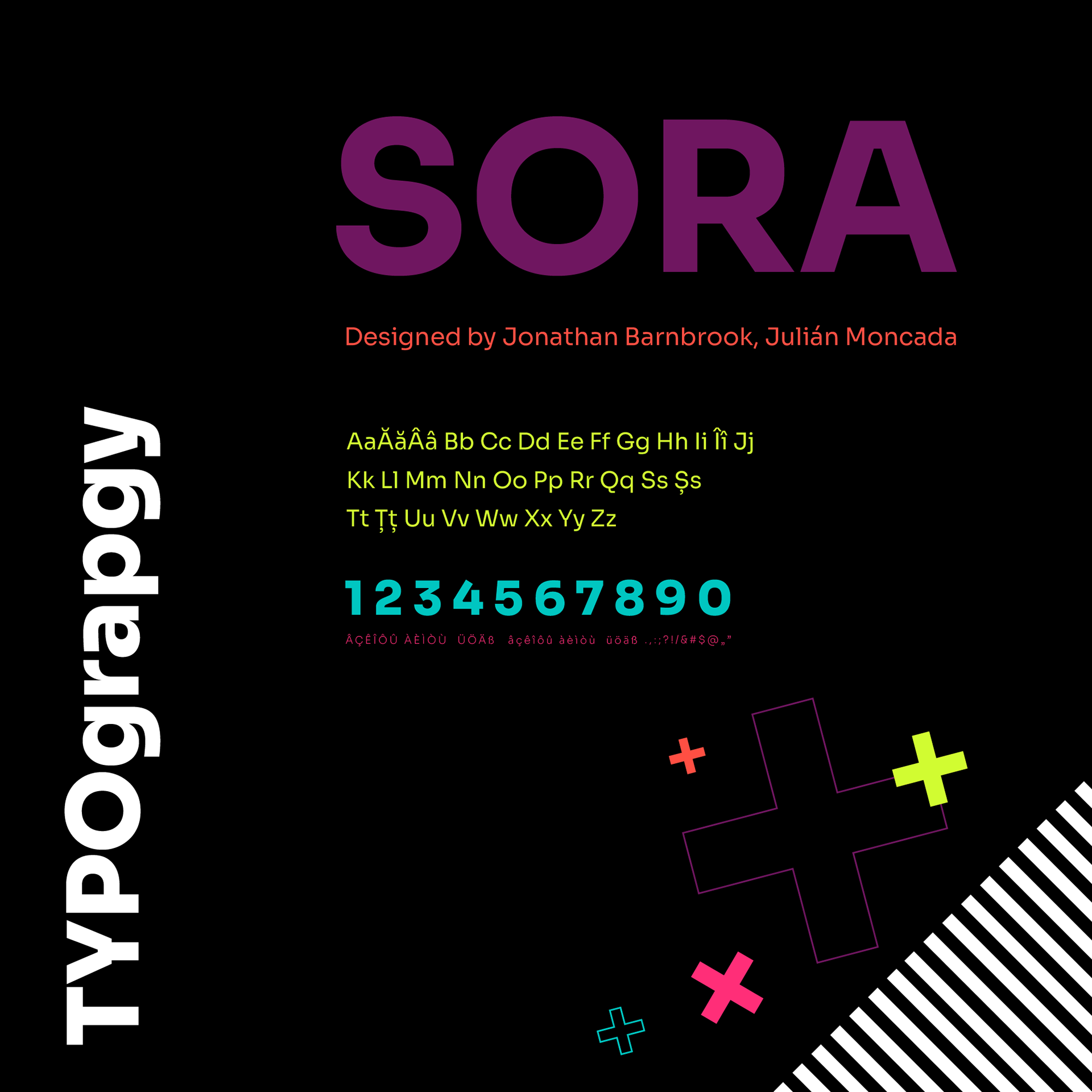
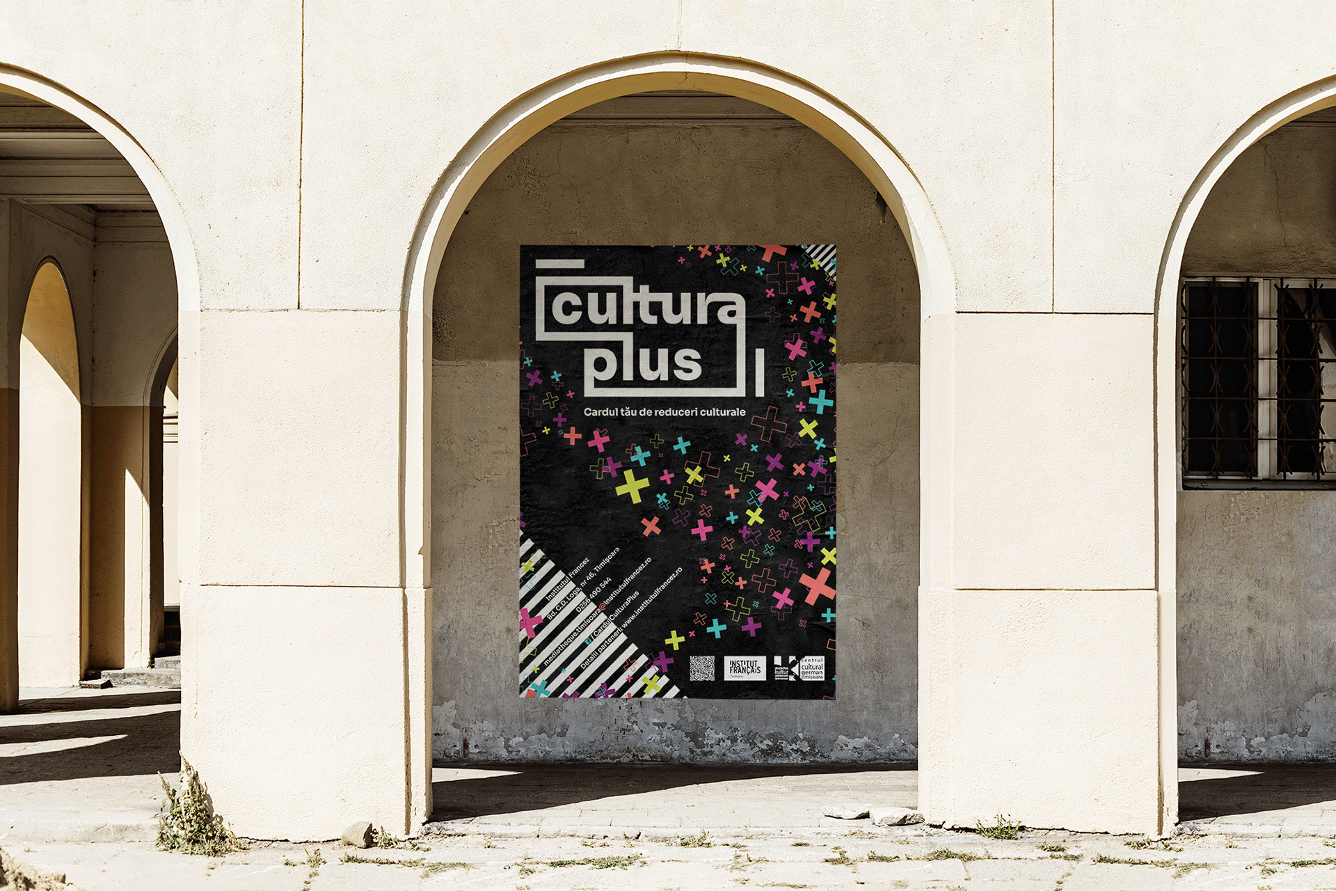
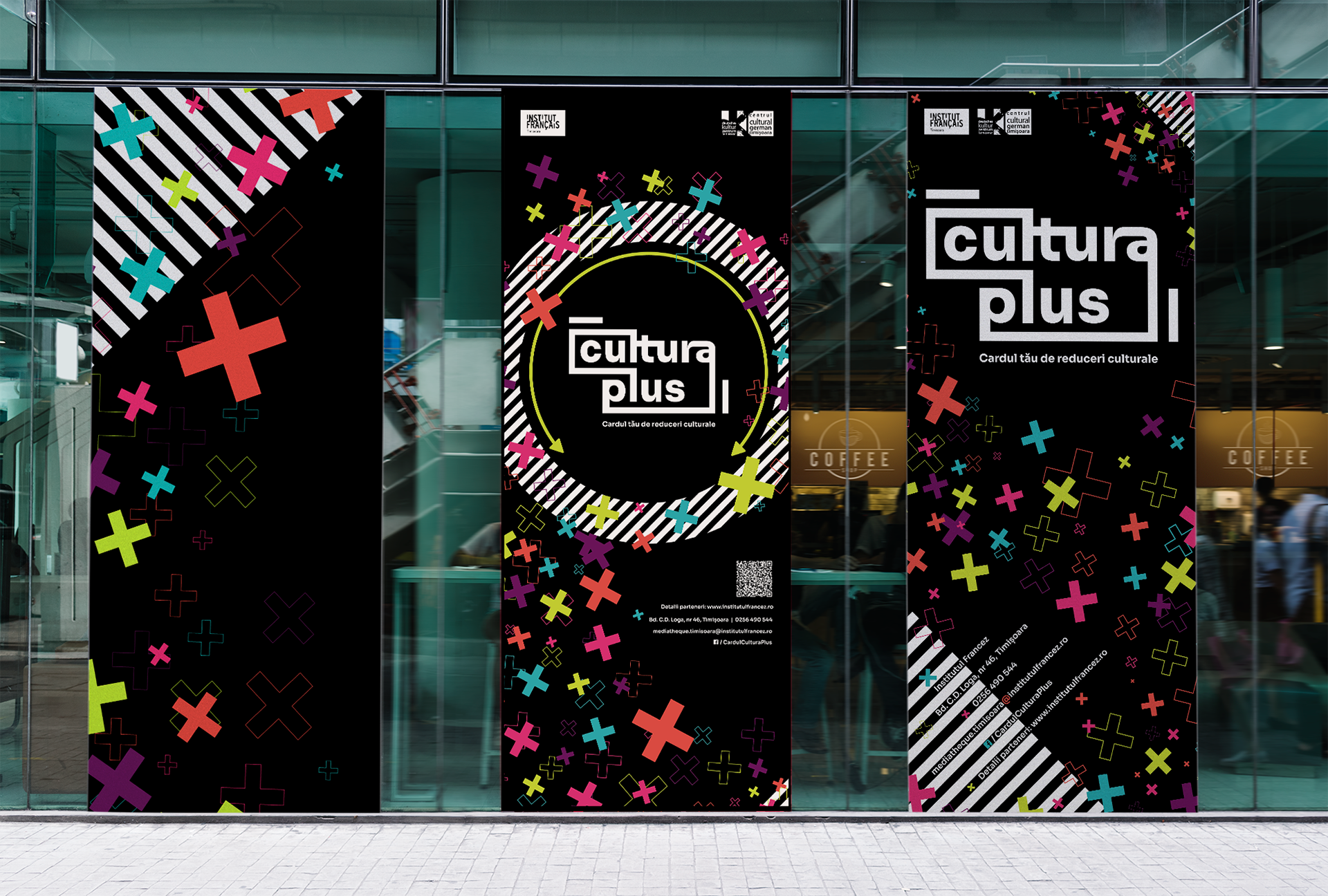
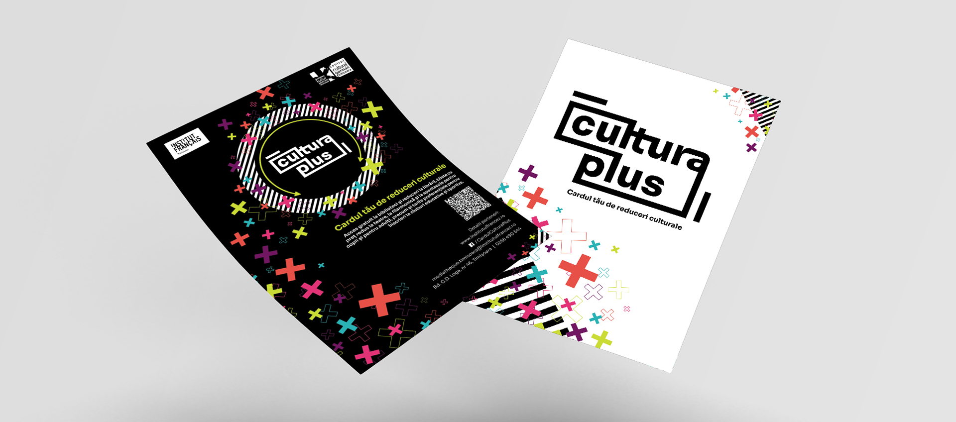
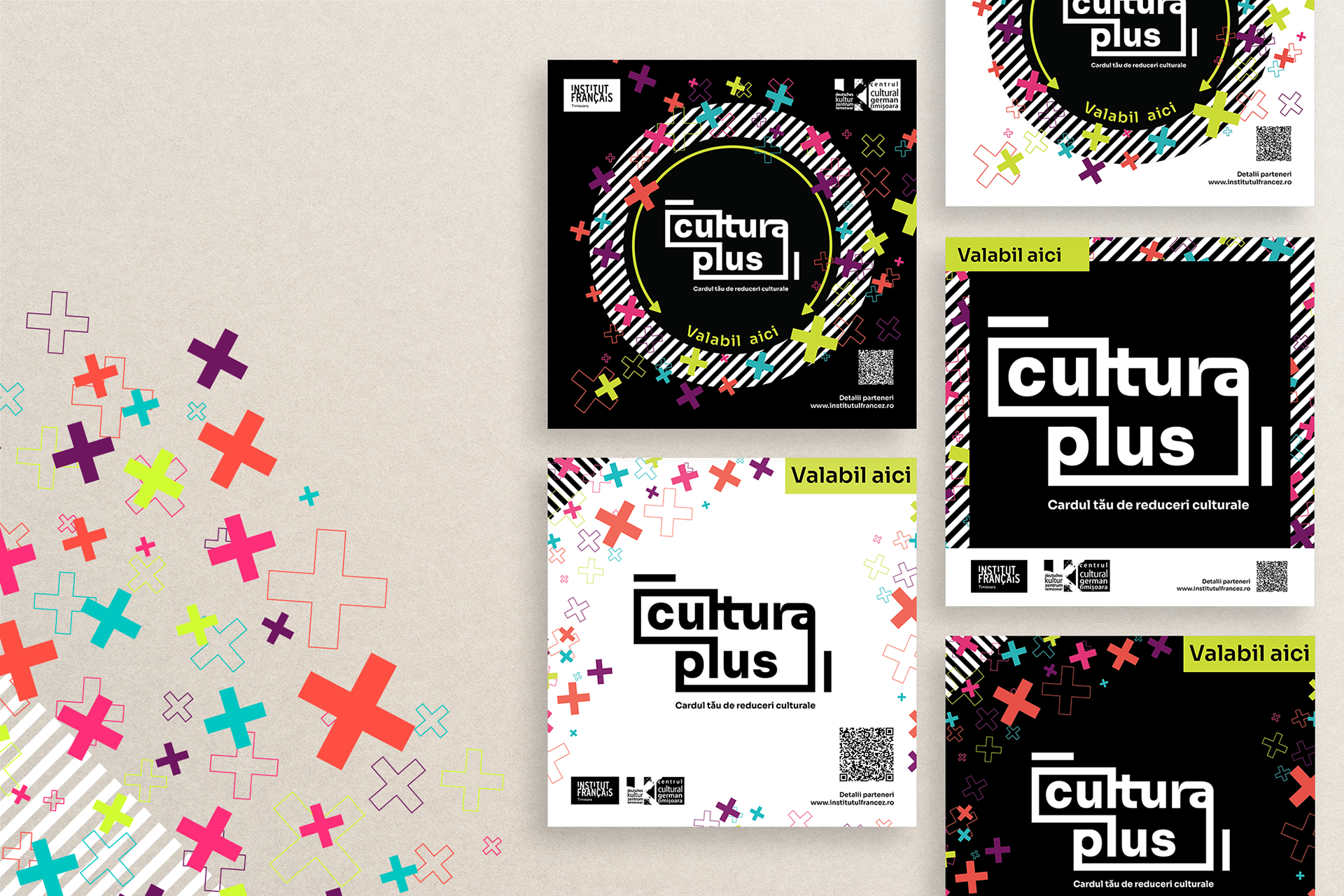
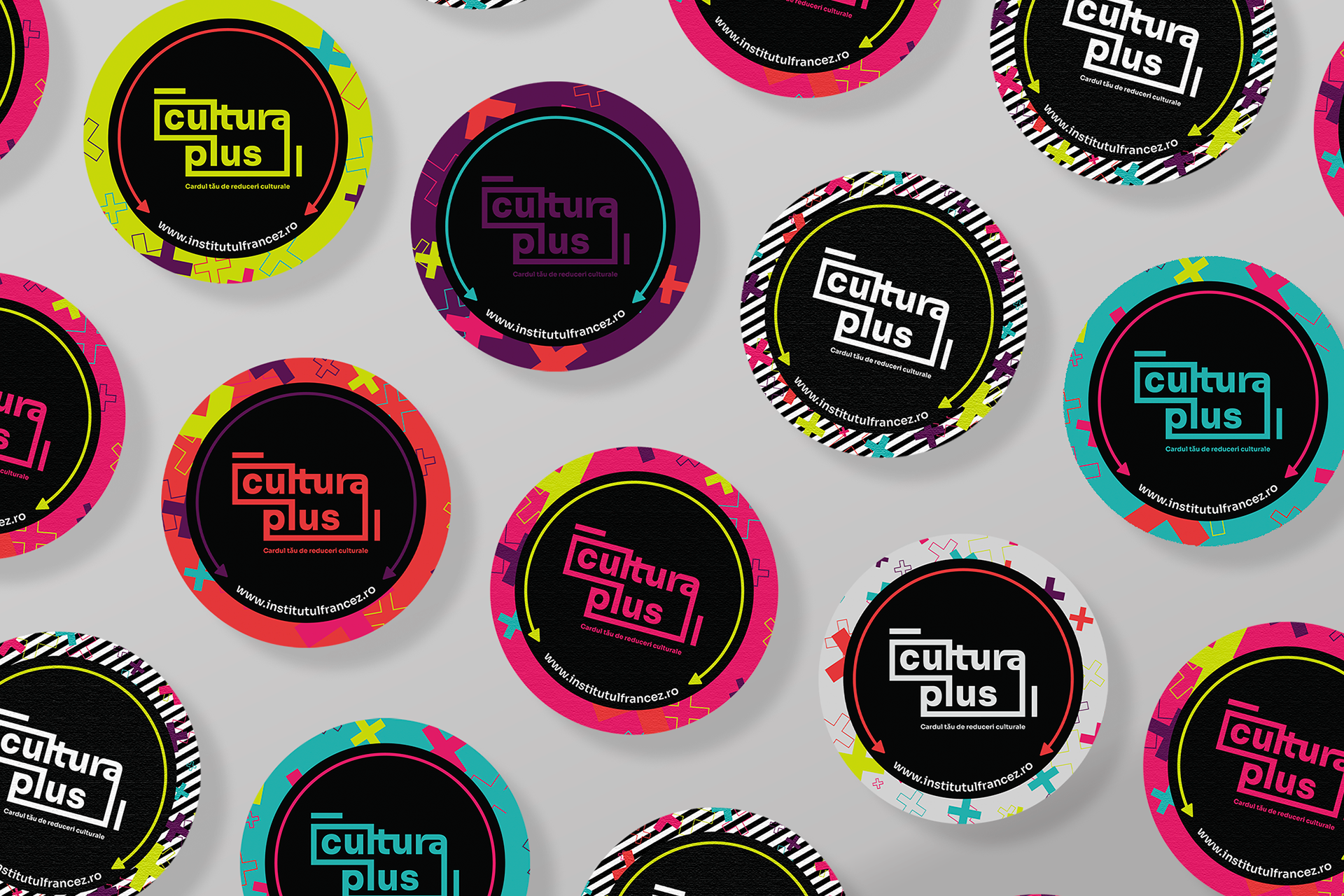
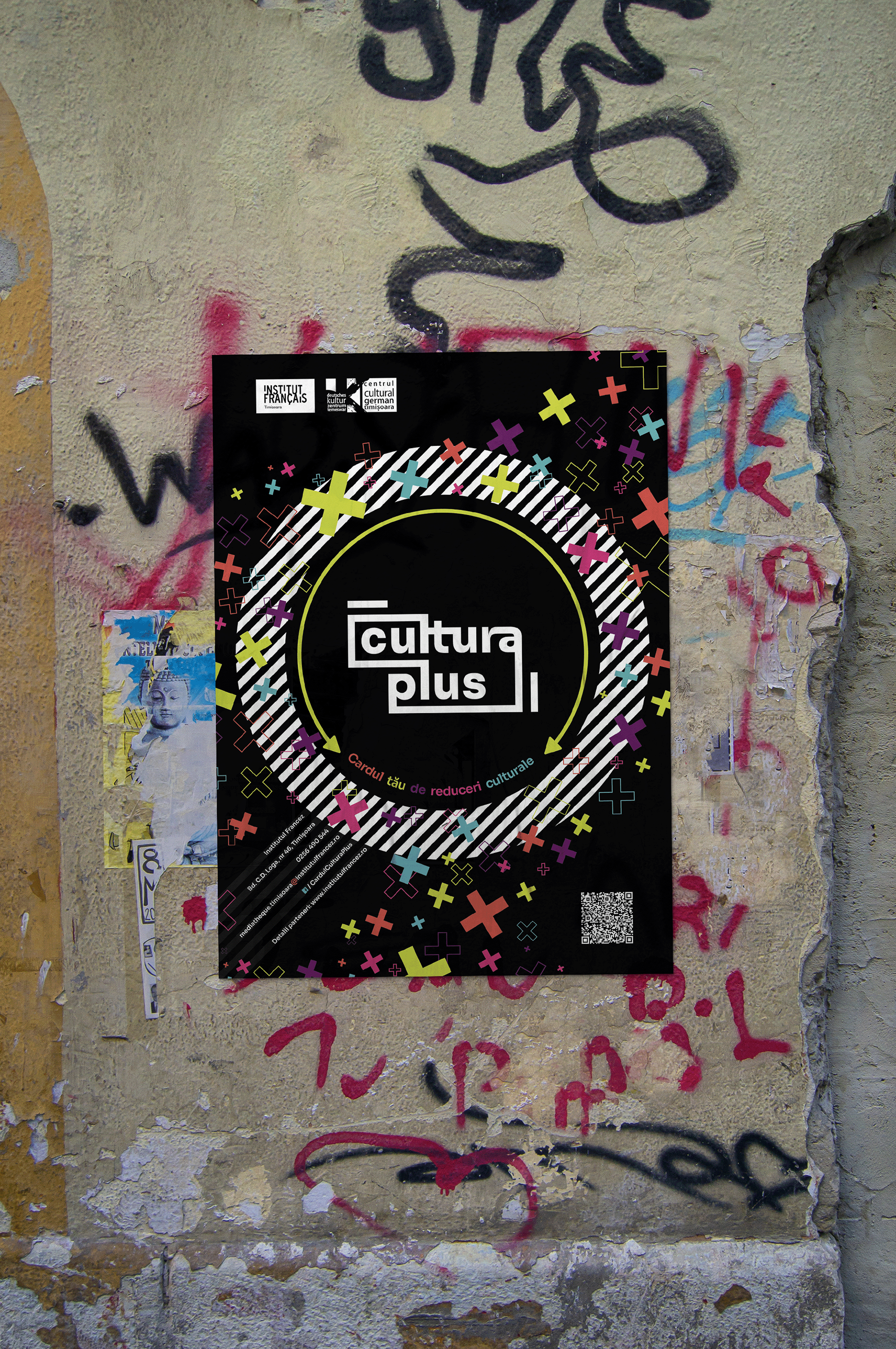
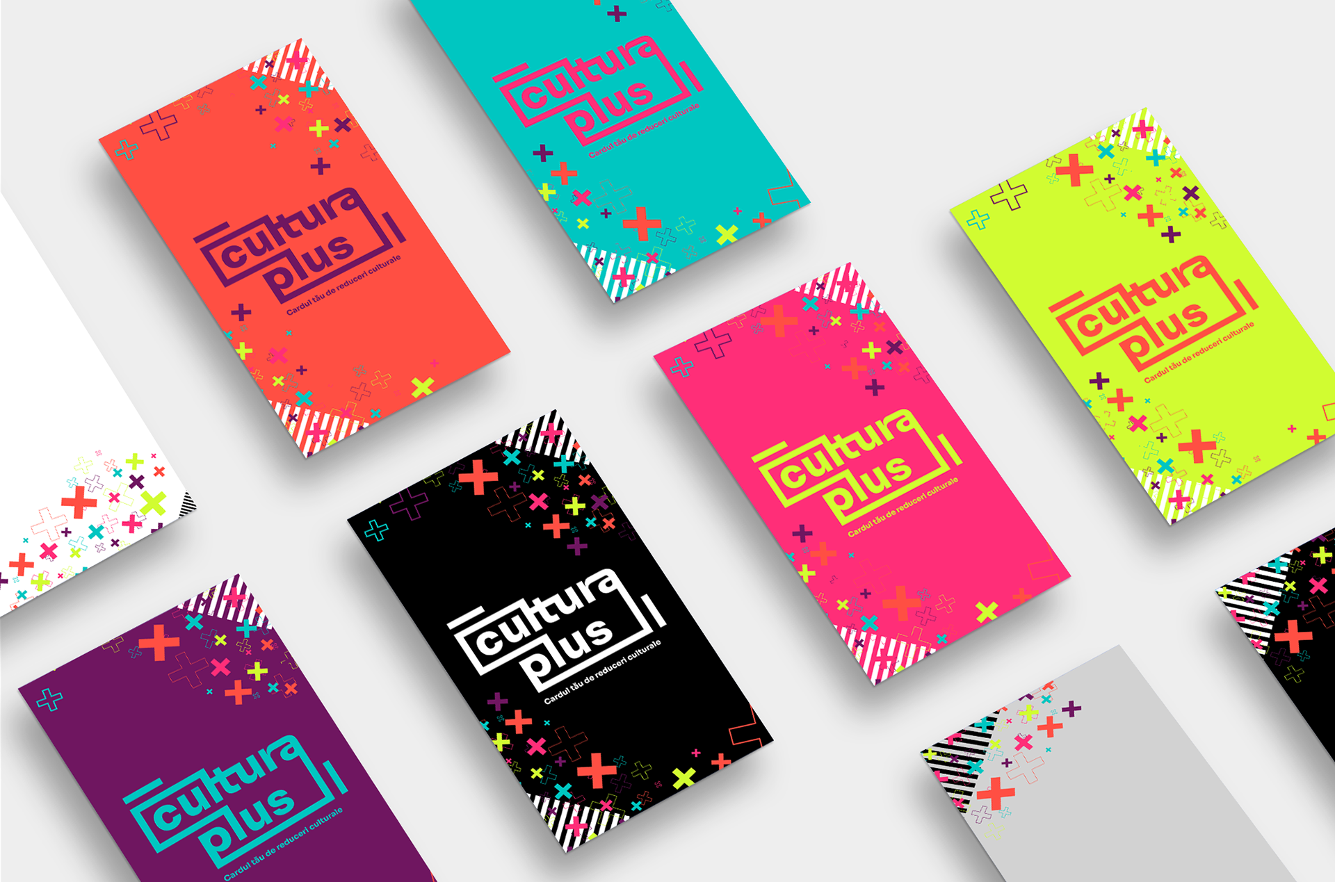
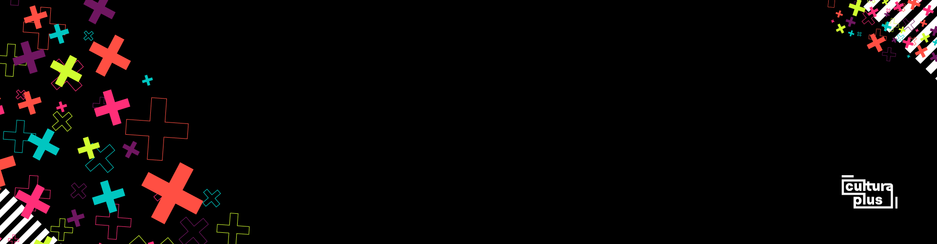
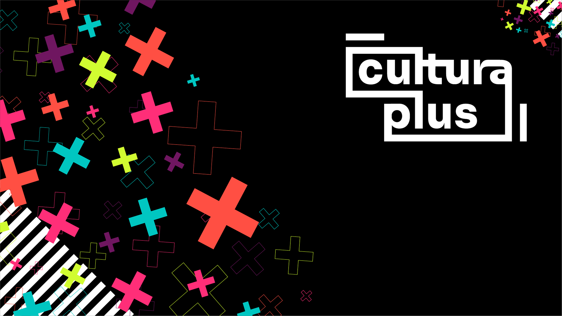
Starting from the core concept, a card that grants access to beloved cultural activities, I sought to craft a logo that is simple, versatile, and enduring. The monocolor design, adaptable to white, black, or the identity palette, makes the logo incredibly flexible across media, from printed cards to large-scale advertising graphics. The color palette pulses with cultural vitality: bright and joyous hues representing fun, life, and connection. Culture, after all, bridges artists and audiences, uniting diverse souls around shared moments of joy and inspiration.Typography played a crucial role in embodying this spirit. I selected SORA, a clean, geometric typeface with a nod to traditional print’s nostalgic charm. It’s easily legible whether in digital banners or tactile flyers, perfectly balancing modernity with warmth. Graphic elements enhance the identity’s storytelling. The playful “PLUS” pattern subtly imprints the card’s name into viewers’ minds, while the “ZEBRA” motif serves as an urban bridge, reflecting the cityscape where culture pulses and people connect.
The Creative Harvest
The resulting identity presents Cardul Cultura Plus as a must-have, urban-cool cultural companion. Print materials including card graphics, flyers, posters, stickers, and large roll-ups along digital assets all sing the same vibrant tune, making culture accessible, exciting, and impossible to ignore. This project captures the heart of city life, offering a joyful invitation to explore, connect, and celebrate the rich tapestry of cultural moments in everyday life..