The project essence
ArtEncounters Foundation is a vibrant cultural platform based in Timisoara, devoted to bridging contemporary art with communities locally and globally. Their vision is to serve as a meeting point for people, cultures, and ideas—fostering open dialogue for a sustainable and inclusive future. Over several exhibitions, they invited me to translate this ambitious mission into visual identity systems that both honor the artists’ profound works and resonate with diverse audiences.
THE CREATIVE APPROACH
The challenge was to develop identities for three distinctive exhibitions while maintaining a coherent ground aligned with the Foundation’s high standards. The guiding principle: each exhibition’s artwork must remain the star, with graphic elements that support, never compete. Using well-established typography, bold yet restrained graphics, and spacious layouts, I delivered a comprehensive range of assets: posters, indoor/outdoor signage, wall texts, stickers, mash banners, postcards, digital advertising banners, and social media materials. The processes were complex and time-delicate, requiring meticulous attention to respect both the artists’ vision and the Foundation’s ethos.
The Creative Harvest
Together, we crafted striking, modern visuals that complement and elevate the exhibitions’ messages. These identities invite viewers into rich cultural discussions without distractions, enhancing engagement on-site and online. The collaboration was an inspiring experience and a reaffirmation that great design is both thoughtful and expressive, a bridge between art and audience, tradition and innovation.
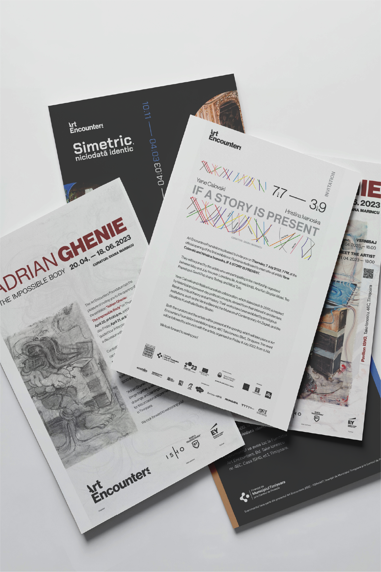
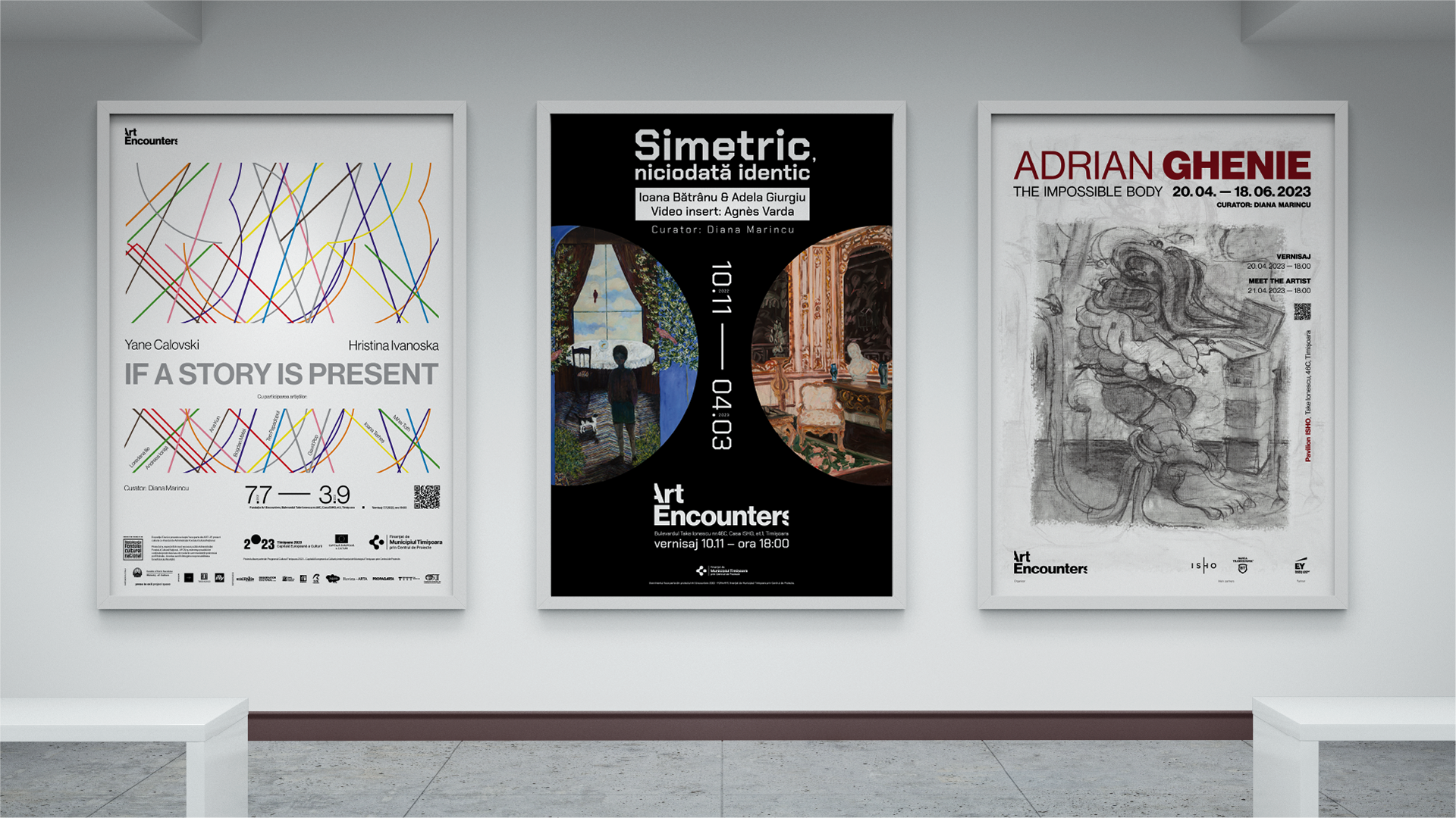
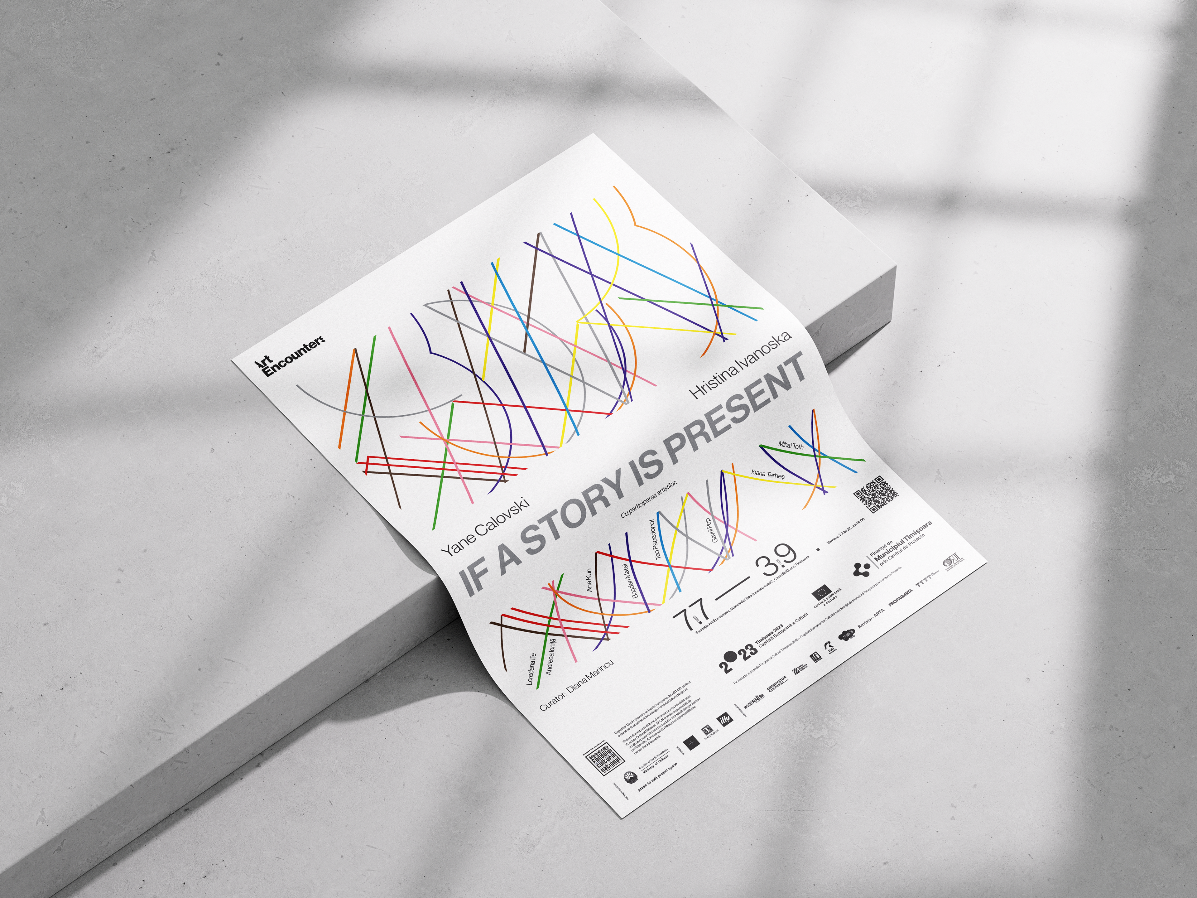
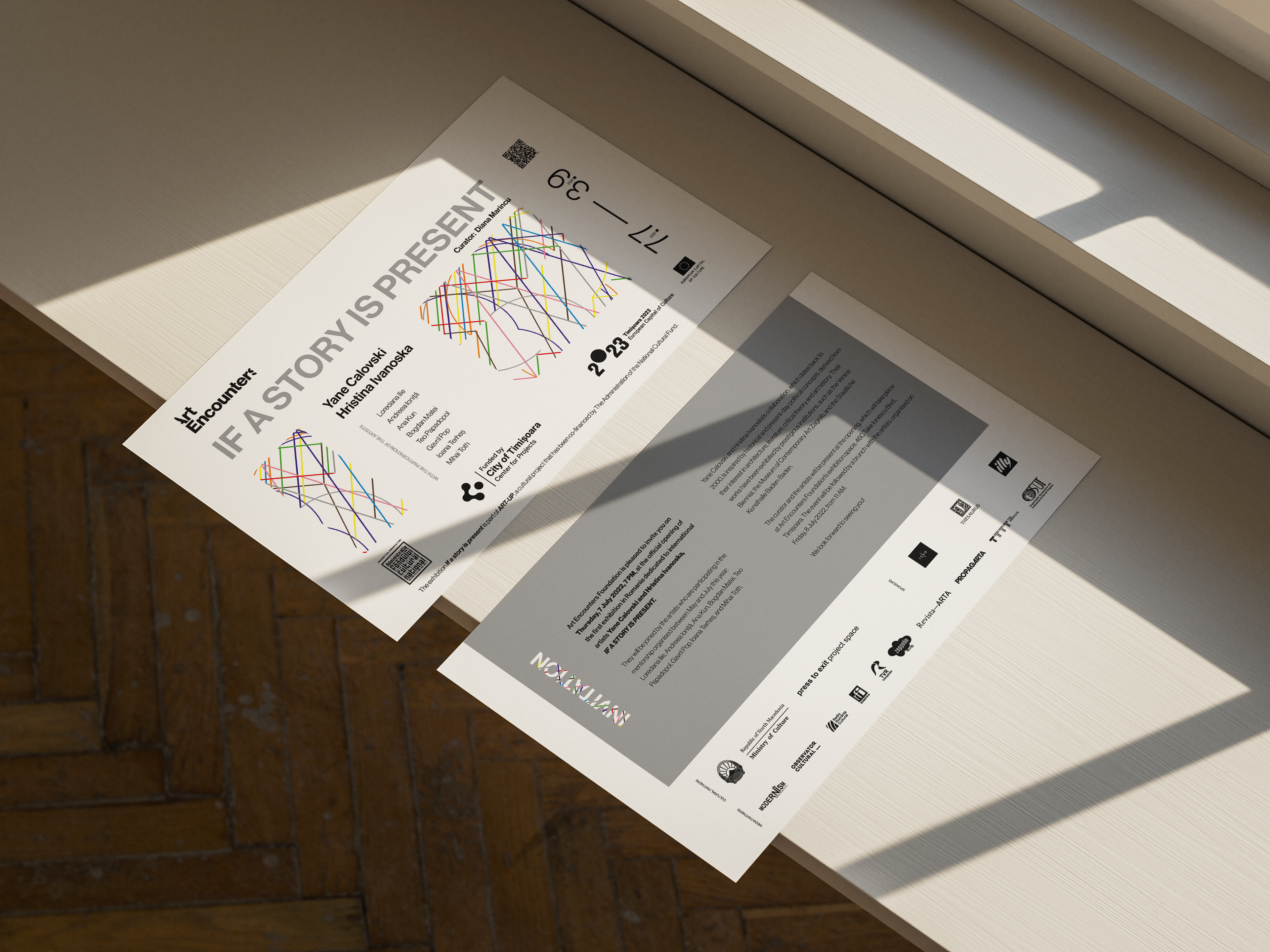
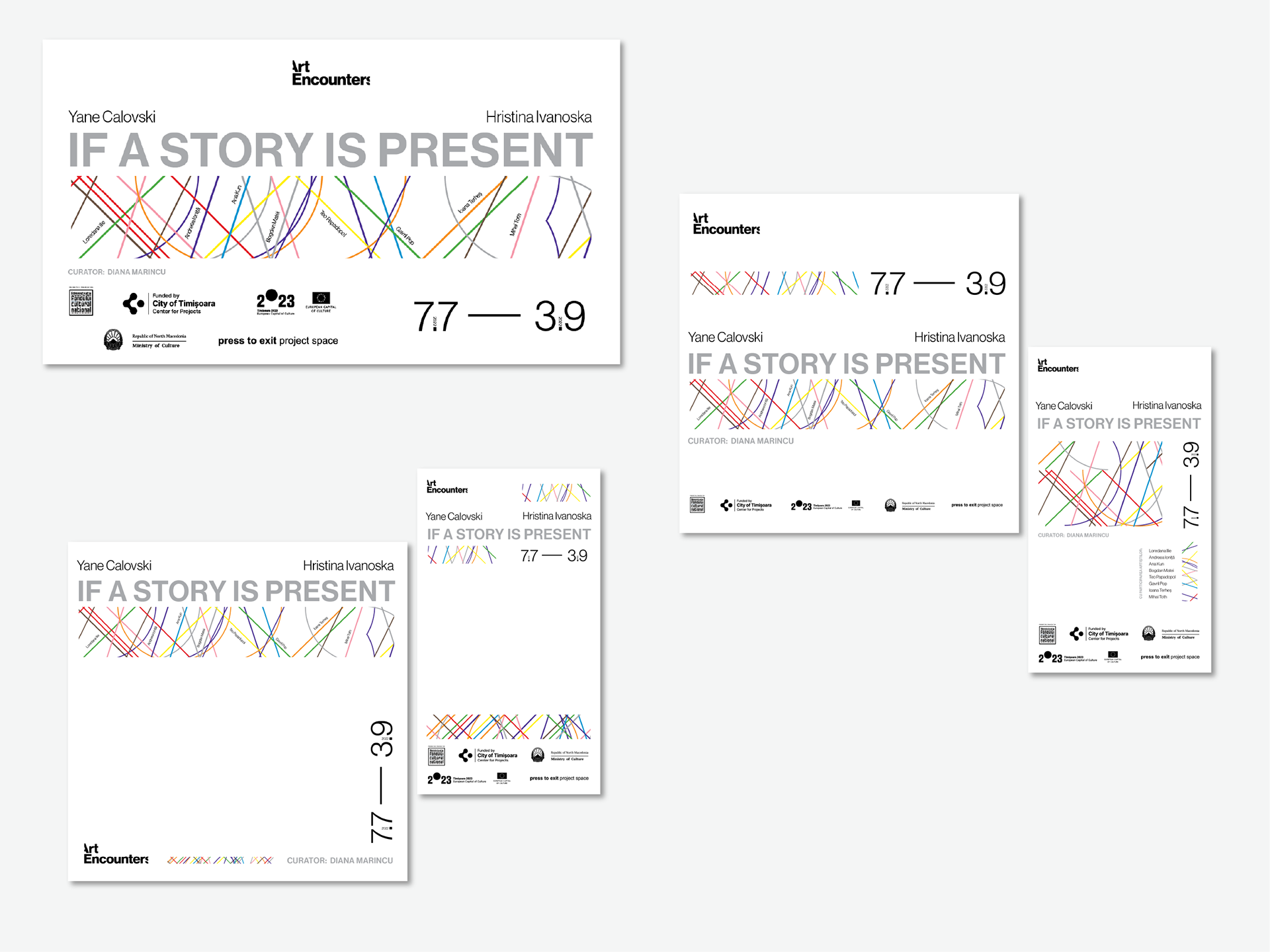
Exhibition: If A Story is Present | Yane Calovski and Hristina Ivanoska
For this exhibition that channels mentorship, exploration, and collaboration, I designed a contemporary, clean visual language that breathes space and clarity. One of the playful, line-based artworks inspired a fabric-like composition integrating the names of the young local artists mentored by the featured masters. This weaving symbolizes creative connection and shared experience, the visual identity acting as a gentle binder holding diverse voices in harmony. White and light tones dominate the palette, echoing the sincerity and vibrant curiosity of emerging artists paired with the wisdom of their mentors—creating something fresh, hopeful, and open.
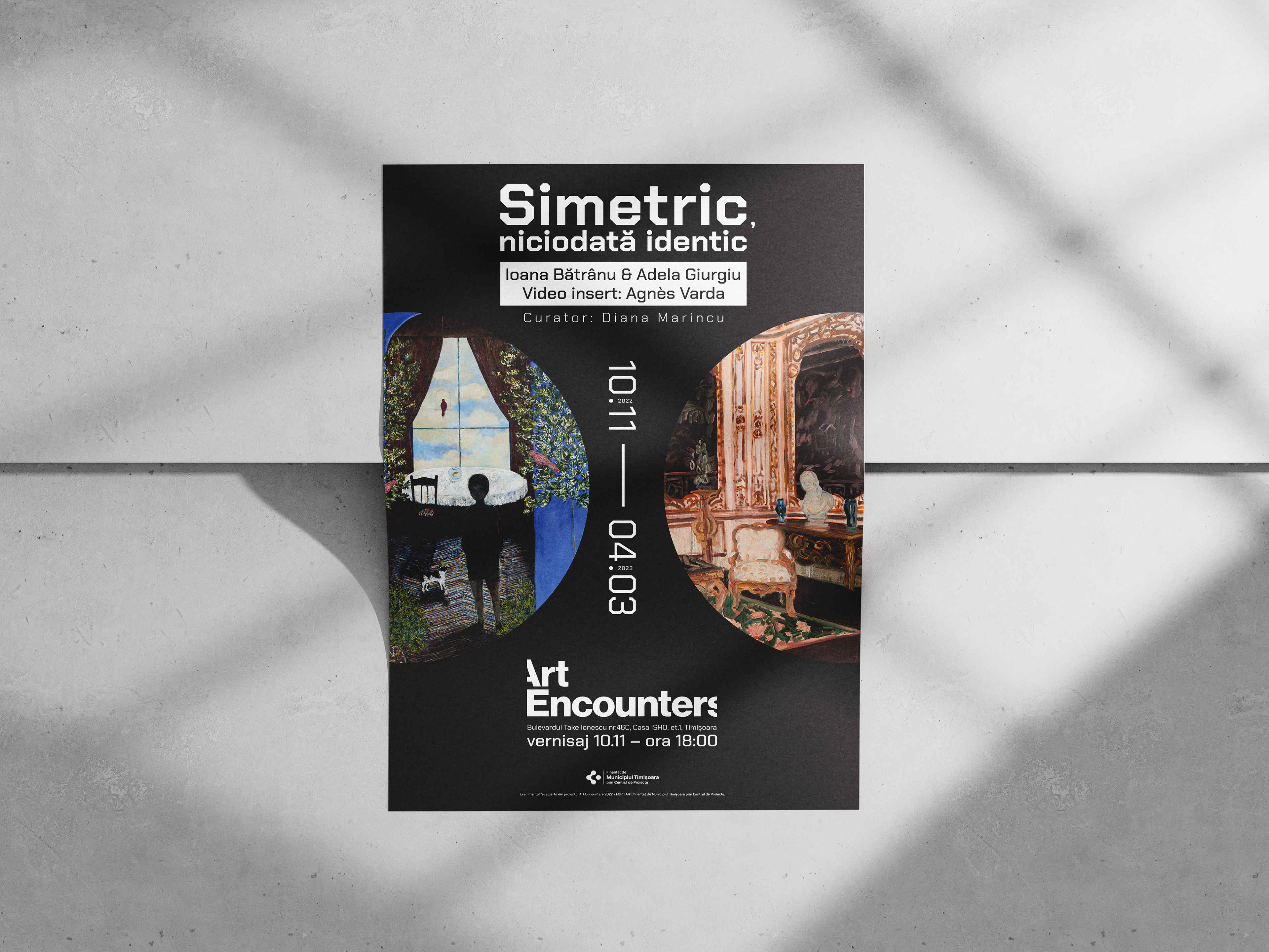
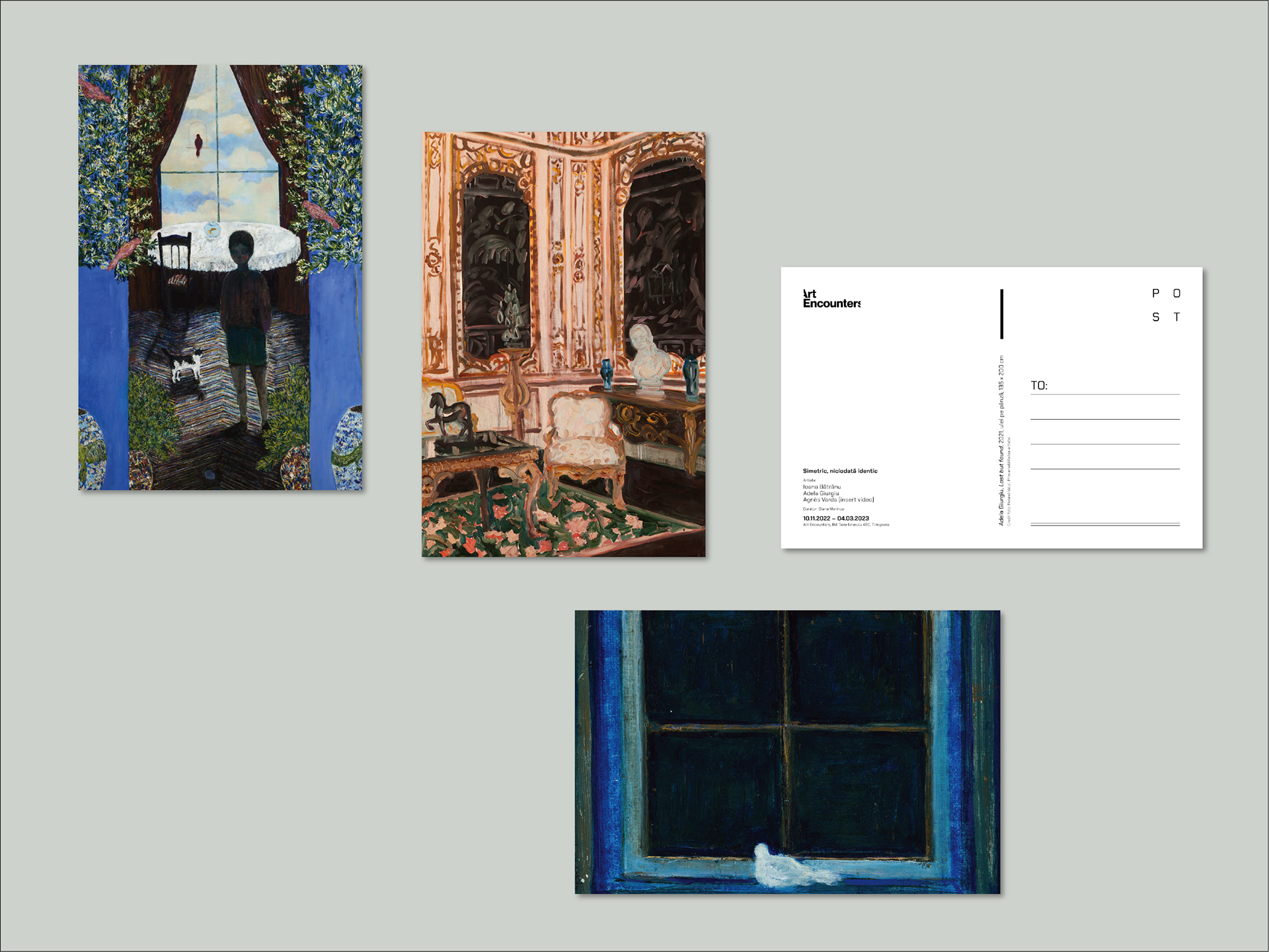
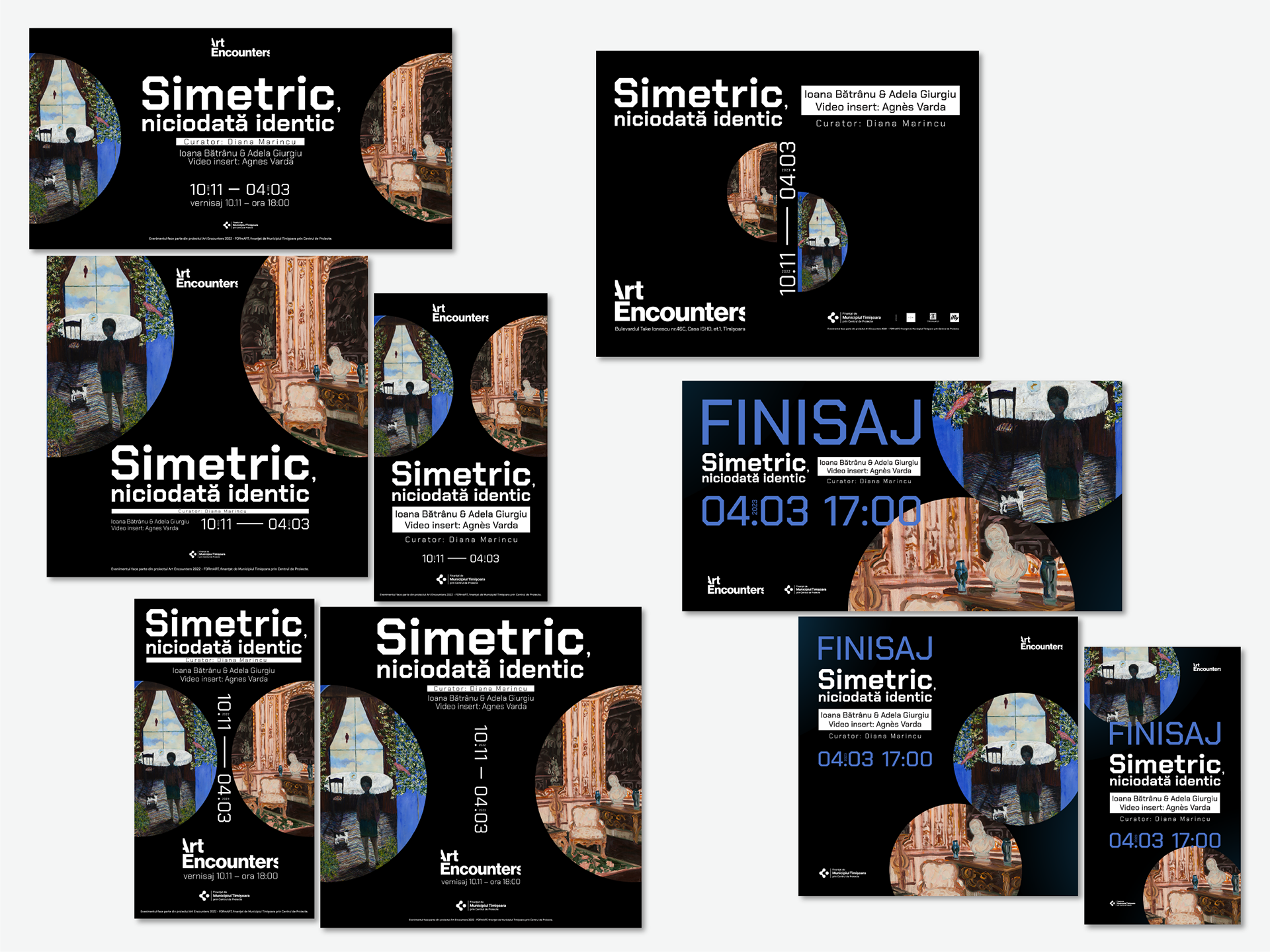
Exhibition: Symmetrical, never identical | Ioana Bătrânu, Adela Giurgiu, Agnès Varda (insert video)
For this thought-provoking exhibition, the creative process centered on exploring the nuanced dance between symmetry and difference—a visual rhythm underpinning the art itself. I chose a dark background to heighten the richness and vibrancy of the artist’s color palettes, directing the viewer’s gaze deeply inward. The typography was deliberately chosen to reflect geometric precision and balanced edges, an unusual yet perfectly symmetrical font that resonates with the show’s conceptual core. The design invites viewers from the very first glance to immerse themselves in a subtle tension between order and uniqueness, mirroring the invisible structures on which human existence subtly depend
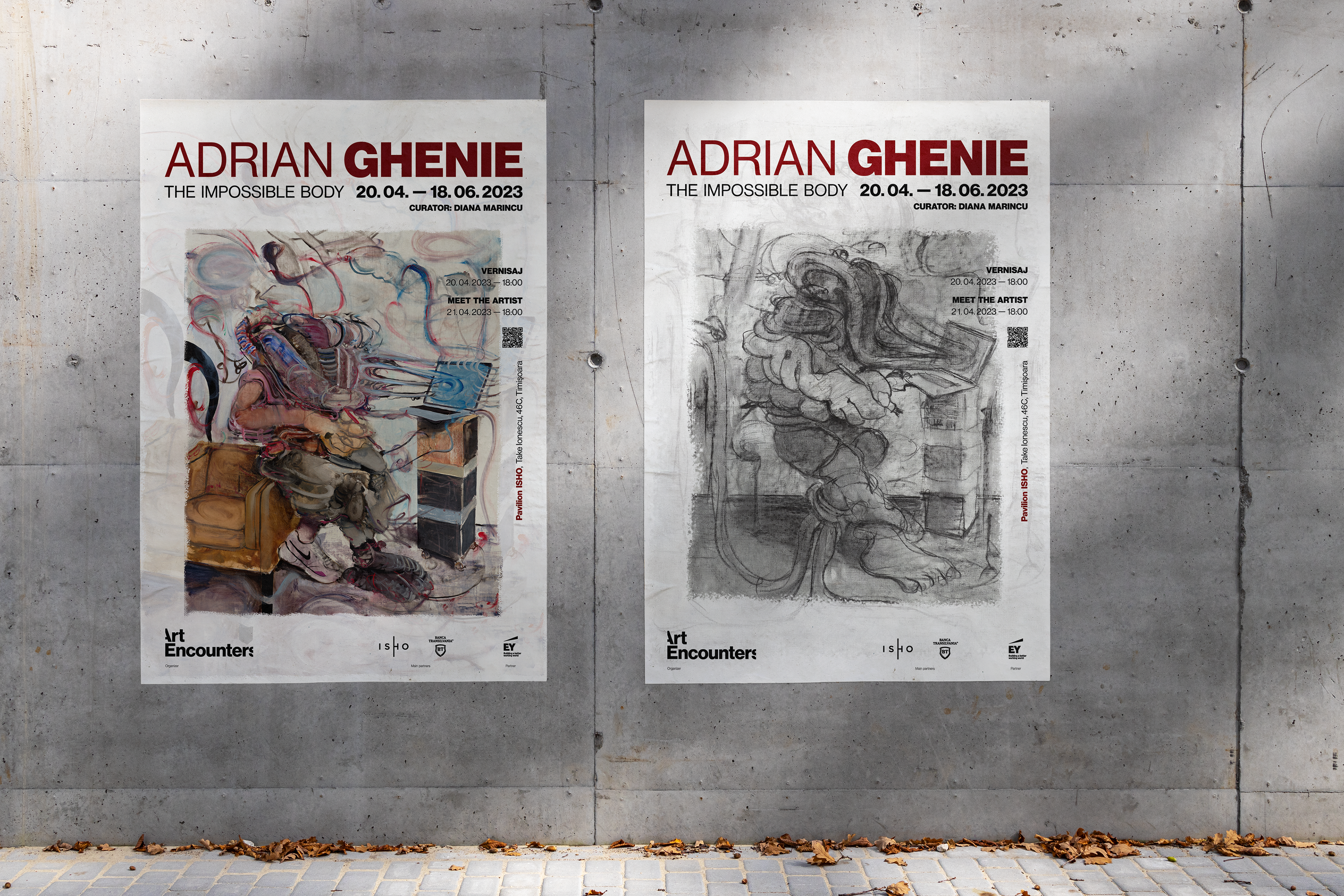
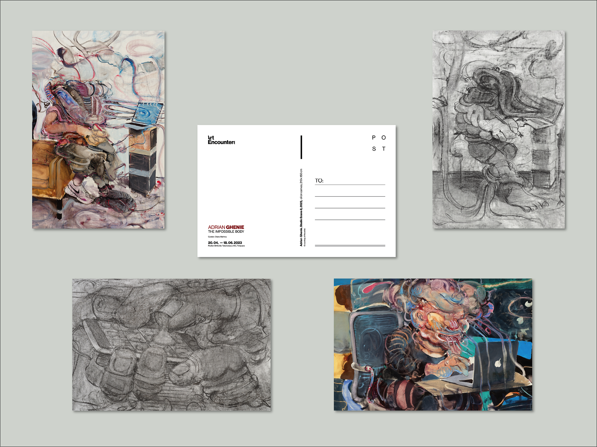
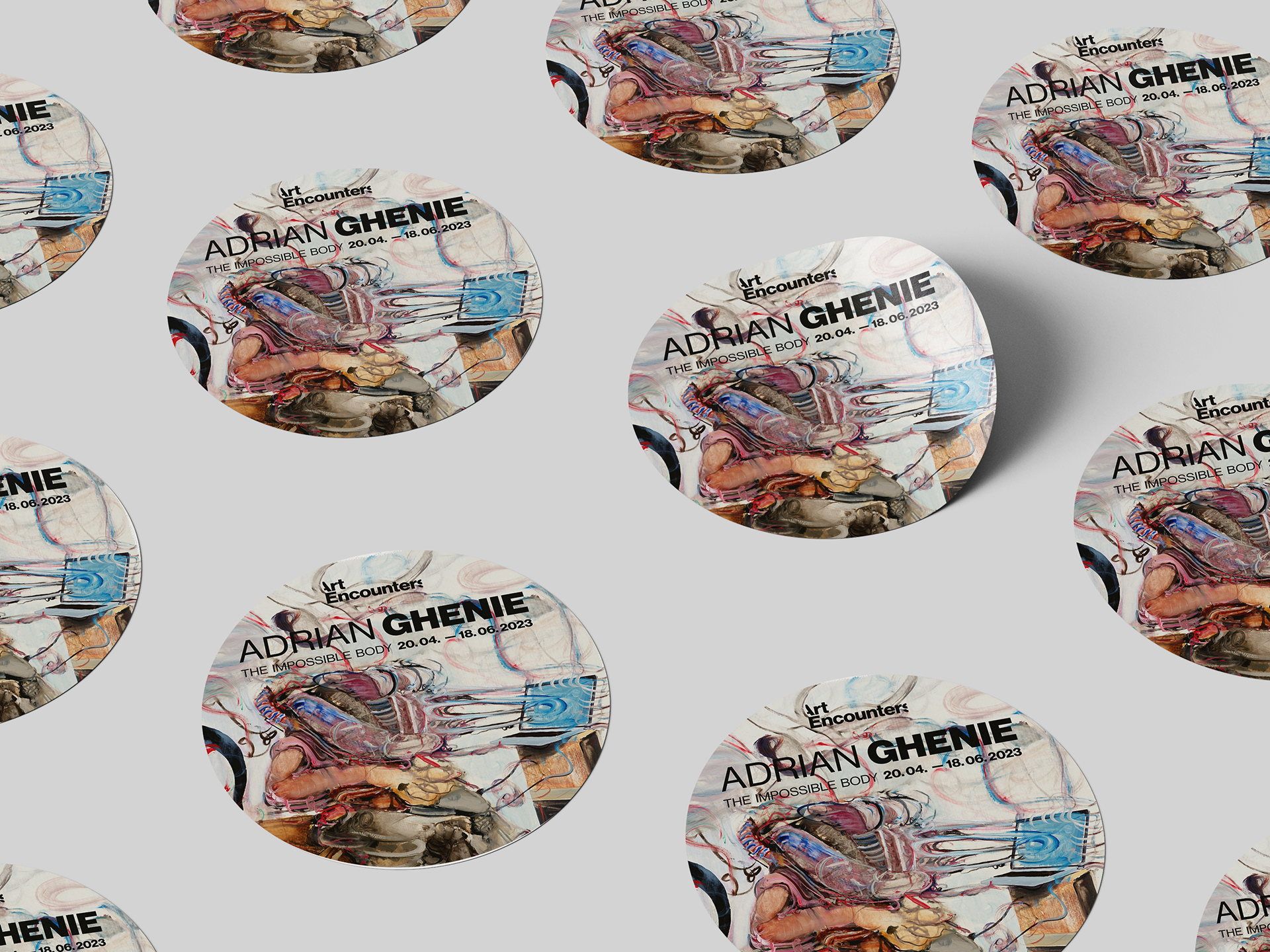
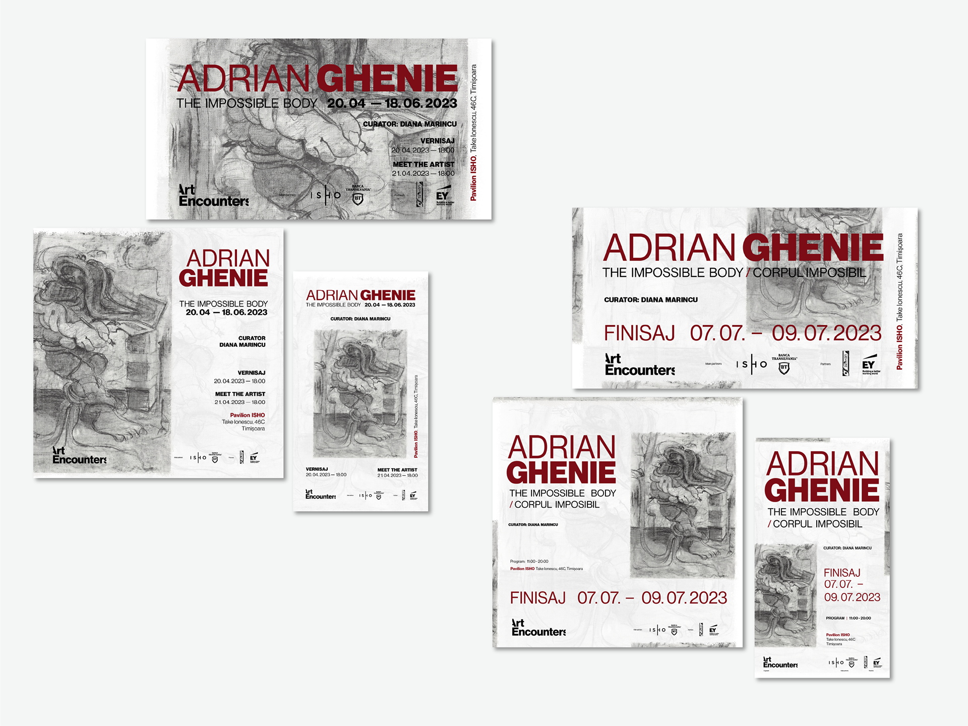
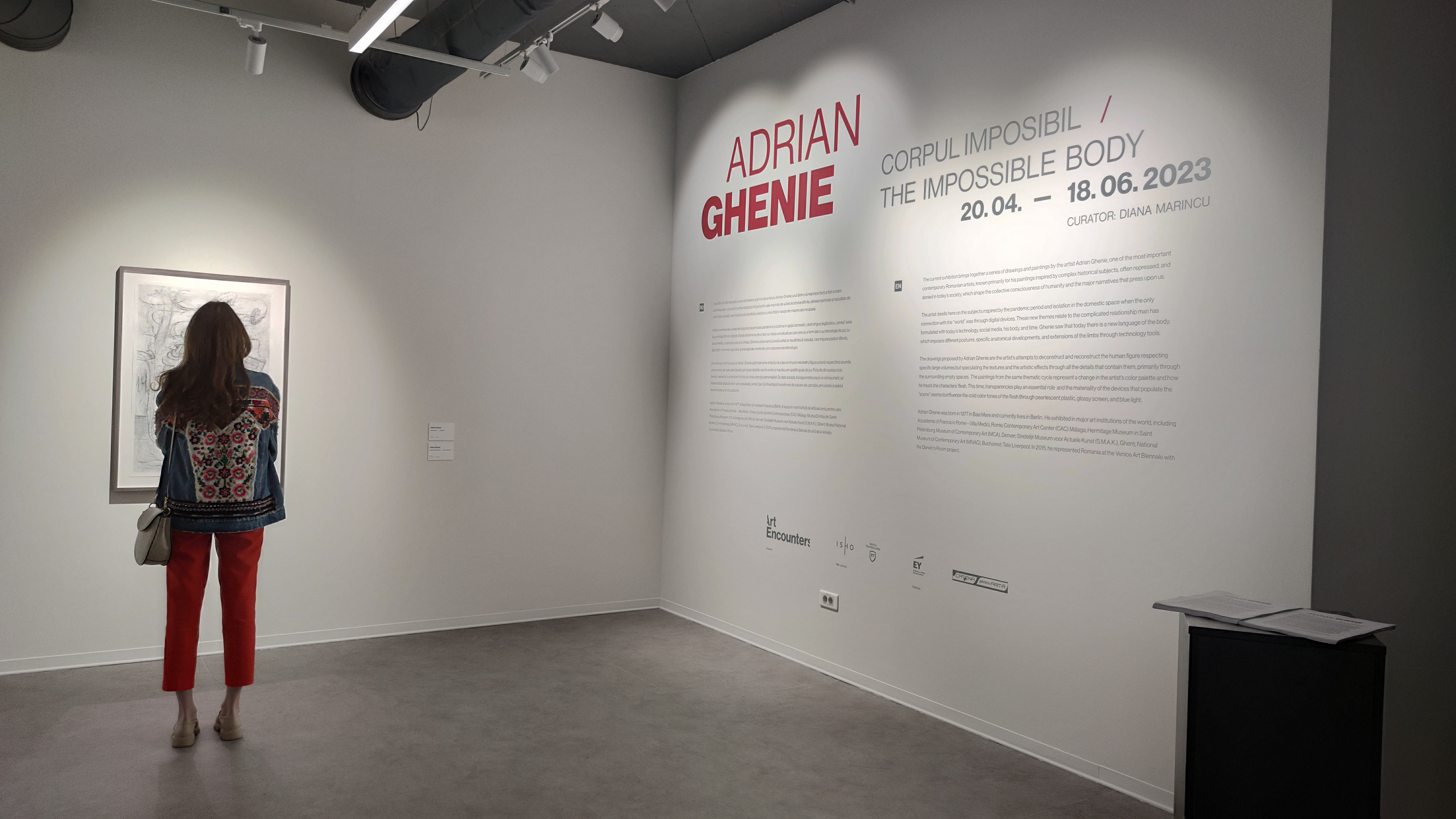
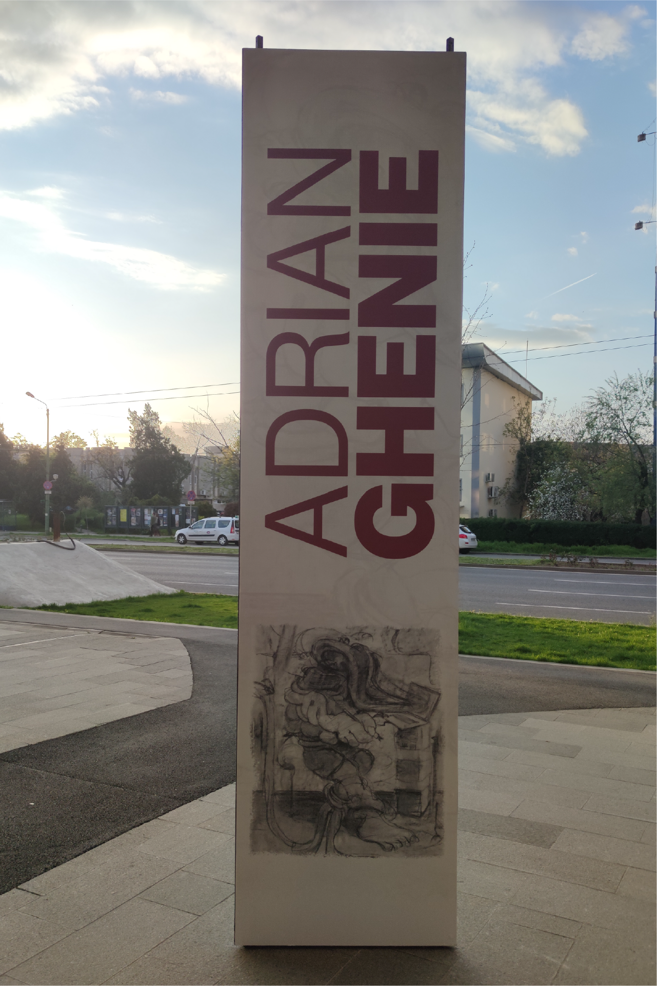
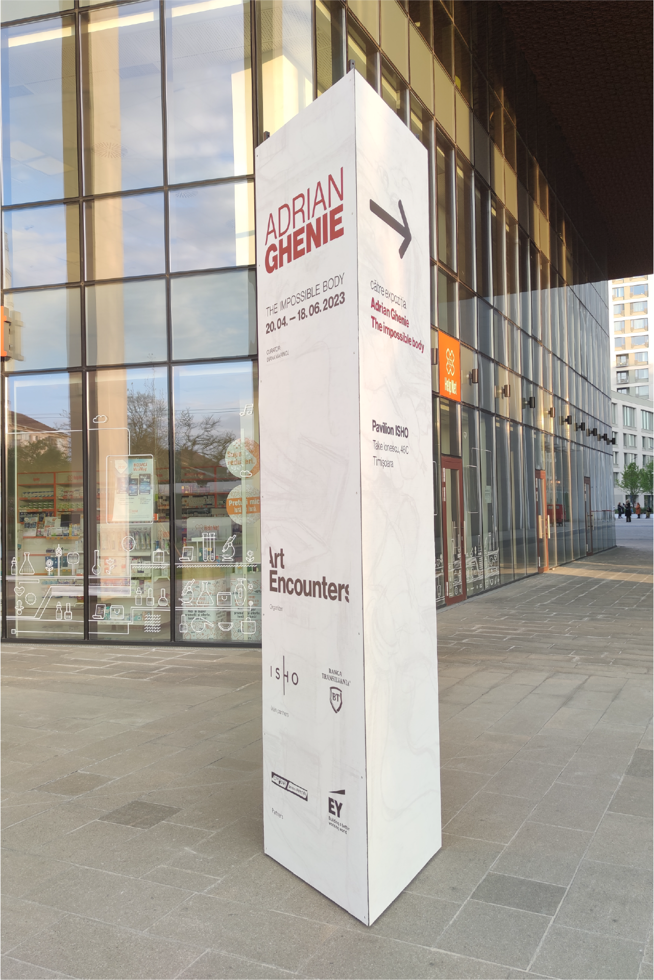
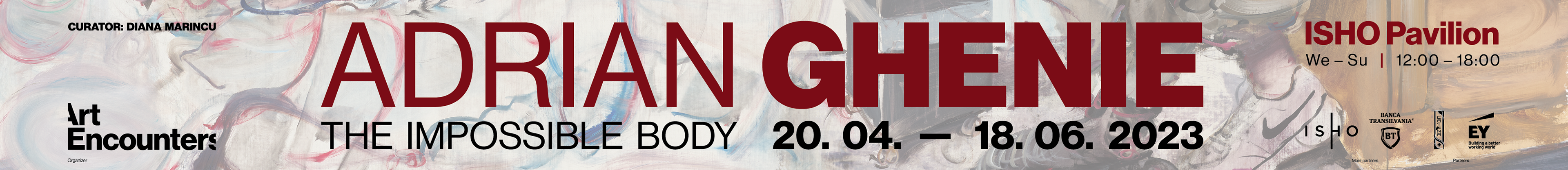
Exhibition: The Impossible Body | Adrian Ghenie
This monumental exhibition demanded an identity both bold and refined, echoing the artist’s compelling exploration of history and memory. I centered the design around one of Ghenie’s intricate black and white hand drawings, elevating its detail by pairing it with a clean, textured white background suggestive of fine paper. Deep, dark red accents were introduced, drawn from the tones of Ghenie’s other significant works, symbolizing artistic maturity, energy, and an undeniable presence. The resulting identity strikes a balance between reverence and impact, underpinning the exhibition’s intensity while honoring the complexity of Ghenie’s narratives.